
Prillwitz Pro – Font Family
The typeface Prillwitz as a digital font was created in three optical styles. Created especially for a printing in small sizes for newspapers.
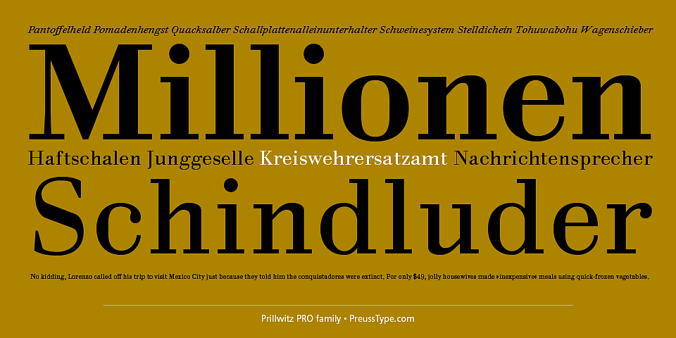
Prillwitz Press combines aesthetic and functional attributes which make written text highly readable. It was originally designed for a newspaper with medium contrast to withstand harsh printing conditions. Its structure is quite narrow which makes this typeface ideal for body text and headlines where space is at premium.
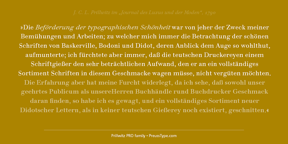
For the Normal – even more for the Book – a soft and reader-friendly outline was created through a so-called »Schmitz« and optimized in numerous test prints. The arris character and the common maximal stroke width contrast of the known classicist typefaces (Didot/Bodoni) were edited by the study of the original prints. This was also done in order to reach a very good readability in small type sizes.
This typeface is perfectly suited to scientific and belletristic works. Accordingly it has three styles: Regular, Bold and Italic as Highlighting.
The typeface Prillwitz is a complete new interpretation and continuing development of the conservated originals from 1790. They have been kept in the German Library in Leipzig. It was always given the priority to keep the strong roughness and at the same time optimizing the readability of this striking font.
Preis
50/600 Euro
Designer
Johann Carl Ludwig Prillwitz
Ingo Preuss
Publisher
PreussType


Weblog
Die Top 5 Vorteile einer Social Media Werbeagentur buchen
Die Qual der Wahl – Erfolg im Internet – die Auswahl der Webagentur
Entdecke die neuesten Trends in Damenmode: Stilvoll und zeitlos
Festplatte abgestürzt – das sind die 3 häufigsten Gründe!
Webdesign – was müssen Unternehmen beachten?
Welche Werbe- und Designtrends sind für 2024 zu erwarten?
Limitierte Editionen: Das Phänomen von exklusiven Sneaker-Veröffentlichungen
To-go-Verpackungen mit Persönlichkeit
Deutsches Design beim Bauen – das sind die wichtigsten Merkmale
Ein praktischer Leitfaden für Marketer, die KI nutzen wollen
Wie Design unser Leben beeinflusst
Designmöglichkeiten in Windows: So personalisierst du deinen Desktop
Instrumentenbau: Design trifft Handwerkskunst
Design und Cybersicherheit: Die Symbiose von Form und Funktion