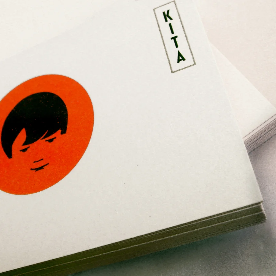
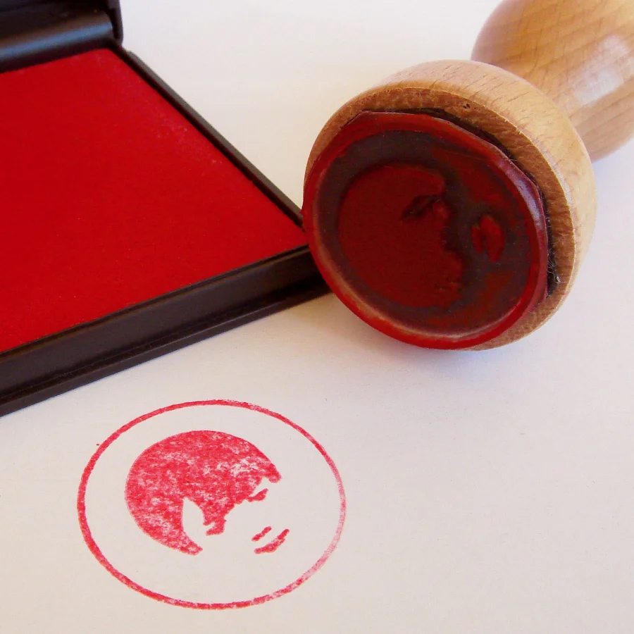
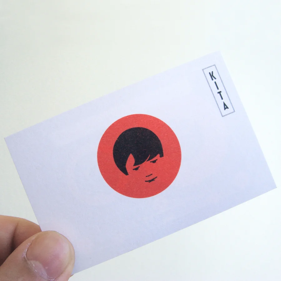
Schriftwahl Standard Georgia Times Droid Sans Droid Serif Inconsolata Compatil


2010 » Corporatedesign » Logos » Nippon Boy

Nippon Boy

Studio identity …
KITA is a design studio, a visual playground based in Berlin.
Design has much to do with being open minded. Open minded and curious like a child. KITA is the abbreviation of the german word “Kindertagesstaette”, which means “nursery” and it is the name of an Institution for raising children and daycare facility for children.

But KITA is also a japanese word for “north” (north of Germany). The designers were looking for a strong sign to symbolize the combination of their love towards japanese design culture and the curiosity of a child. From here, the “nippon boy” symbol. The circle is a strong emblem for the everlasting pursuit of beauty in design but it is also an allusion to Japan’s flag.

L.F.V.W


4 Kommentare

Robert

nice concept.

Markus Reuter

Is that a joke?
a quote from HORT’s website:
“HORT began its inhabitance back in 1994, under the previous stage name of EIKES GRAFISCHER HORT. Who the hell is Eike? Eike is the creator of HORT. HORT – a direct translation of the studio’s mission. A creative playground. A place where ‘work and play’ can be said in the same sentence. An unconventional working environment. Once a household name in the music industry. Now, a multi-disciplinary creative hub. Not just a studio space, but an institution devoted to making ideas come to life. A place to learn, a place to grow, and a place that is still growing. Not a client execution tool. HORT has been known to draw inspiration from things other than design.”

Jens

Die beschreibung bezieht sich auf die formfindung des logos. Als gestalter muss und sollte man aber so oder so immer neugierig bleiben. Kita ist ein japanisches Wort und die übersetzung für norden. Deshalb das kindergesicht im japan kreis. Das als basis ergibt das logo. Mehr auch nicht.
Es soll in keinsterweise in konkurrenz zu eike und seinem studiokonzept treten. Wir haben eine völlig andere ausrichtung.

Das kann man so oder so nicht, da das studio einzigartig ist und großartige arbeiten abliefert.

Nochmal: Es geht hier ausschliesslich, um die herleitung fürs logo und die verknüpfung der japanischen kultur und deren übersetzung in ein kindliches gesicht in einem roten kreis.

That’s it.

Kommentieren