
Kinderbuchhaus
Over ten years ago a sanctuary for infinite phantasy was created: The Kinderbuchhaus in Hamburg-Altona, which literally translated is the children’s book house. A team of bibliophiles dedicates their time and passion towards the upkeep of this jem. Central to it are illustrations from – mostly contemporary – children’s books. We were asked to createa more modern visual look for this
special place.
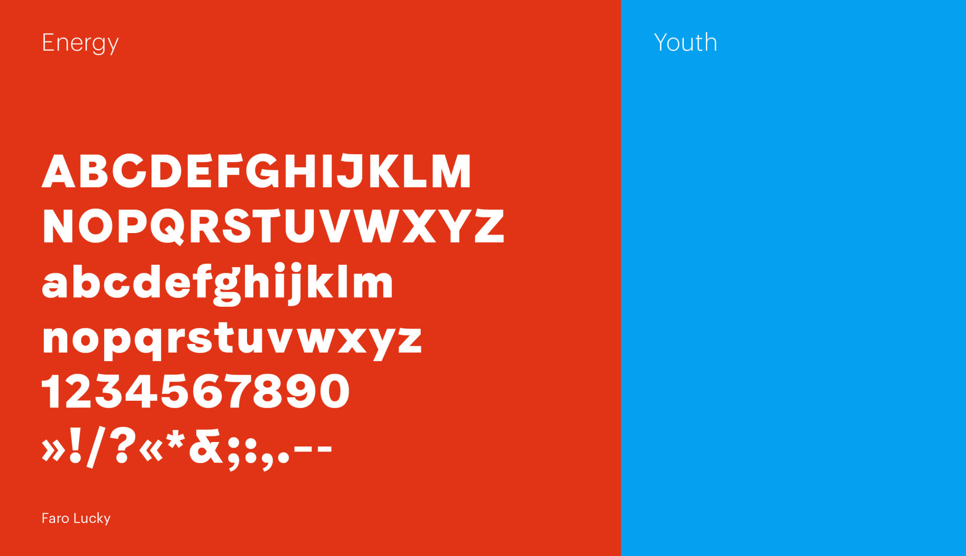
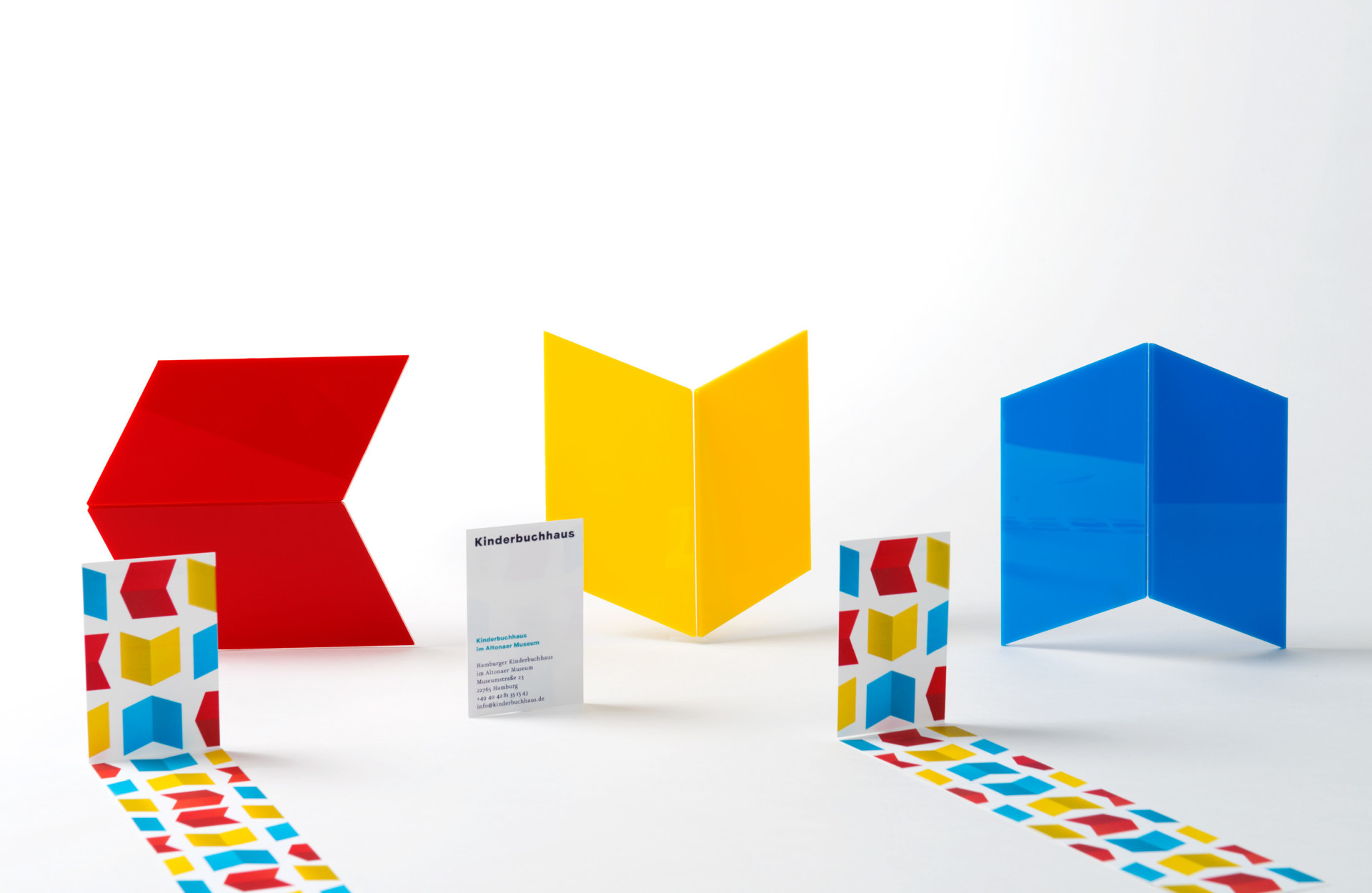
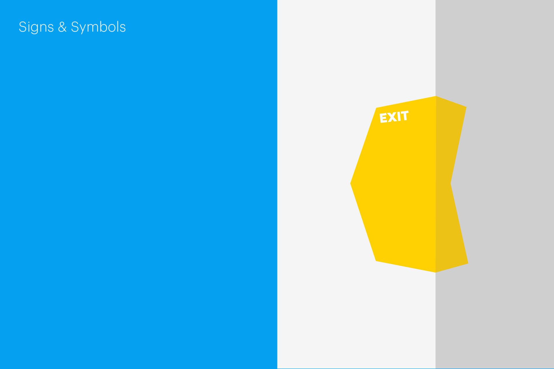
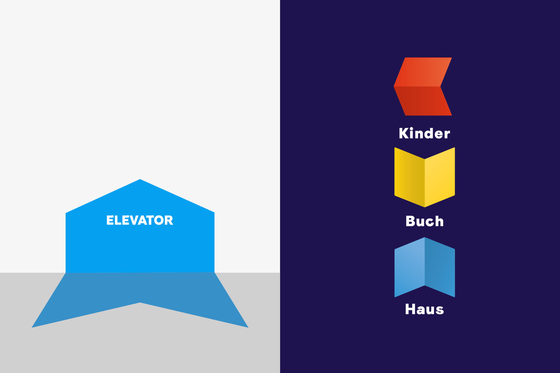
Simple, playful, visually strong and colourful were parts of the brief. An open bookserved as the beginning of our visual journey. Only by rotating this form, it changes into the letter K (for the German word for children: Kinder) and into a rooftop, symbolizing the house. Put together, a simple and easy to decipher logo is formed in the crayon colours red, yellow and blue. The hanseatic darkblue subline spelling the actual nameout »Kinderbuchhaus« is added, using the font Faro Lucky by Luzi Type. The new corporate design was applied to the business stationary, the flyers and posters as well as the celebration publication for the anniversary.
Agentur
Paperlux


Weblog
Mit einer cleveren SEO die Sichtbarkeit im Netz erhöhen
Einbruchschutz für Eigenheime: Die Grundlagen im Überblick
Moderne Heizsysteme: Welche Heizungsanlagen versprechen die größte Energieersparnis?
Die Top 5 Vorteile einer Social Media Werbeagentur buchen
Die Qual der Wahl – Erfolg im Internet – die Auswahl der Webagentur
Entdecke die neuesten Trends in Damenmode: Stilvoll und zeitlos
Festplatte abgestürzt – das sind die 3 häufigsten Gründe!
Webdesign – was müssen Unternehmen beachten?
Welche Werbe- und Designtrends sind für 2024 zu erwarten?
Limitierte Editionen: Das Phänomen von exklusiven Sneaker-Veröffentlichungen
Die Vorteile eines eigenen Website-Servers: Das sind sie
Das richtige Produkt im Netz finden: Die Welt der SEO-Agenturen
Den Ort finden, an dem Kreativität am besten entsteht
Deutsches Design beim Bauen – das sind die wichtigsten Merkmale
Gestaltung des Glücks: Wie visuelles Design die Wahrnehmung von Gewinnchancen beeinflusst
Wie Design unser Leben beeinflusst
Nachhaltige Etiketten drucken: Worauf muss man achten?