
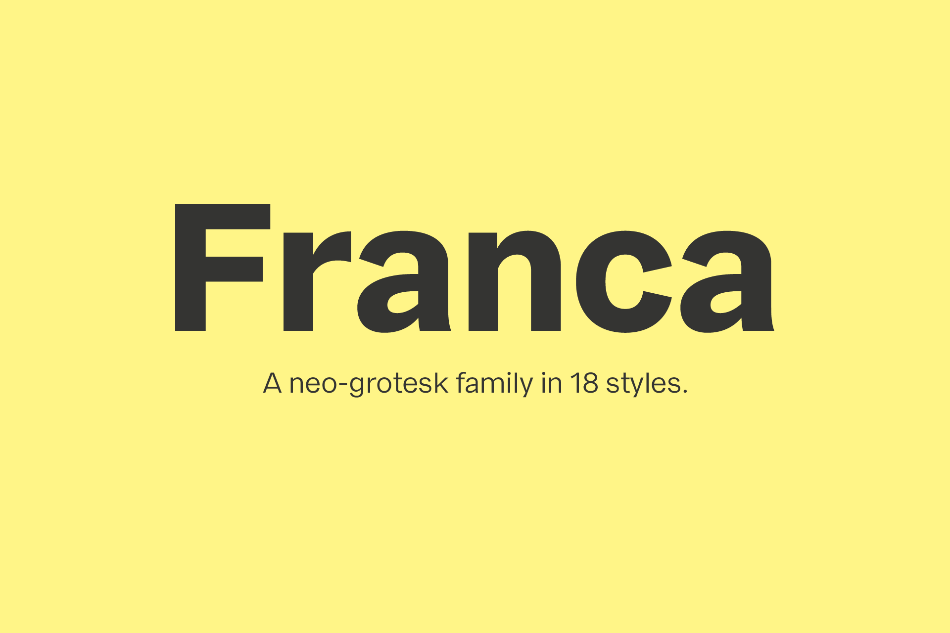
Franca
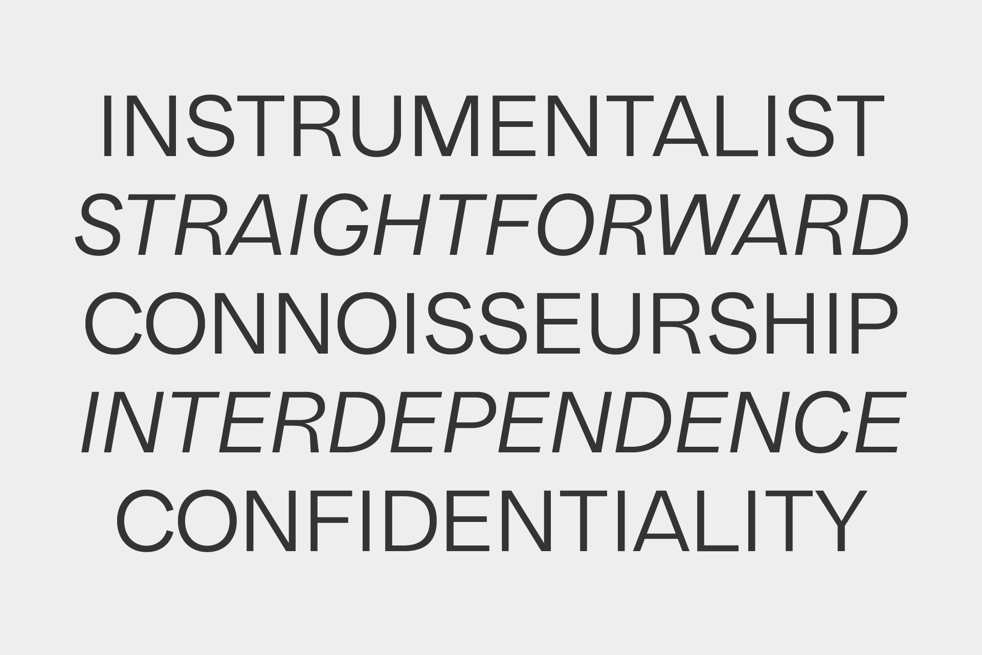
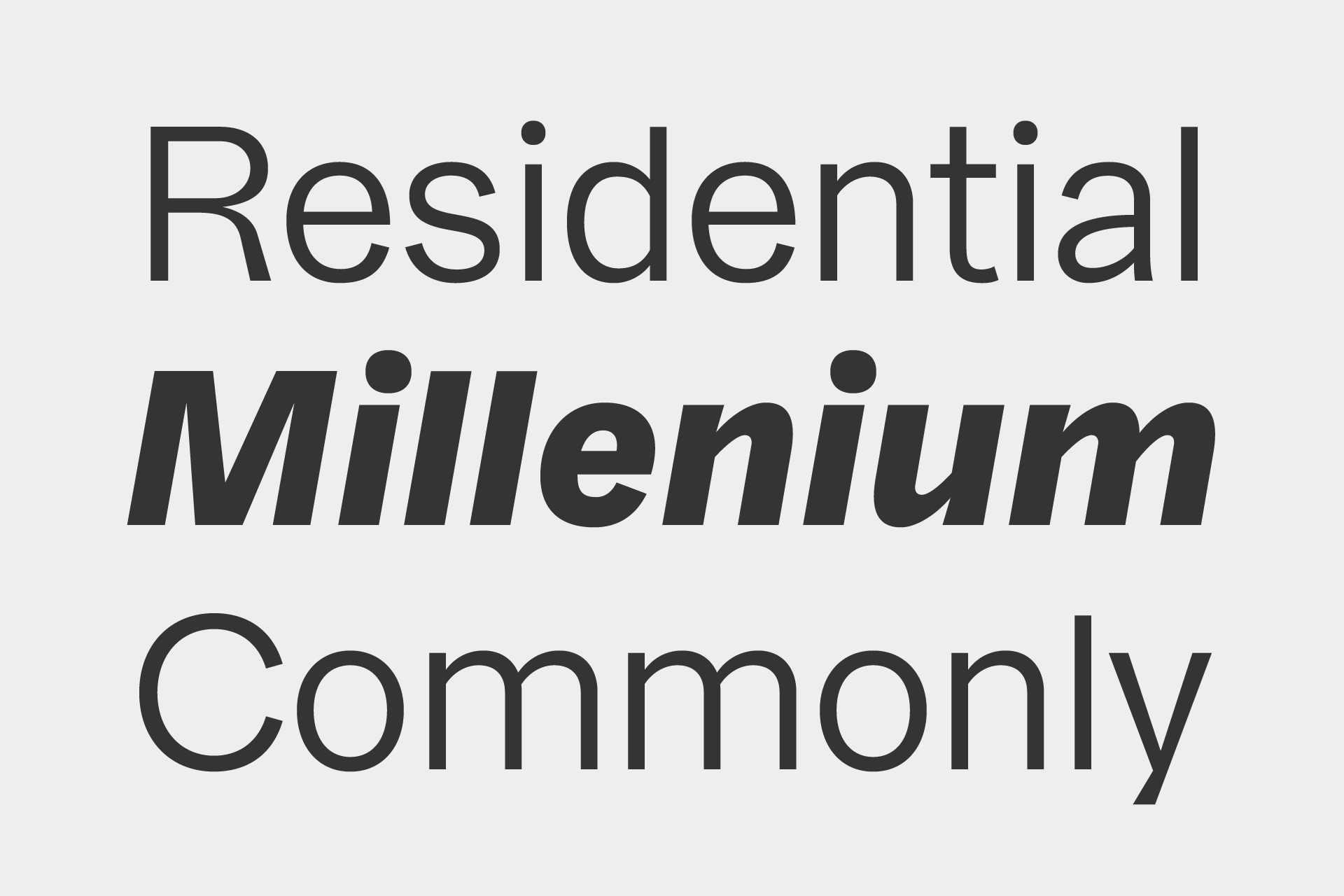
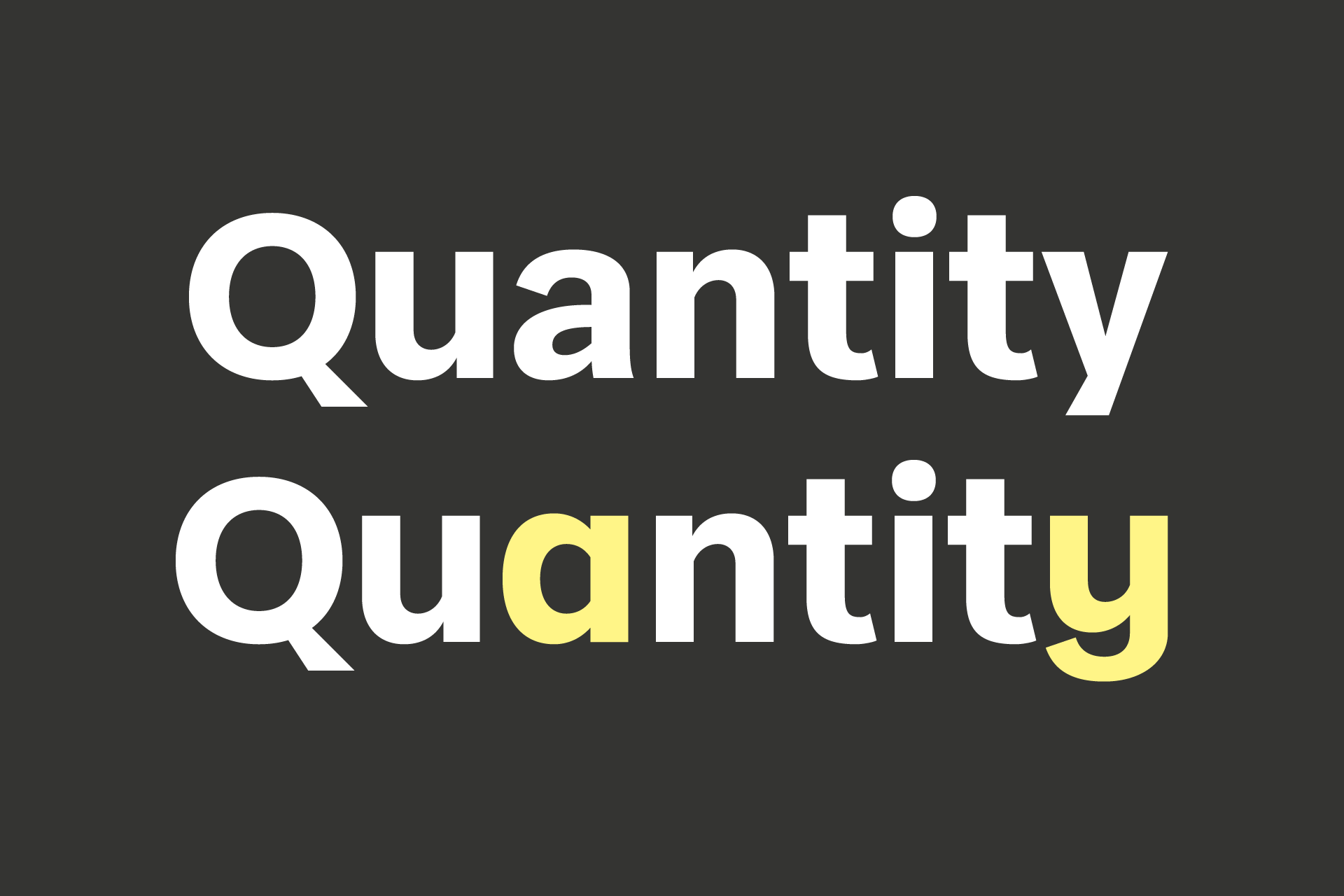
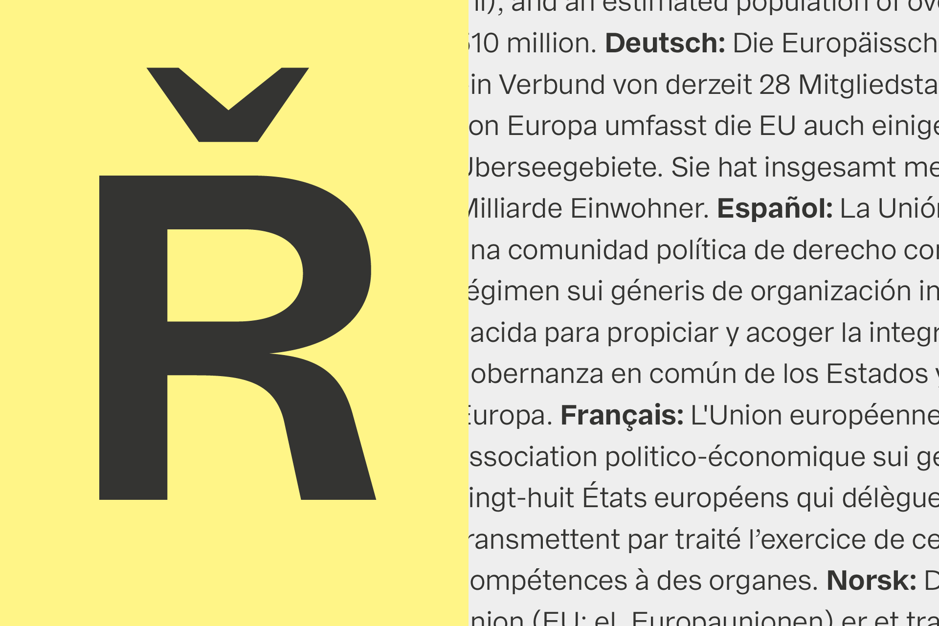
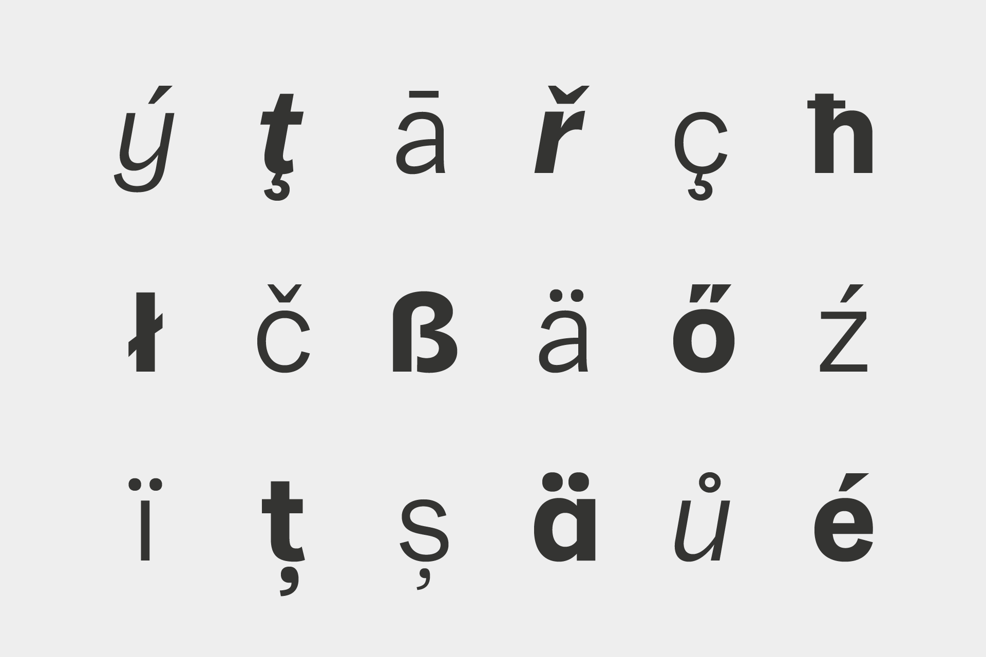
Franca is a neo-grotesk family in nine weights plus matching italics. The inspiration for the design came trough the constant interest in new interpretations of the classic grotesk model and a study of „neutral“ typefaces like Helvetica, Univers or Normal Grotesk. During the studies, additional attention was given to the American representatives of the genre, resulting in the initial impetus for a reinterpretation, combining both paths into one contemporary design. This is reflected in the name, blending together the names of the most popular typefaces of each genres, (Fran)klin and Helveti(ca).
Due to its large x-height and plain design, the family is perfectly suited for all kinds of text. Its mid-weights are optimized for usage in long paragraphs, while the bolder weights, due to a short descender and ascender, create a compact and confident look in headlines or short copy.
Preis
38,25 Euro
Designer
René Bieder


Weblog
Darum sollte eine Firma Giveaways nutzen:
Rolex Uhren: Darum sind sie nach wie vor angesagt
Was tut sich im Online-Marketing 2024?
Mit einer cleveren SEO die Sichtbarkeit im Netz erhöhen
Einbruchschutz für Eigenheime: Die Grundlagen im Überblick
Moderne Heizsysteme: Welche Heizungsanlagen versprechen die größte Energieersparnis?
Die Top 5 Vorteile einer Social Media Werbeagentur buchen
Die Qual der Wahl – Erfolg im Internet – die Auswahl der Webagentur
Werbebotschaften – der Motor für den Verkauf
Welche Werbe- und Designtrends sind für 2024 zu erwarten?
To-go-Verpackungen mit Persönlichkeit
Die Vorteile eines eigenen Website-Servers: Das sind sie
Das richtige Produkt im Netz finden: Die Welt der SEO-Agenturen
Deutsches Design beim Bauen – das sind die wichtigsten Merkmale
Designmöglichkeiten in Windows: So personalisierst du deinen Desktop
Backlinks – großer Nutzen für Unternehmen unterschiedlichster Branchen
Die Macht der Farben: Farbpsychologie im Webdesign