The Center for Philosophical Technologies – Branding, Web Design
The CPT is a strategic initiative of Arizona State University and brings together philosophers, designers, artists, scientists and critical and creative practitioners to interrogate, critique, and reconceive the relation between philosophical inquiry and technological development in the 21st century and beyond.
The CPT thinks about technologies broadly, from advancements in AI, biotechnology, and planetary infrastructure design to technologies for storytelling, ecological communication, and community building, in order to envision technical practices that are critically engaged, ecologically embedded, and speculatively framed.
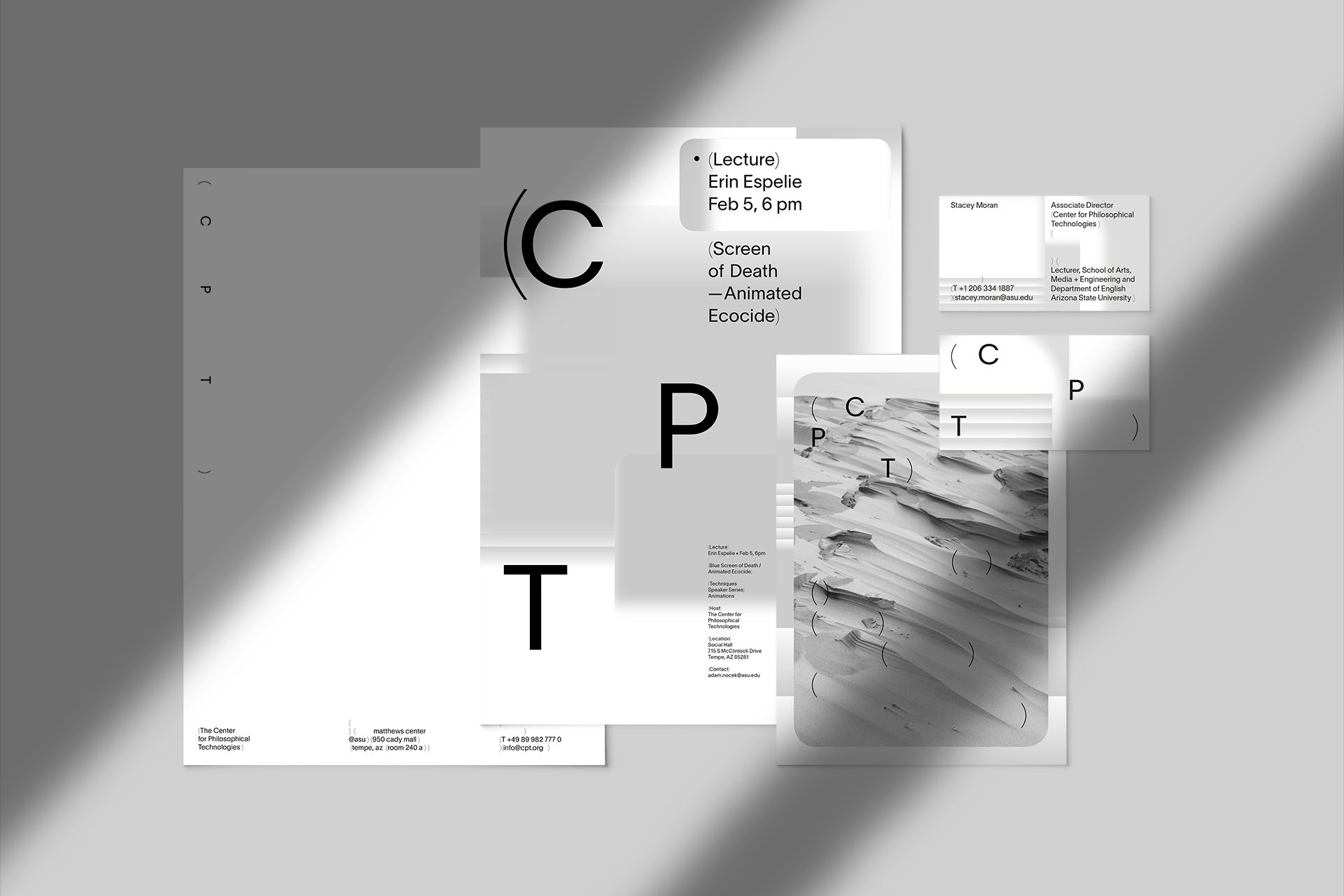
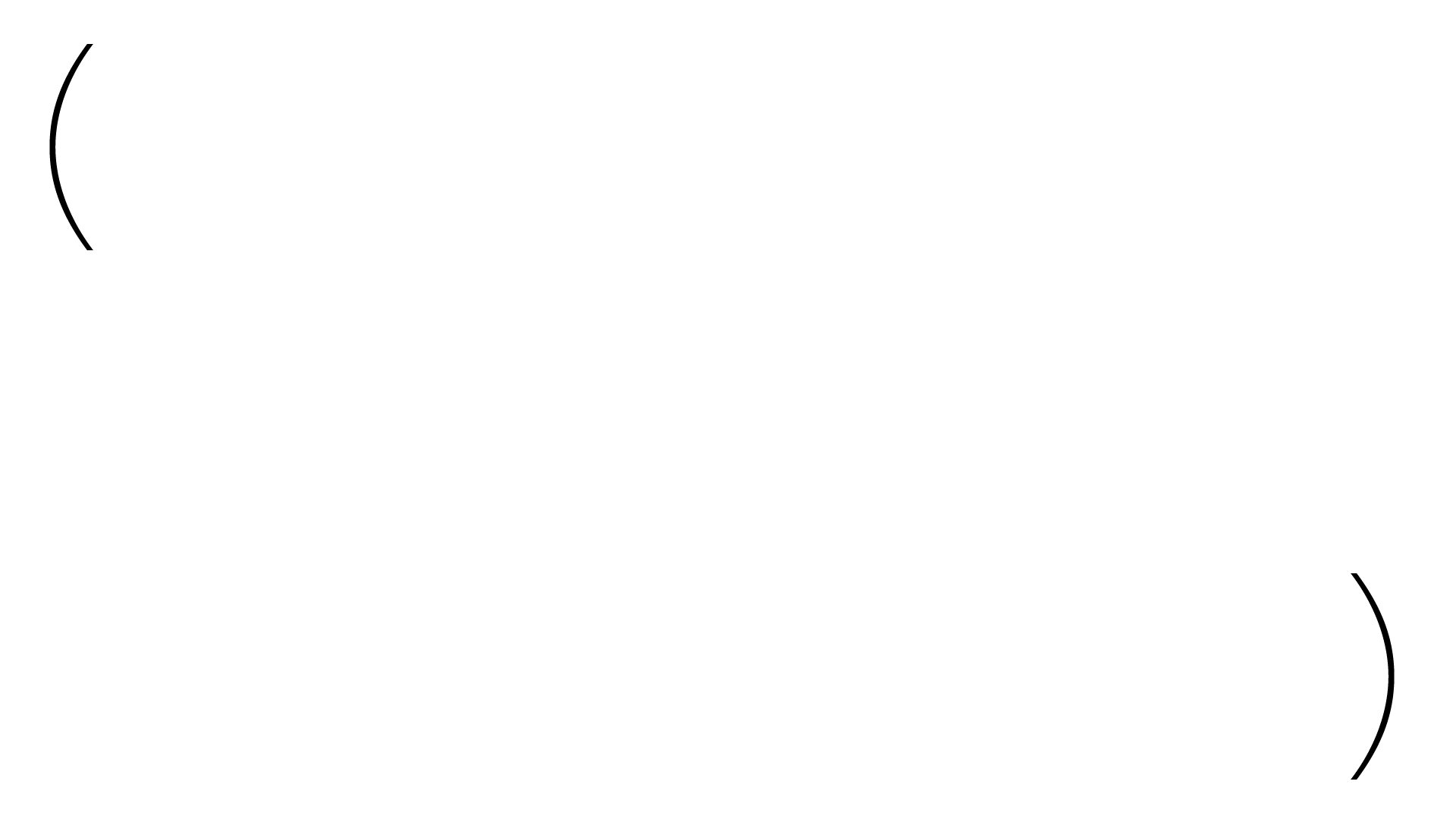
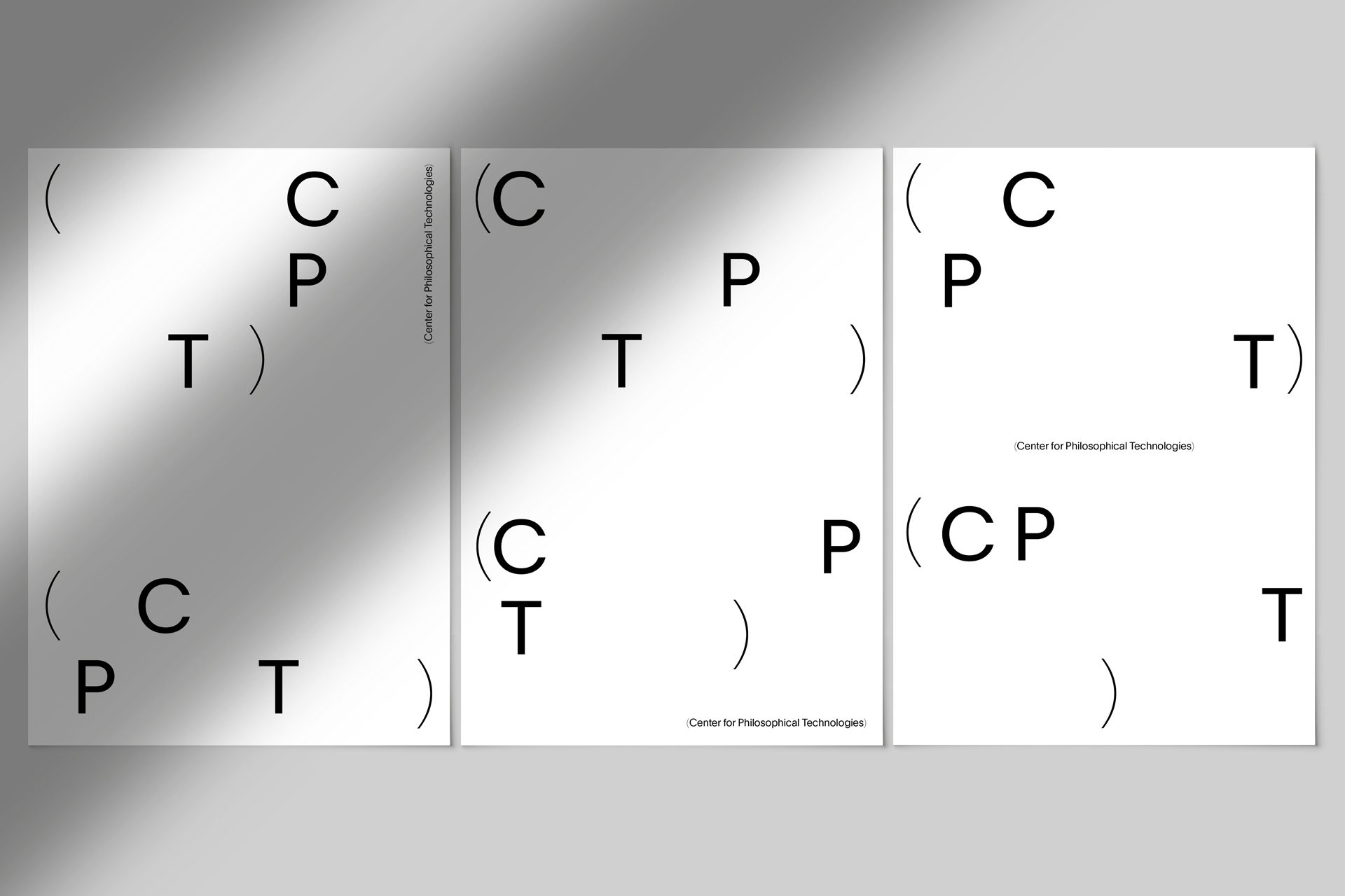
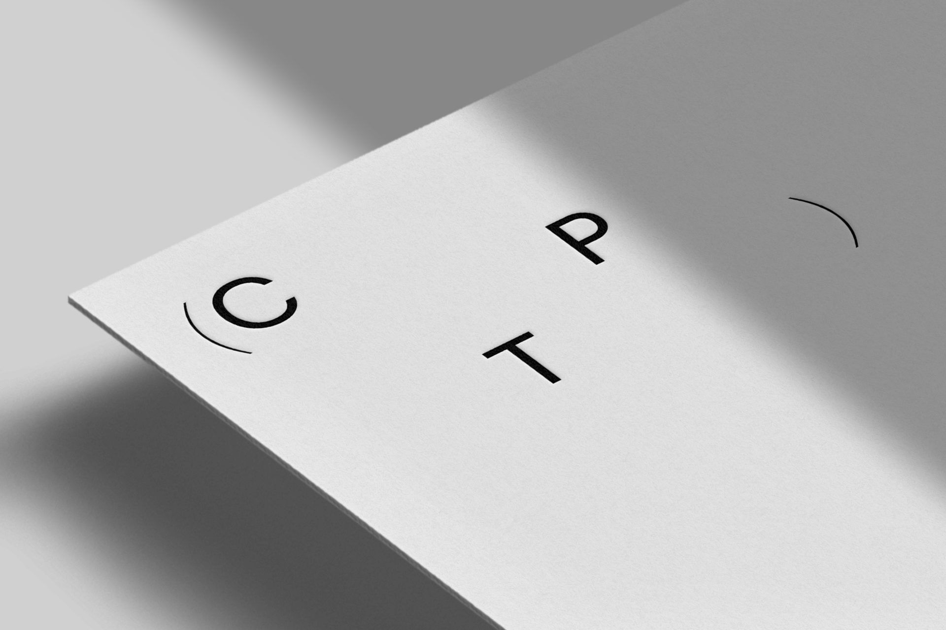
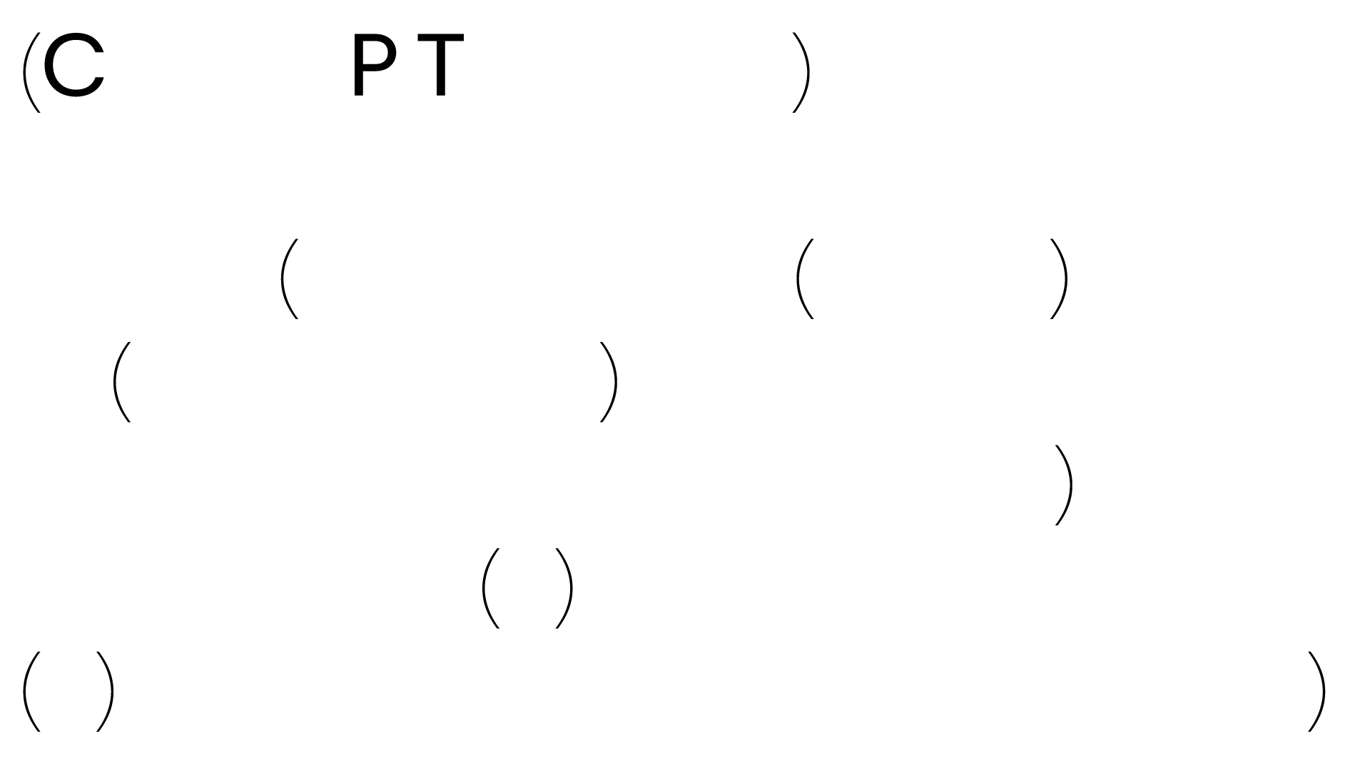
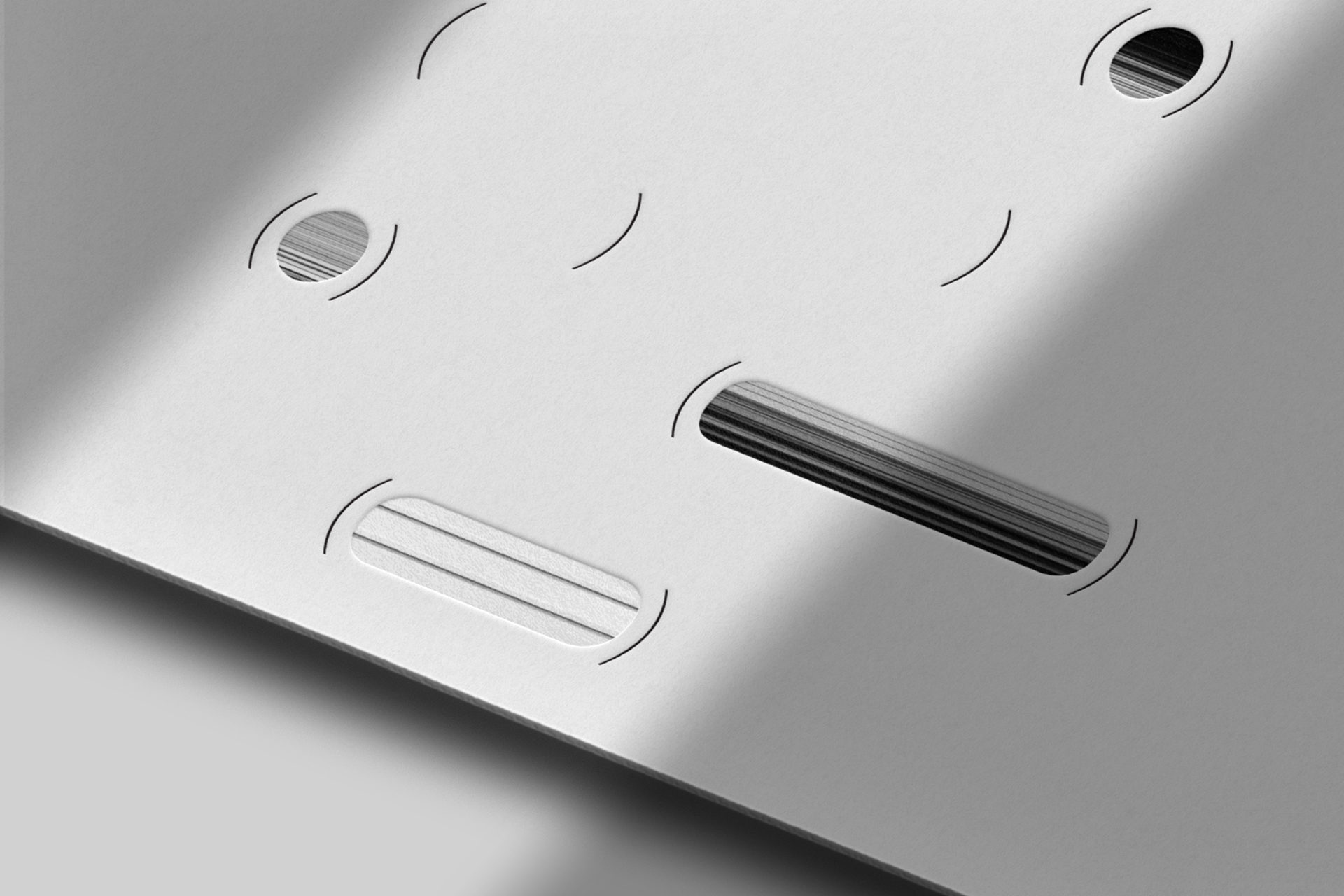
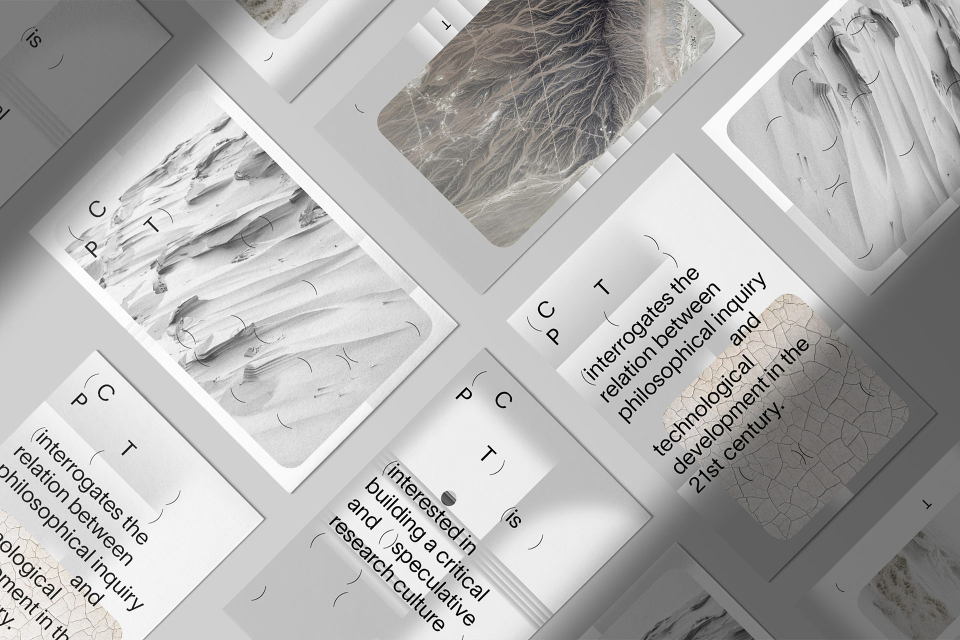
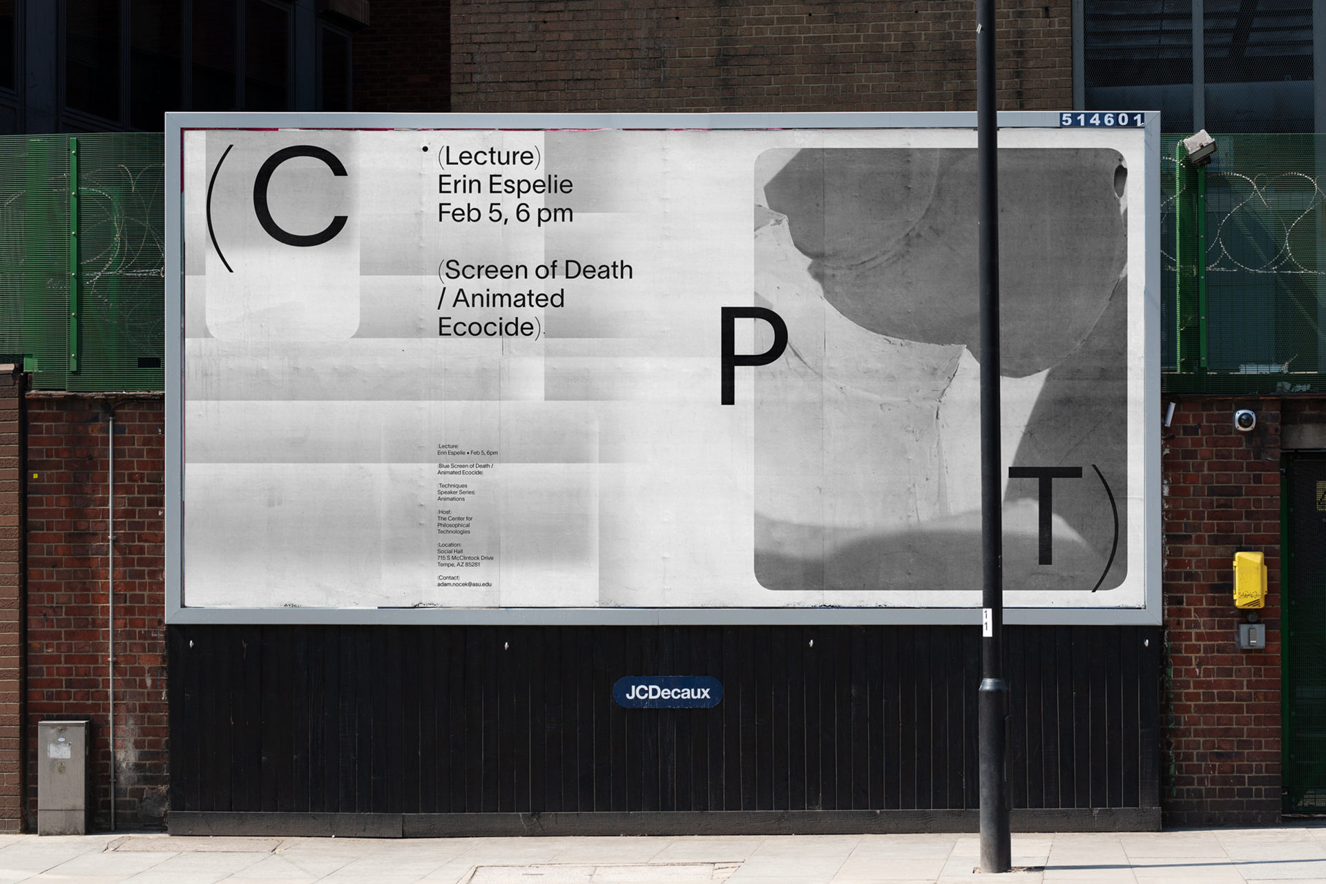
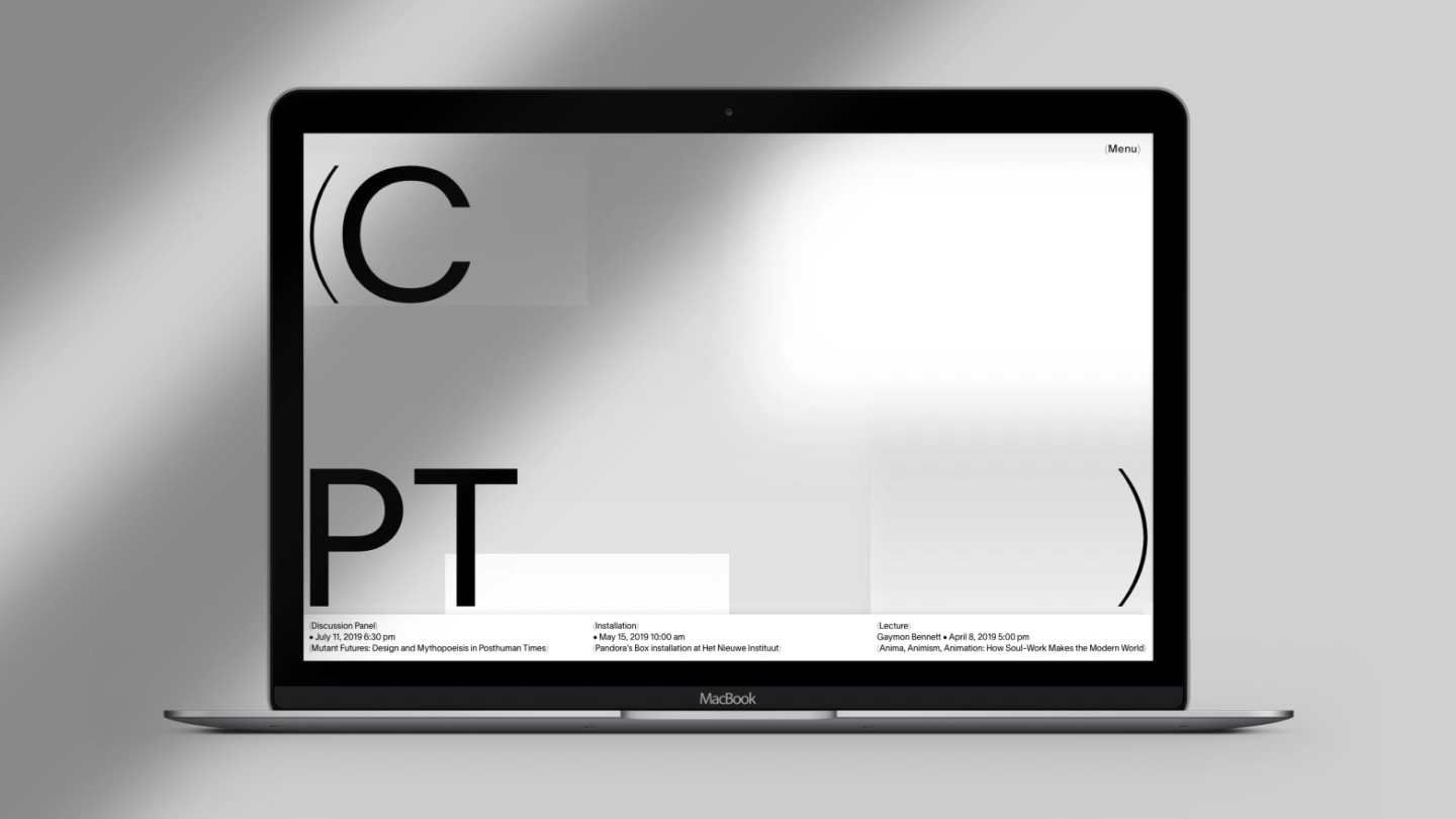
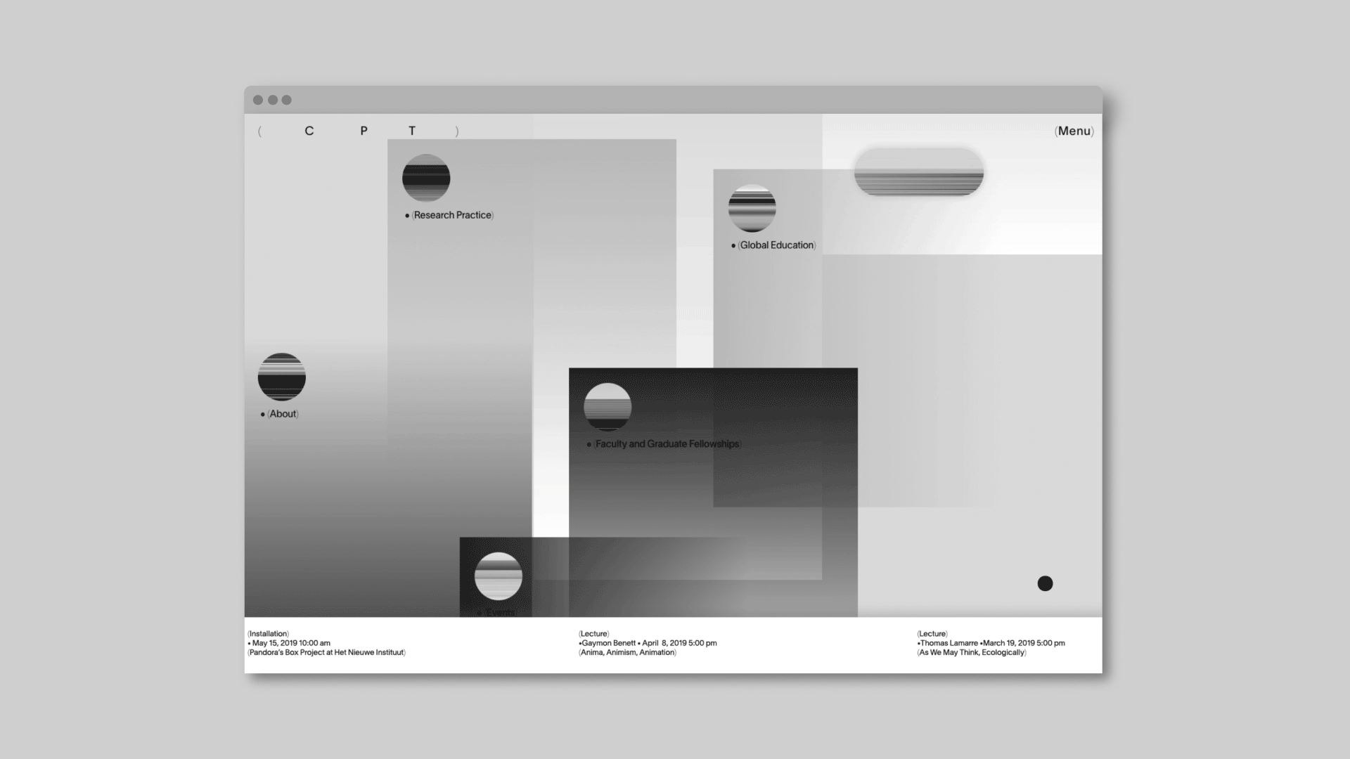
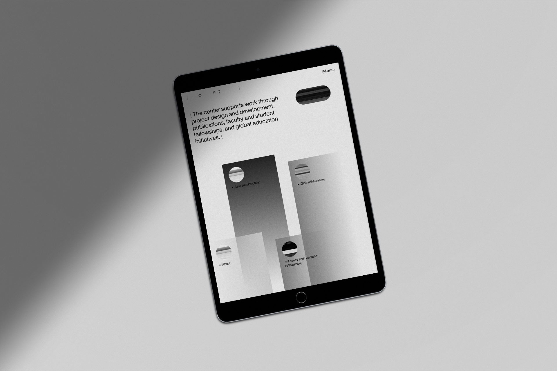
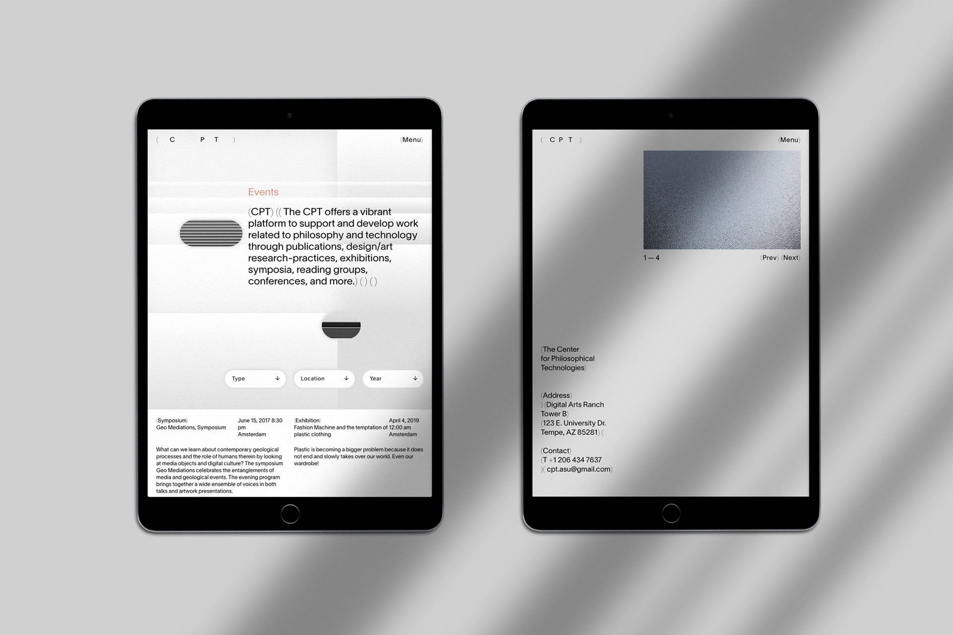
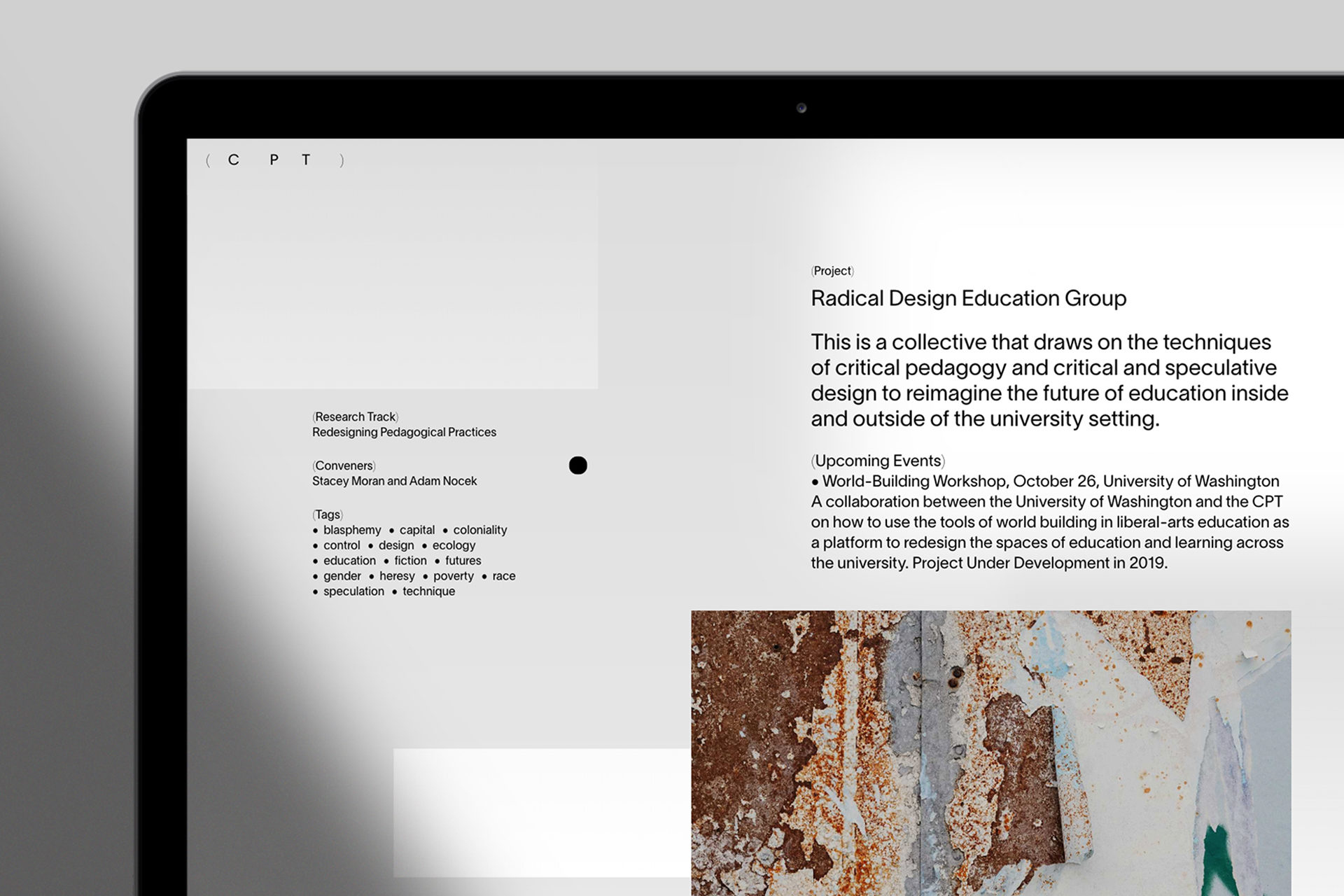
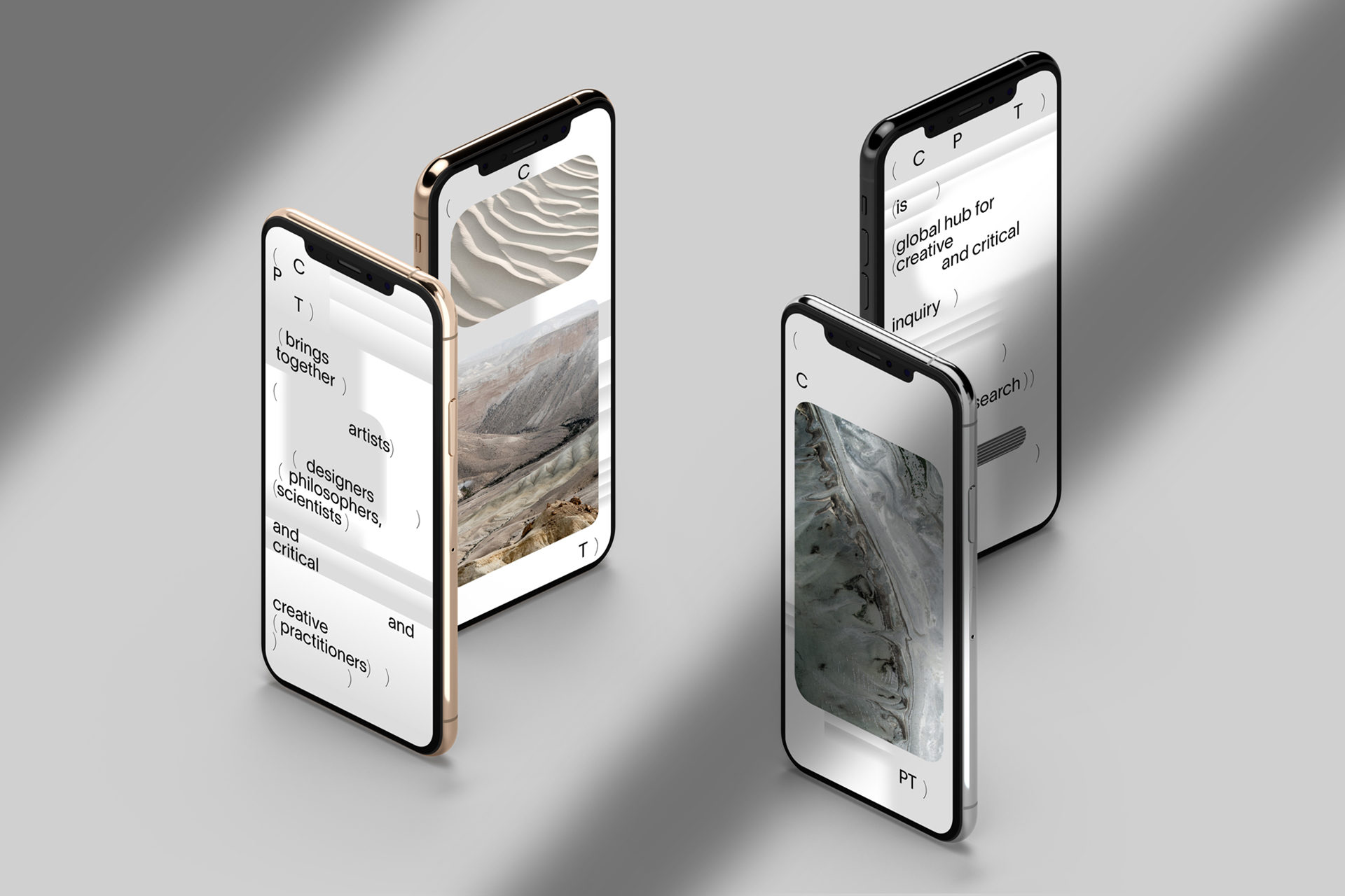
Logo: Reflecting the center’s dynamic DIY approach, the logo builds on the acronym (CPT) whereby letters can be arranged freely within the system and are framed by parentheses. Our research into language and expression of ideas through typography led the conceptual rediscovery of parentheses: They allow writers the freedom to provide additional and clarifying information, inserting relevant thought, always providing context and content.
This variable branding system can be used both statically and animated, adapting to various formats and spacial contexts, but moreover it can easily be typed out and used together with research texts, or claims, creating connected streams of thought.
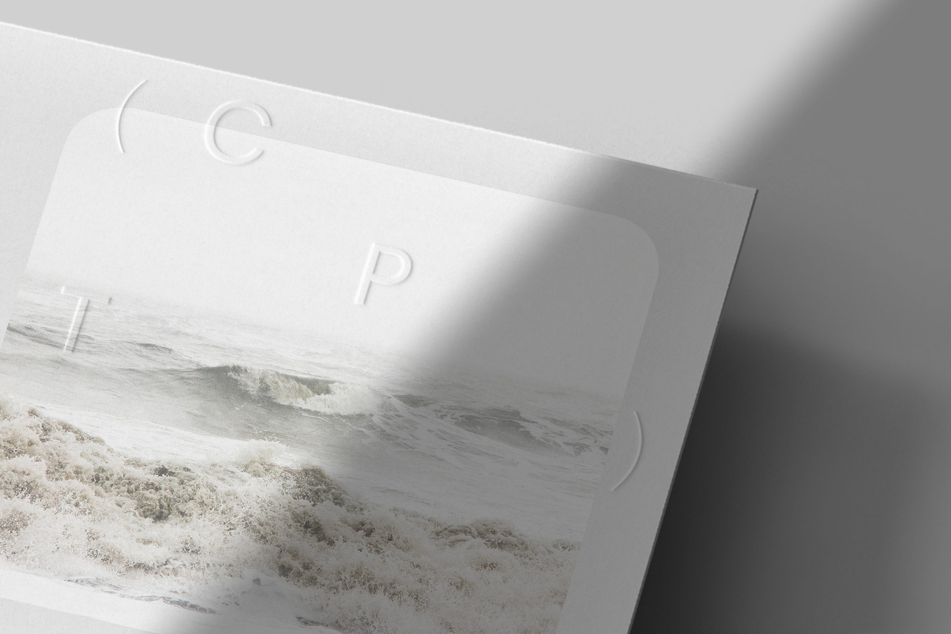
Identity: The website backgrounds build an analogy to Arizona’s desert landscape, embodying a view to the far horizon. We used blur, to emphasize the intersection of disciplines at CPT and the vast information clouds those disciplines are made of. The floating forms show an abstracted version of the constantly moving (philosophical) thinking process.
The resulting compositions of the logo, loose type and bubbles create a brand identity, that should invite free associations in the poetic vastness of philosophy and gestalt.
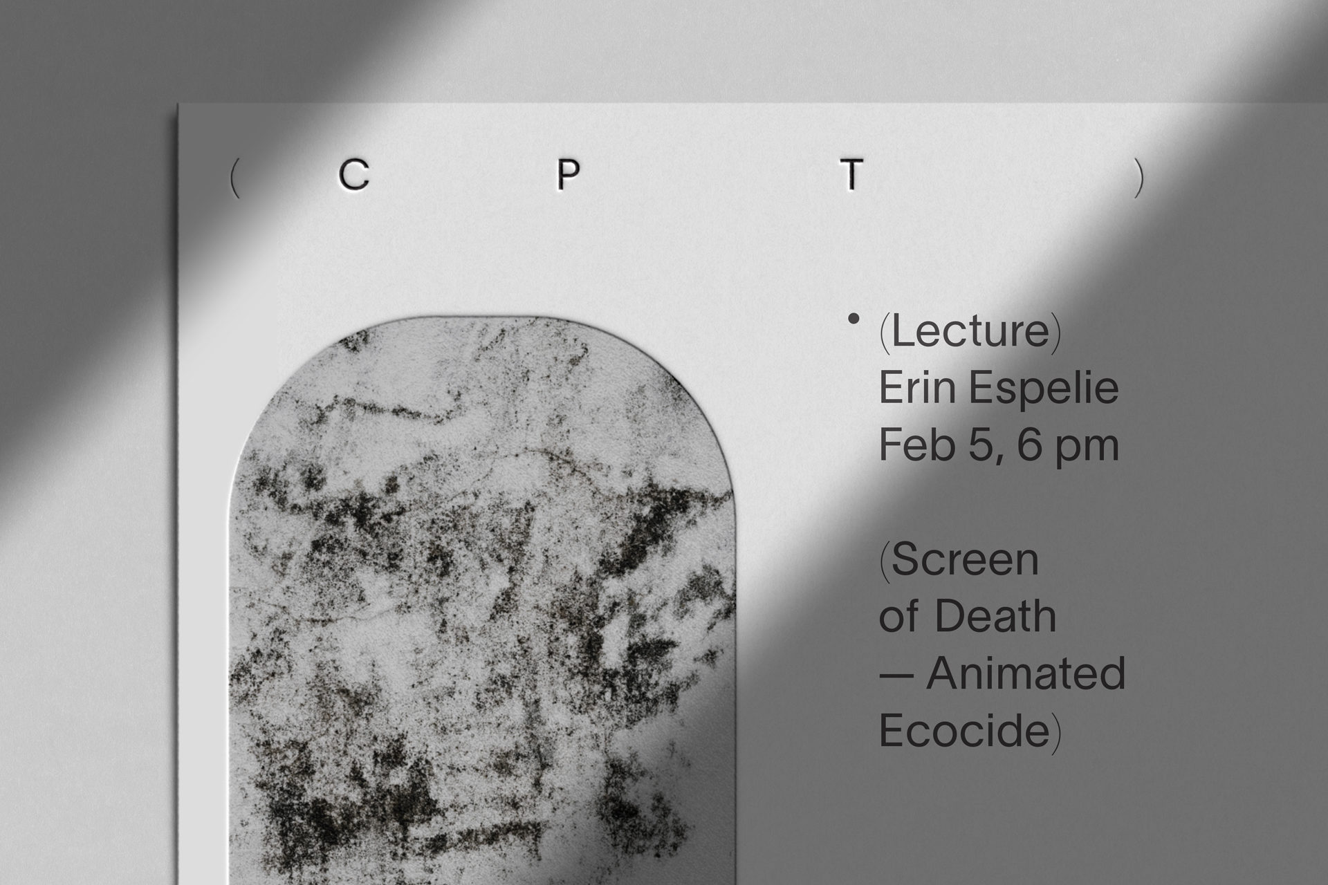
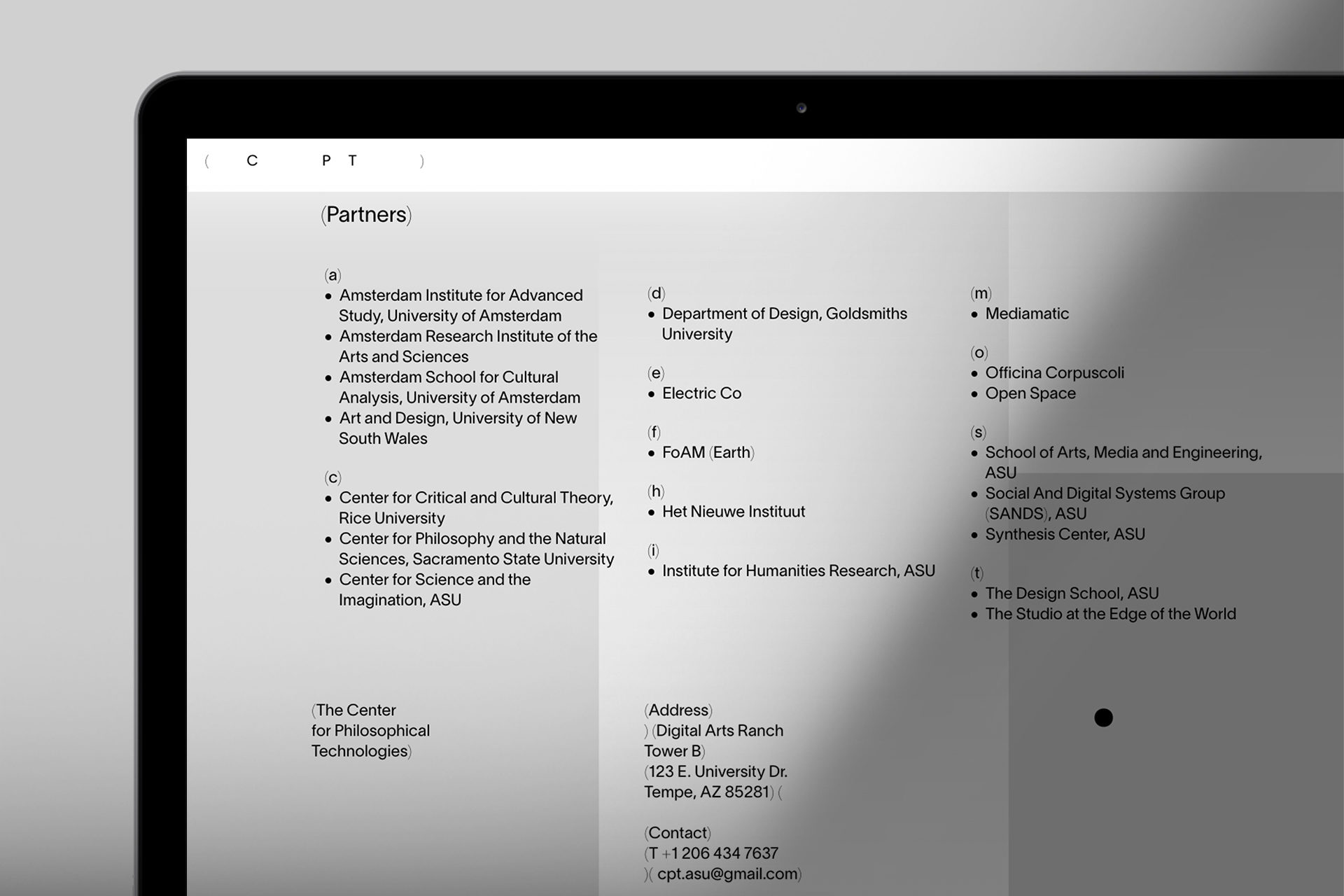
Website: The developed digital experience works with soft animations, blended layers and gradients. Working with abstract images that almost blend in with the background allows readers to think about new associations between the text, background and images. At the same time, we tried to make the vast amounts of texts as accessible as possible, without losing too much of the website’s usability.
Agentur
Moby Digg


Weblog
Die Qual der Wahl – Erfolg im Internet – die Auswahl der Webagentur
Entdecke die neuesten Trends in Damenmode: Stilvoll und zeitlos
E-Mail-Outreach betreiben: Die besten Tipps, um effektiv Entscheider zu erreichen
Festplatte abgestürzt – das sind die 3 häufigsten Gründe!
Webdesign – was müssen Unternehmen beachten?
Veröffentlichung der eigenen Arbeit
Das richtige Produkt im Netz finden: Die Welt der SEO-Agenturen
Windows für Mac-Liebhaber: Die besten Tipps im Umgang
Deutsches Design beim Bauen – das sind die wichtigsten Merkmale
Vielfalt der Druckverfahren im Etikettendruck
Chaotisches Genie oder einfach schusselig? Fünf Tipps für den besseren Merker
Gestaltung des Glücks: Wie visuelles Design die Wahrnehmung von Gewinnchancen beeinflusst
Designmöglichkeiten in Windows: So personalisierst du deinen Desktop
Die besten Online-Tools zum Gestalten von Kalendern
5 Tipps für die Vermarktung von Wein
Nachhaltige vegane Etiketten drucken lassen – ist das möglich?