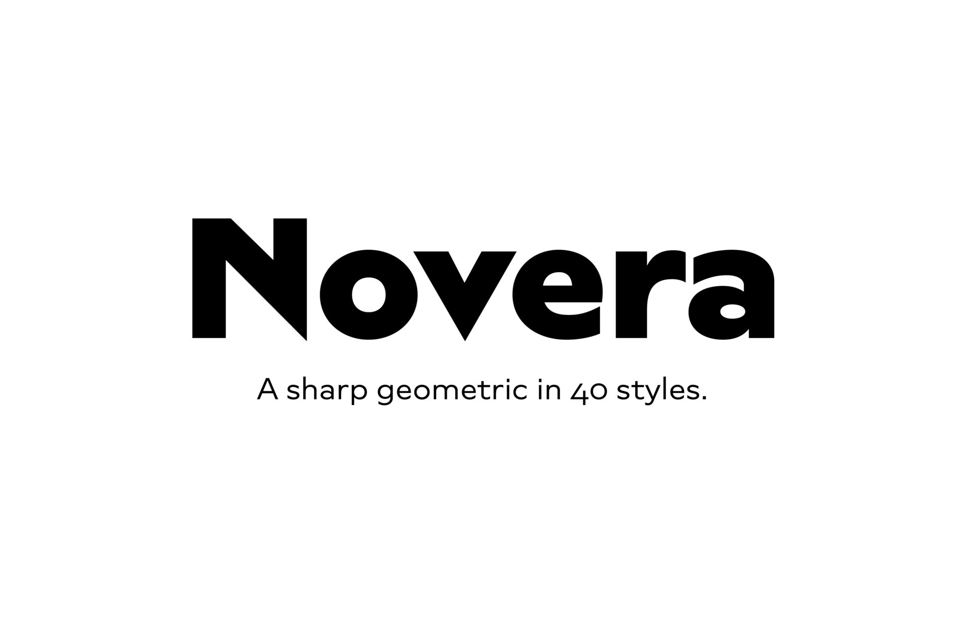
Novera
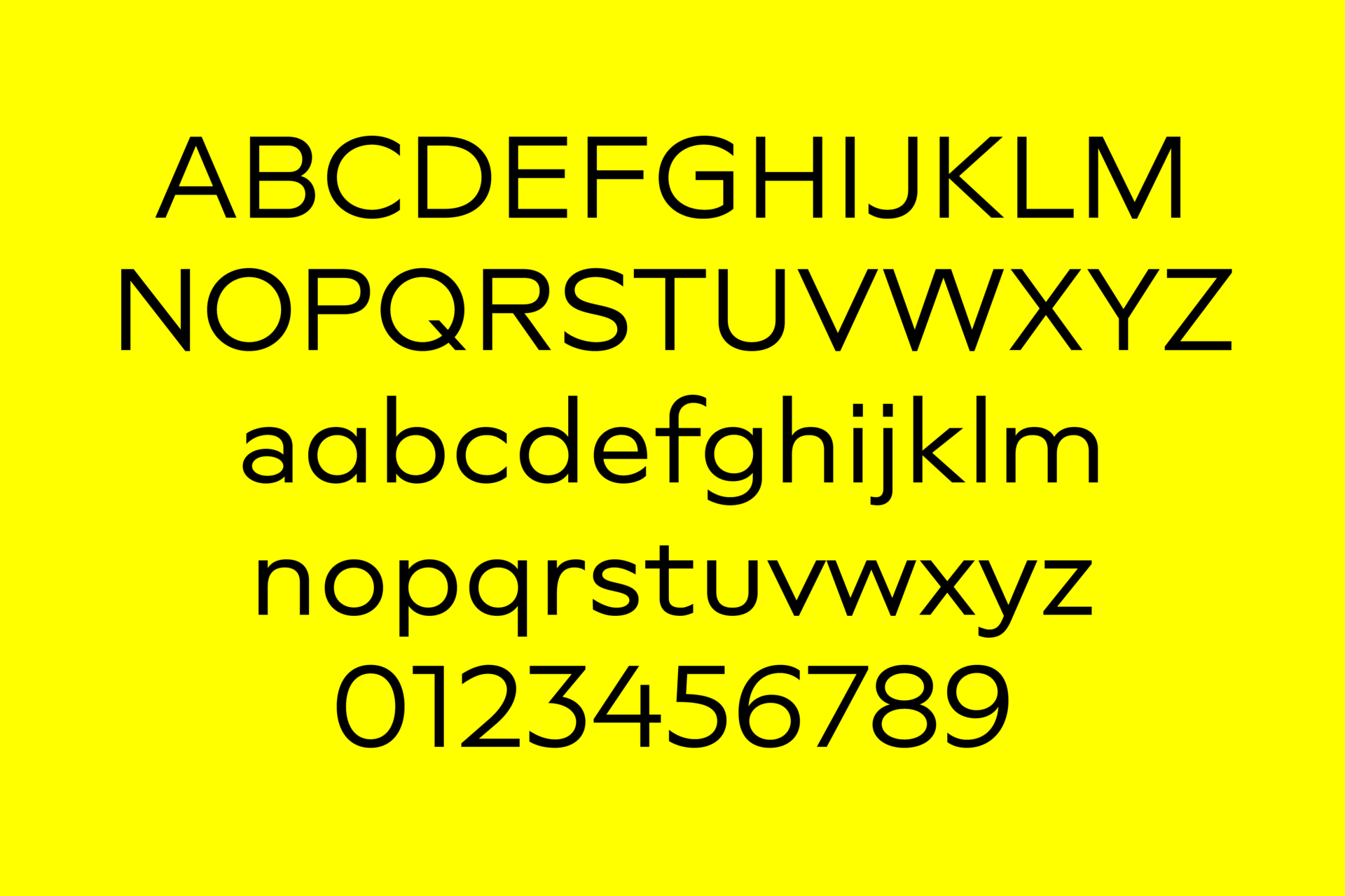
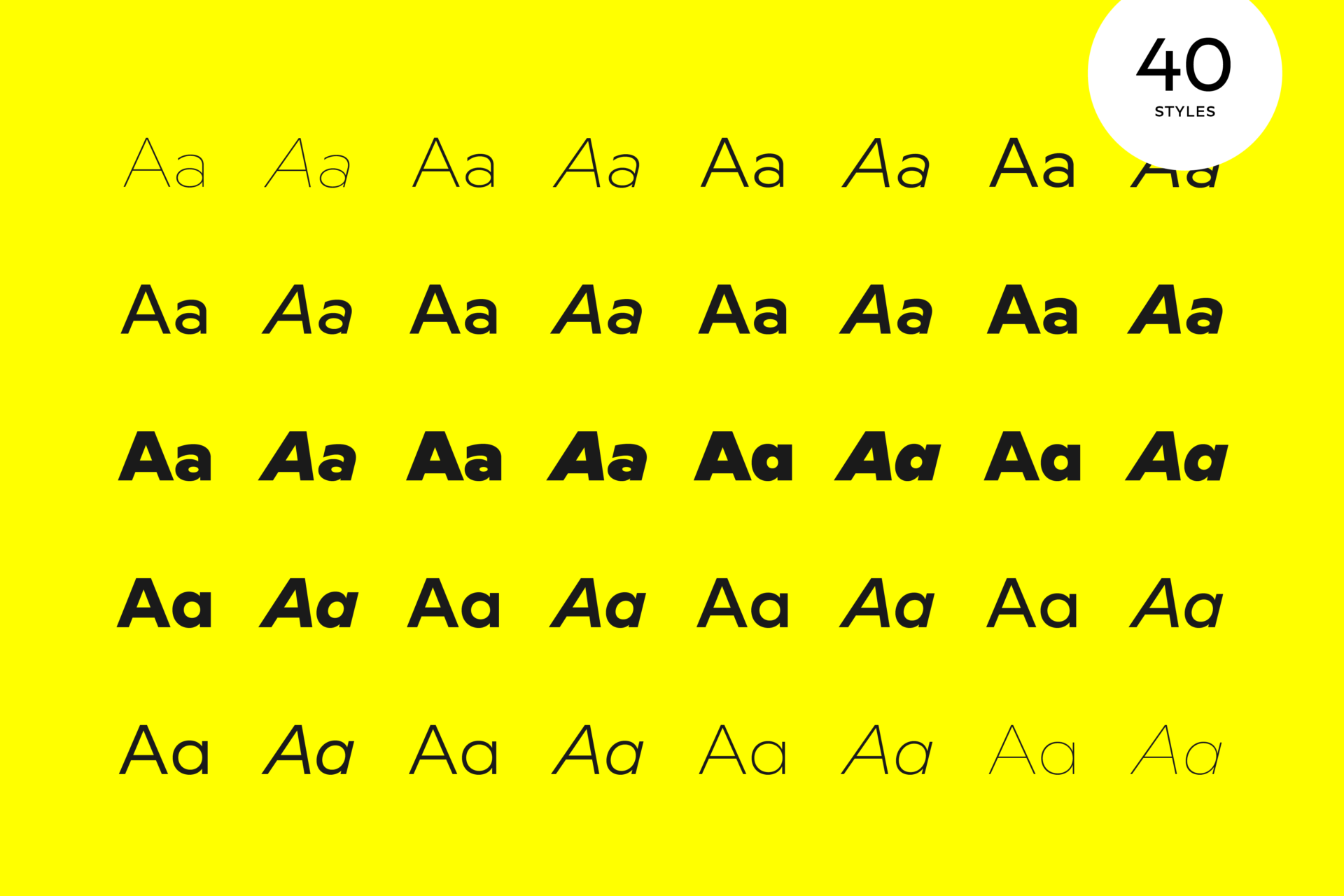
The Novera family is a sharp geometric sans in ten weights plus matching italics, available in two versions – Modern and Classic. It has a contemporary, approachable and multifunctional yet characteristic design, that comes with an extensive glyphs set of 1000+ glyphs per font, meeting all typographic demands.
The Design
Vertical terminals, circular shapes and angular apexes – Novera truely breathes geometry! But the concept goes beyond the application of rational geometry. The intension was to create a highly legible family suitable for every day usage inspired by the work of Paul Renner, Eric Gill or Jakob Erbar, combining the geometric with the human and the functional with the unconventional. Although Novera is inspired by the past, its appearance is unmistakingly modern.
Modern vs Classic
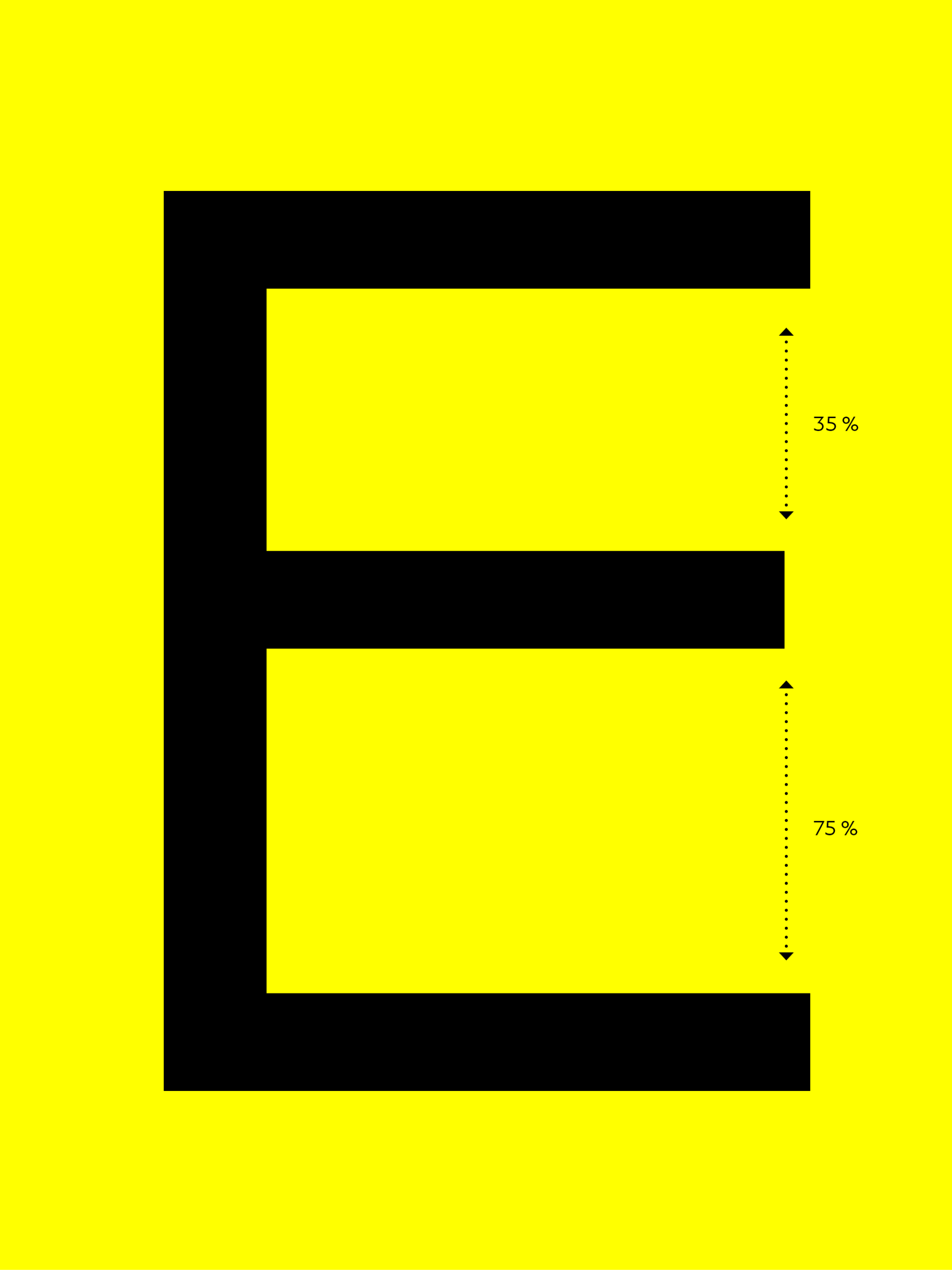
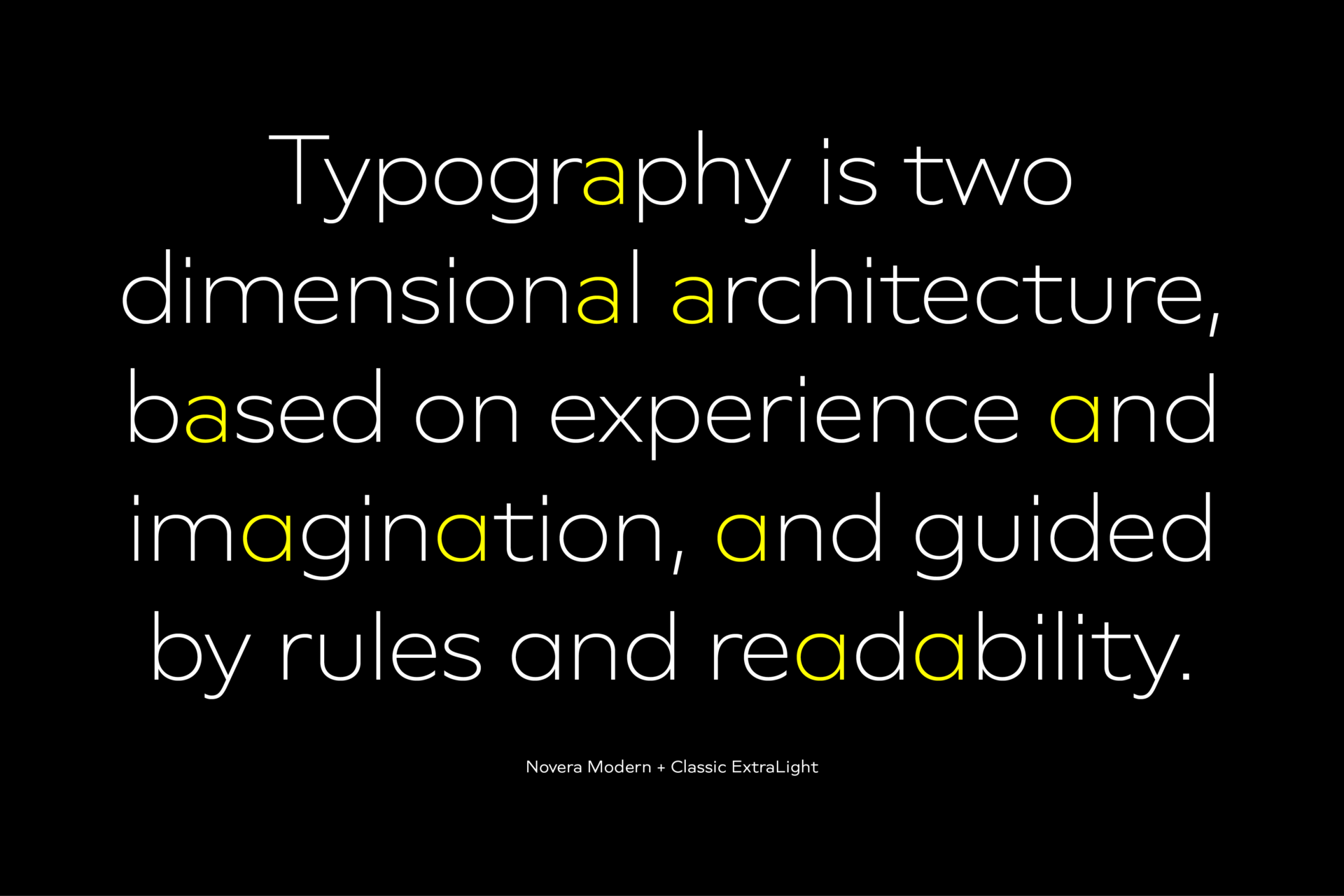
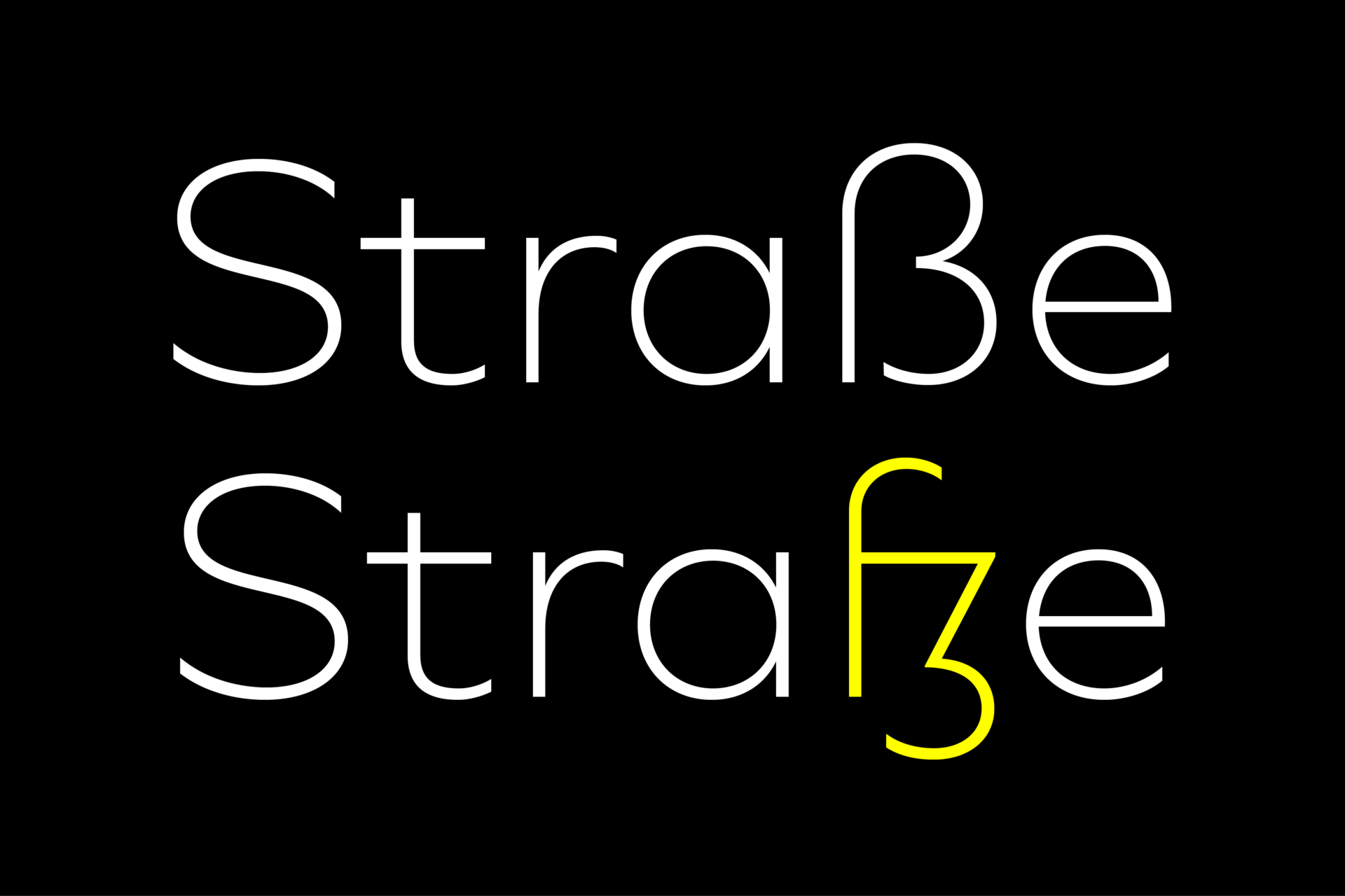
Novera is available in two versions – Modern and Classic – born from the same source file but with different characters set as default. This creates subtle but effective distinctions such as the double-storey a (Novera Modern) which is optimized for legibility in longer text paragraphs, as opposed to the single-storey a (Novera Classic) which allows a purely geometric appearance. Another distinguishing feature are the ascenders on Novera Mondern, which extend above the cap height for an elegant presence, compared to the ascenders on Novera Classic, ending at the cap height, for a compact and helvetica-flavored look. Novera Modern was intended for usage in body copy, whereas Novera Classic was planned for headlines, short paragraphs or logos, but both versions can be used vice versa too, of course.
Alternate Characters
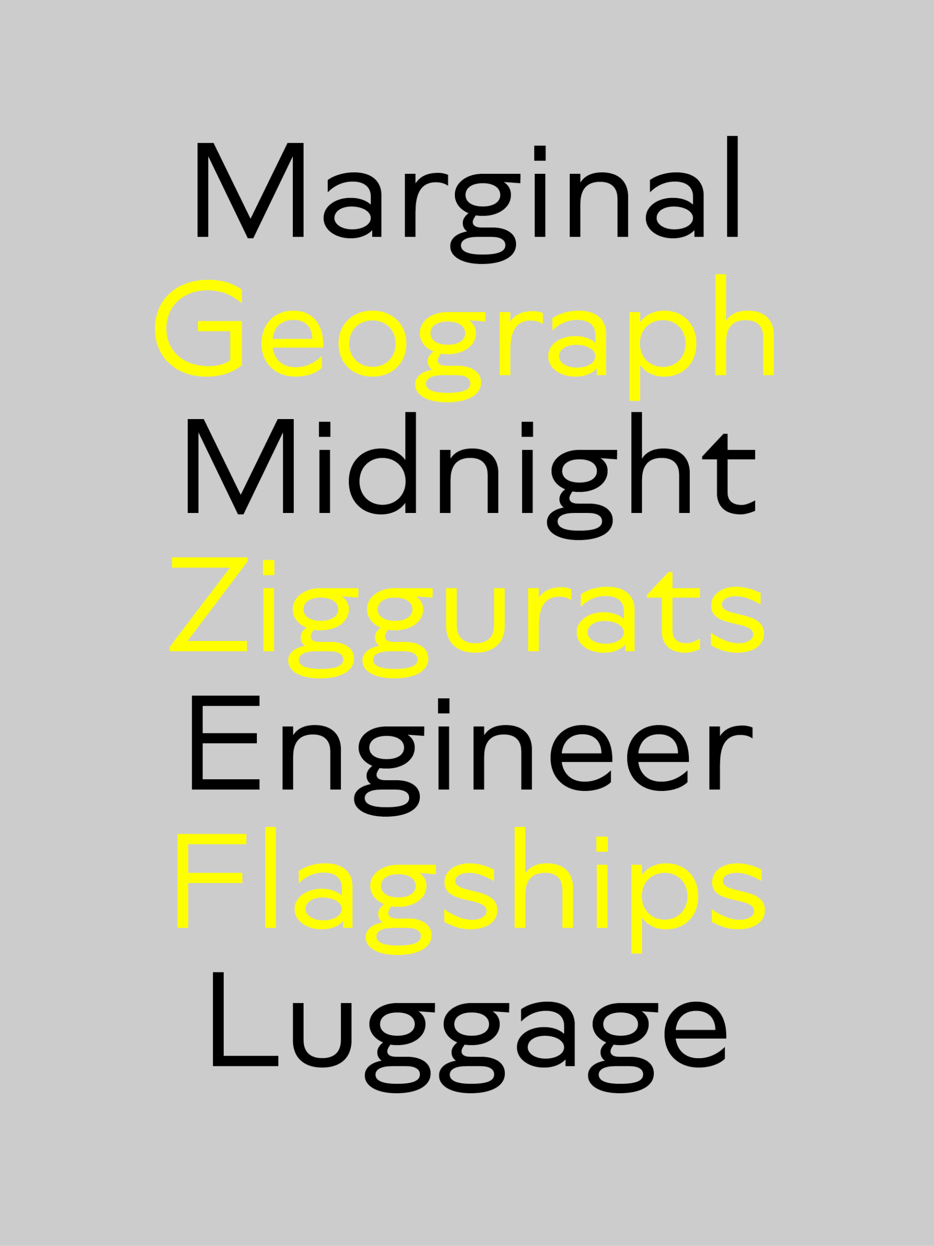
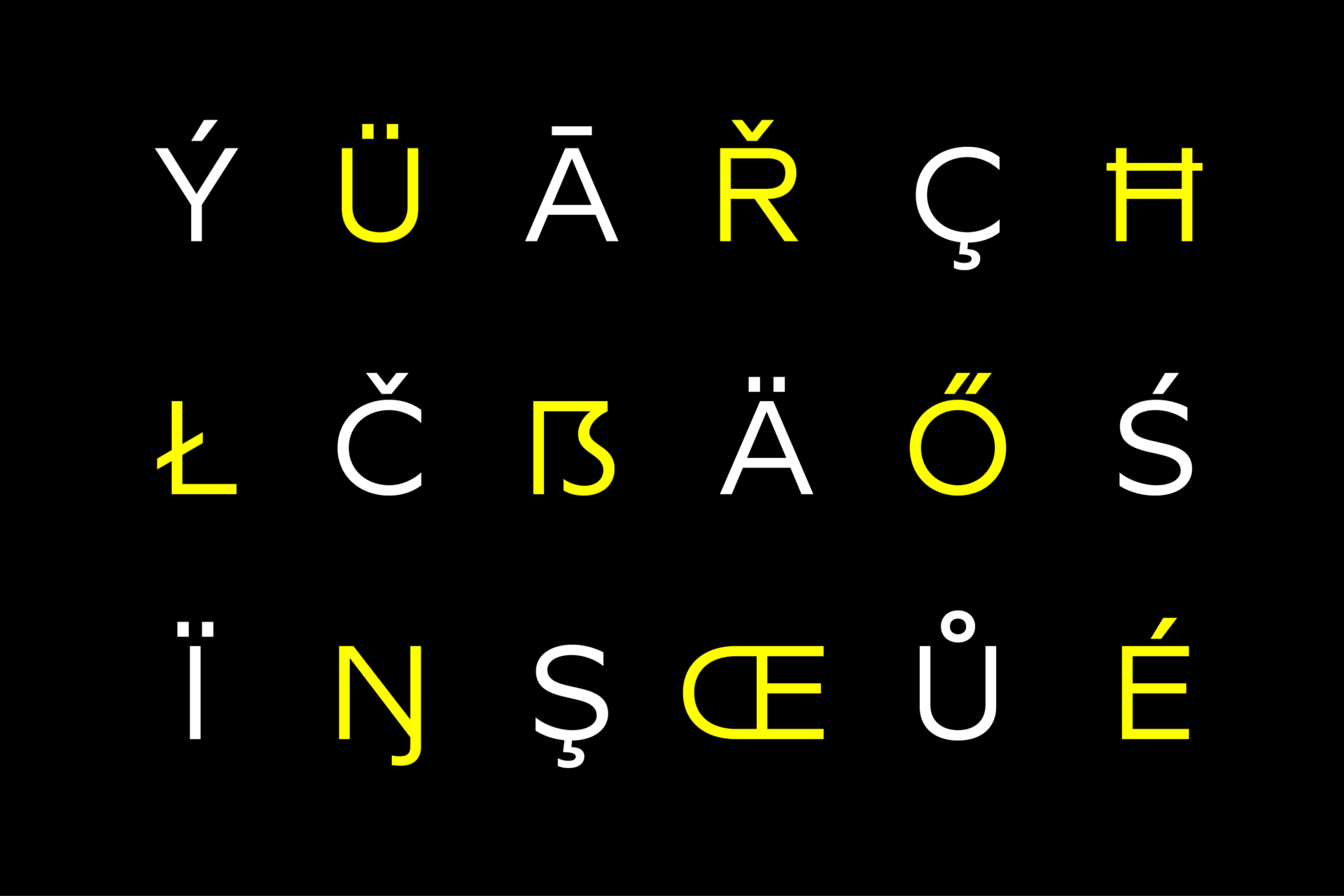
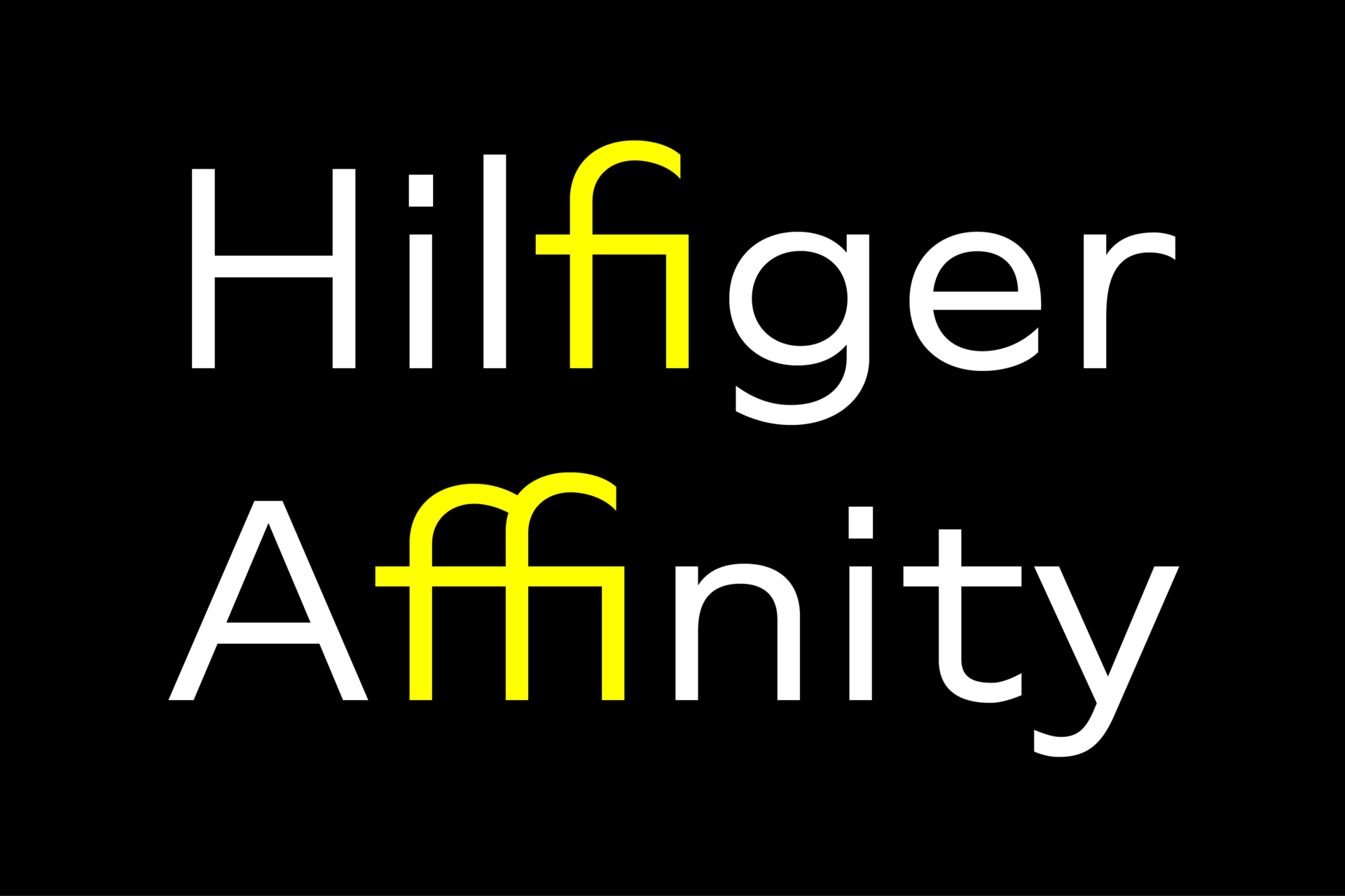
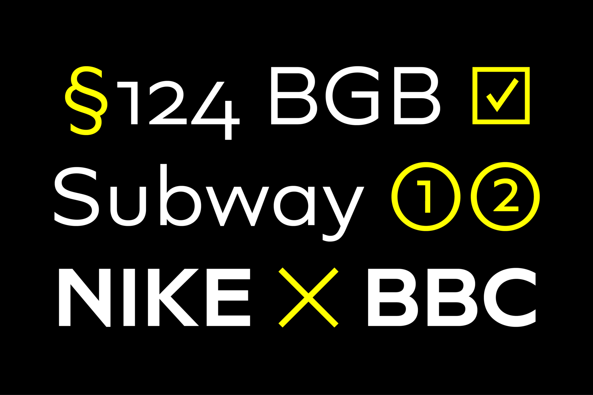
To maintain neutrality and a modern appearance, the standard character set largely dispenses with idiosyncratic forms. This is in contrast to the alternative forms with the gill-like lowercase letters g and t as well as a traditional shape of S and the German ligature t/z, which traces back to old German spellings. Also inspired by German poster designs from the early 20th century are the elongated i-dots and dieresis-dots that can create eye-catchers in headlines or logos. By the way, both versions, Novera Modern and Classic, can be created via stylistic set 1, 17 and 18.
Opentype Features and Symbols
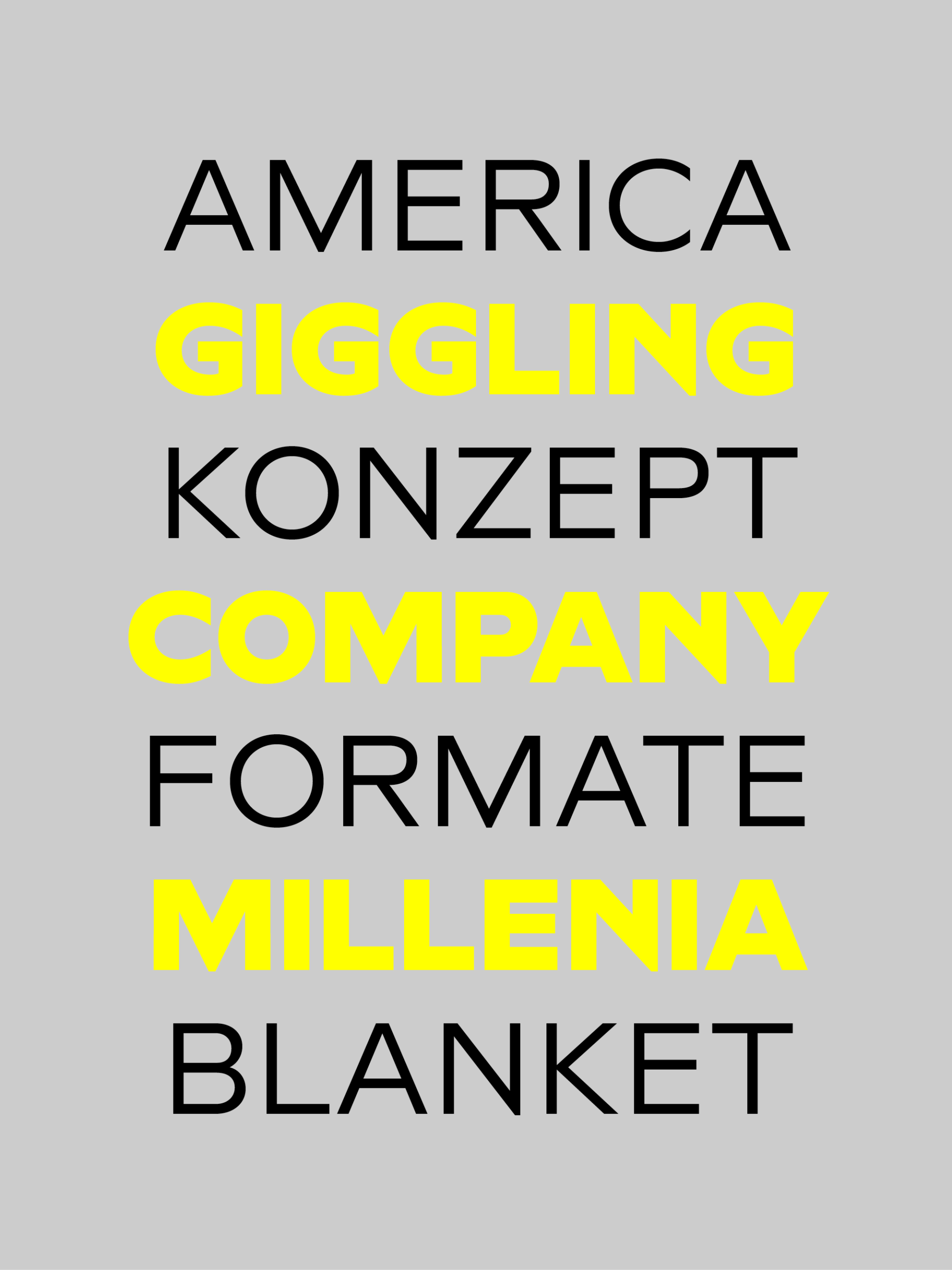
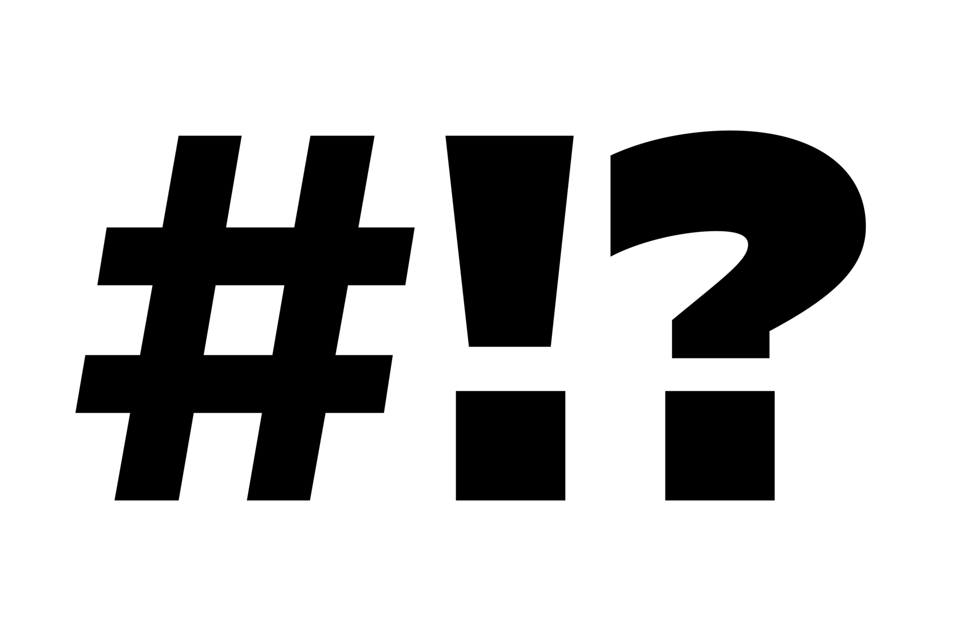
The family comes with many opentype features to support modern typesetting. This includes ligatures, different number sets or alternative shapes for texts set in all caps. If you like arrows and other shapes, you will love Novera! The family has a built-in extensive symbols-set including 48 different arrows and various geometric shapes or icons.
Weights
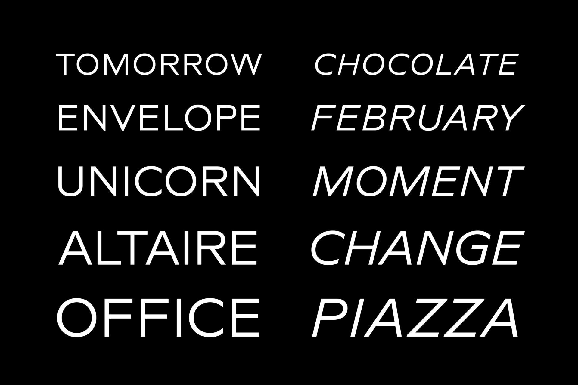
With its 40 styles and 1000+ glyphs per font, the Novera family covers all thinkable design scenarios from branding to web, app or editorial usage. It blends in perfectly in text heavy paragraphs with its mid-weights like Light, Regular, Medium or Bold or stands out like a monument in headlines and posters with its extreme weights like Thin, ExtraLight, Black or Ultra.
Testfonts
If you like to test the fonts before buying the full version, follow this link. Please note, all test fonts are available for evaluation purposes only and contain a limited character set! A commercial license for the full version must be purchased separately. Please send a mail to contact@renebieder.com for more information.
Price
€49,75 (Introductory Offer. Regular Price: €199)
Designer
René Bieder


Weblog
Die Top 5 Vorteile einer Social Media Werbeagentur buchen
Die Qual der Wahl – Erfolg im Internet – die Auswahl der Webagentur
Entdecke die neuesten Trends in Damenmode: Stilvoll und zeitlos
E-Mail-Outreach betreiben: Die besten Tipps, um effektiv Entscheider zu erreichen
Festplatte abgestürzt – das sind die 3 häufigsten Gründe!
Werbebotschaften – der Motor für den Verkauf
Webdesign – was müssen Unternehmen beachten?
Welche Werbe- und Designtrends sind für 2024 zu erwarten?
Limitierte Editionen: Das Phänomen von exklusiven Sneaker-Veröffentlichungen
To-go-Verpackungen mit Persönlichkeit
Die Vorteile eines eigenen Website-Servers: Das sind sie
Veröffentlichung der eigenen Arbeit
Windows für Mac-Liebhaber: Die besten Tipps im Umgang
Den Ort finden, an dem Kreativität am besten entsteht
Ein praktischer Leitfaden für Marketer, die KI nutzen wollen
Gestaltung des Glücks: Wie visuelles Design die Wahrnehmung von Gewinnchancen beeinflusst
Designmöglichkeiten in Windows: So personalisierst du deinen Desktop
Handwerk trifft auf High-Design: Die Exzellenz von Möbeln ‘Made in Germany’
Instrumentenbau: Design trifft Handwerkskunst