Yearbook of Type #1
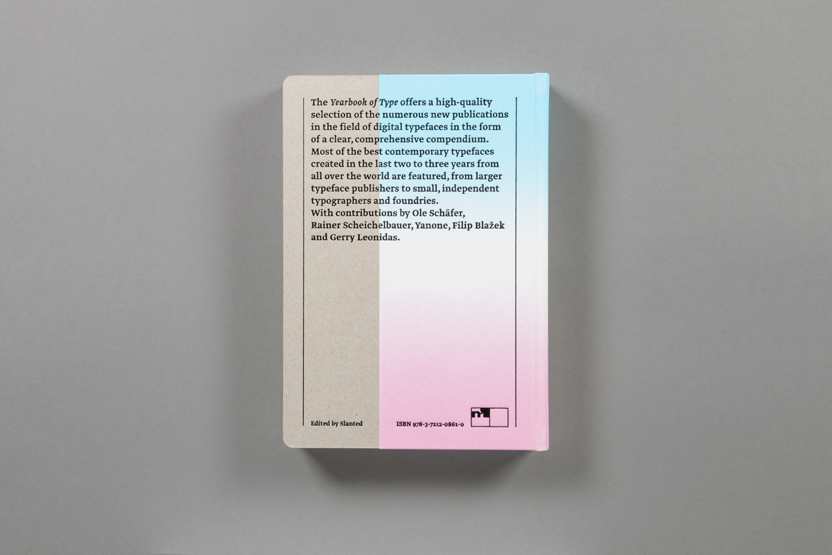
The idea behind the first edition of Yearbook of Type is quite simple: to offer a high quality selection of the numerous new publications in the field of digital typefaces in the form of a clear, comprehensive compendium.
In the past two decades the publication of typefaces has changed radically. The popularity of desktop publishing and typeface designing programs has provided a great many designers with the means to design and use their own types, in great contrast to wood, lead and photo typesetting. What’s more, the internet offers a means of distribution that can be used by individuals and established typeface publishers alike.
The abundance of new and quite interesting typeface designs is certainly a welcome development, especially when one considers the essential role that typefaces play in generating an identity and creating a visual impression. At the same time designers and others working in the field are faced with a chaotic situation with a great number of type designs and publishers.
A variety of blogs and internet portals provide regular information about new fonts and foundries, but there still is no high-quality, independent print publication (typography still looks best on paper!) that provides an overview of the field. That is the goal of this volume − the Yearbook of Type is intended as a series in which the best contemporary new developments in the field of typography are presented. Typefaces created in the last two to three years from all over the world will be featured, from larger typeface publishers to small, independent typographers and foundries.
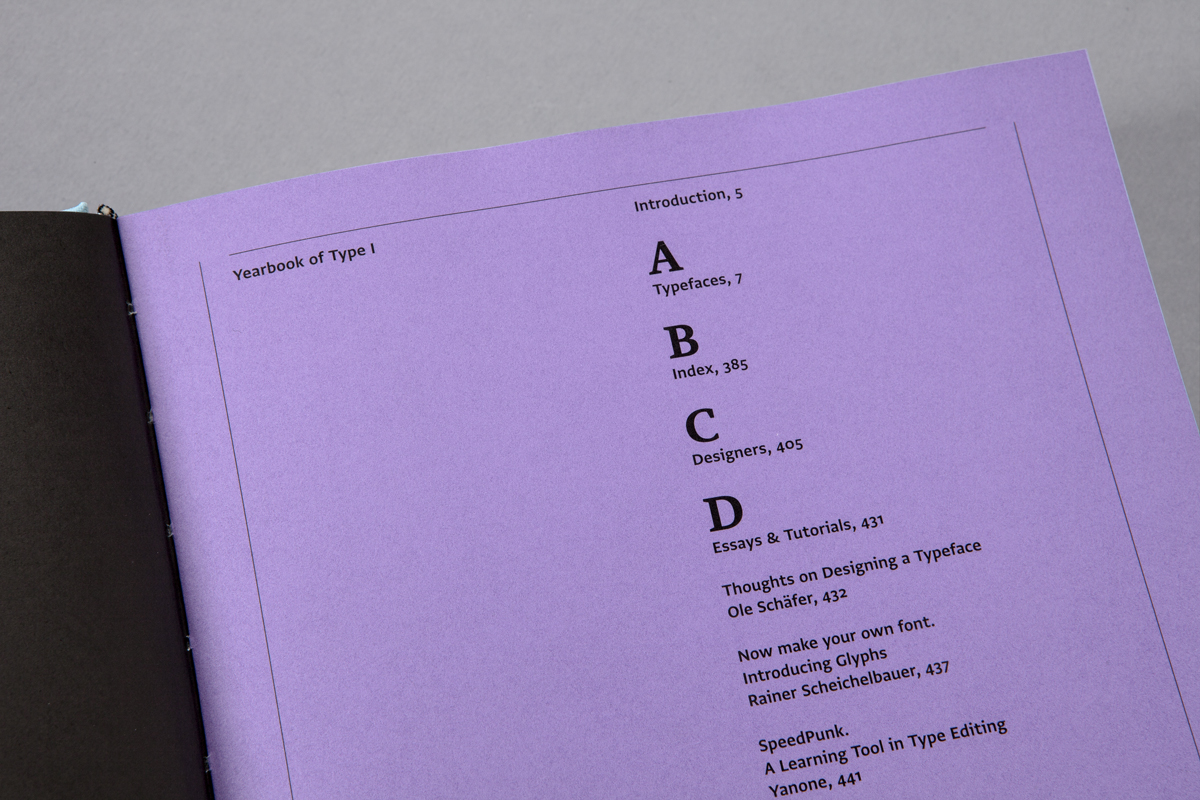
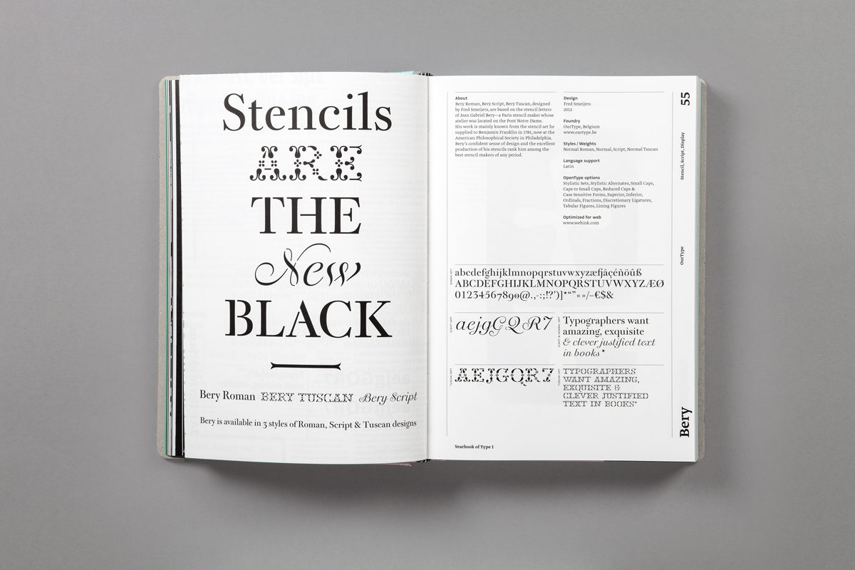
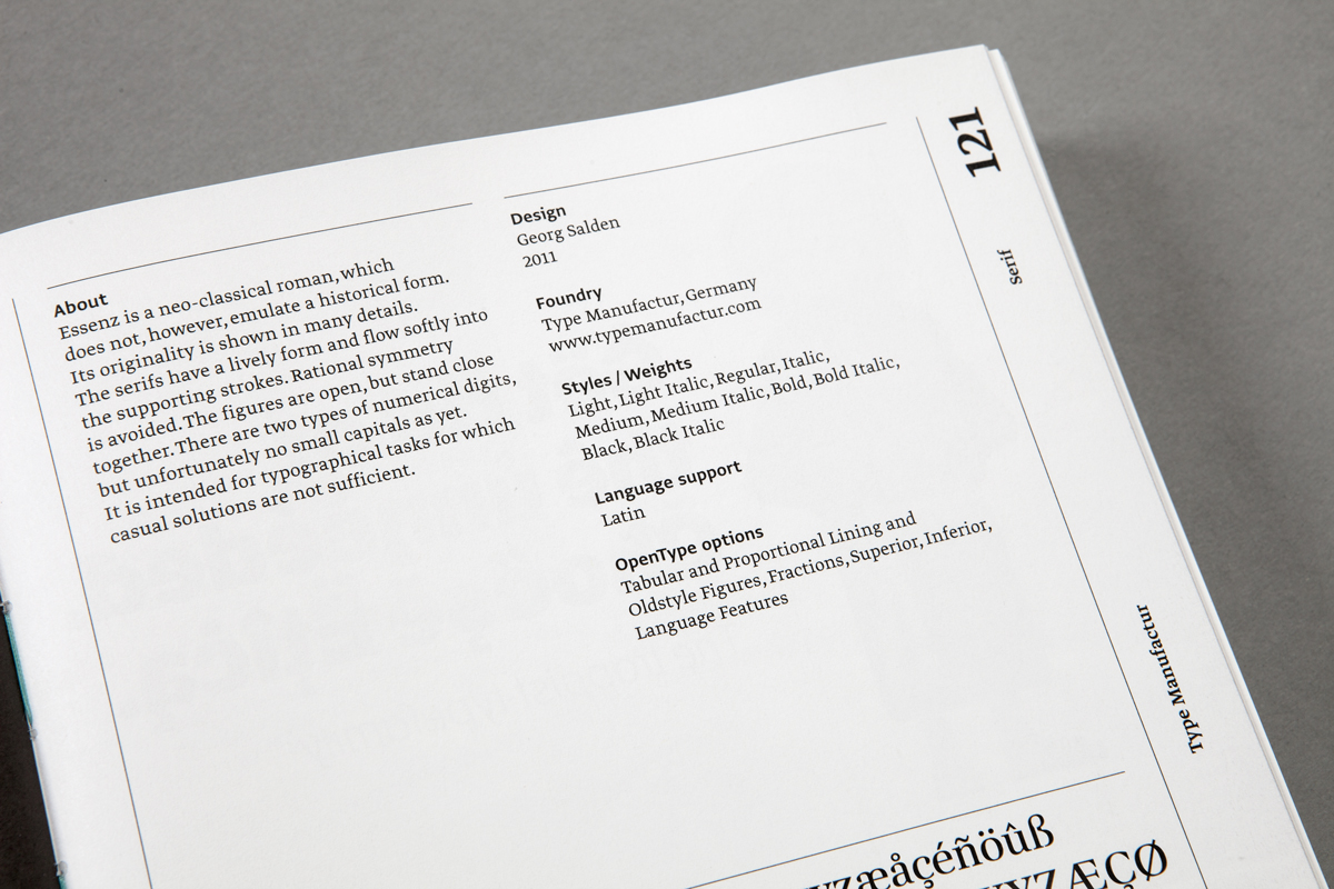
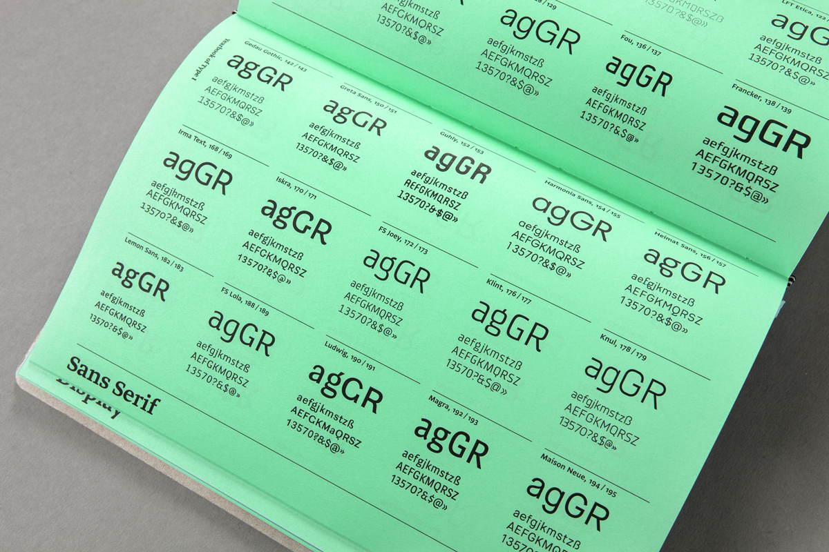
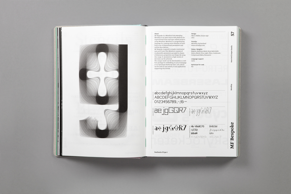
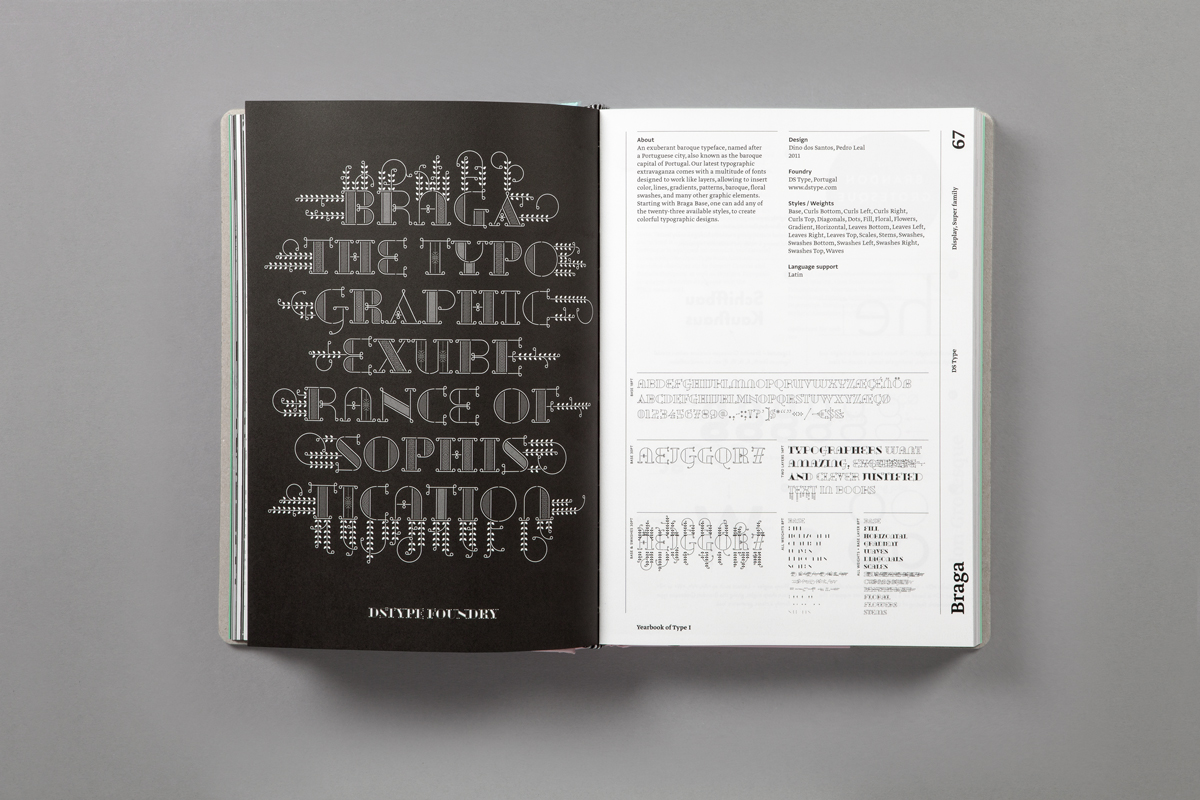
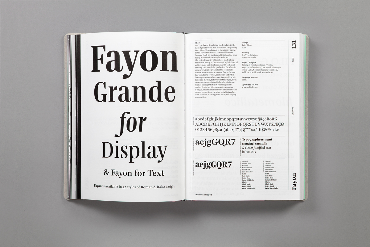
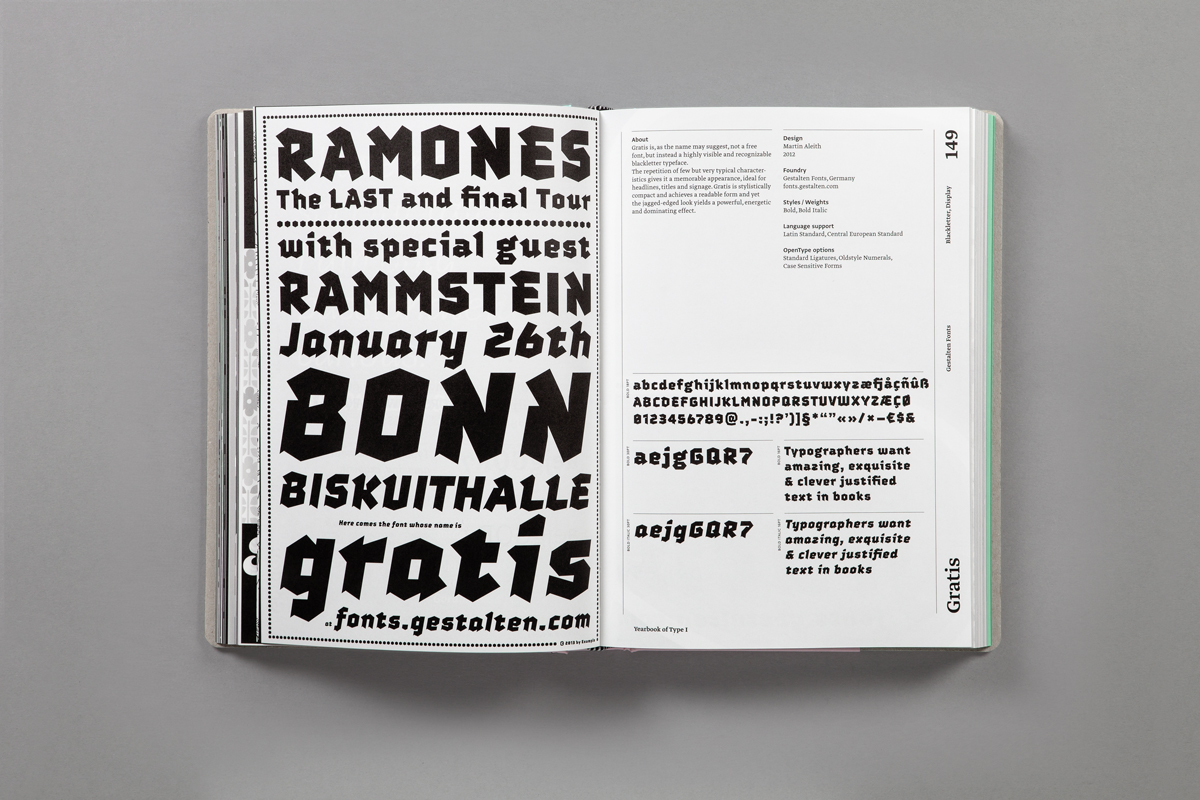
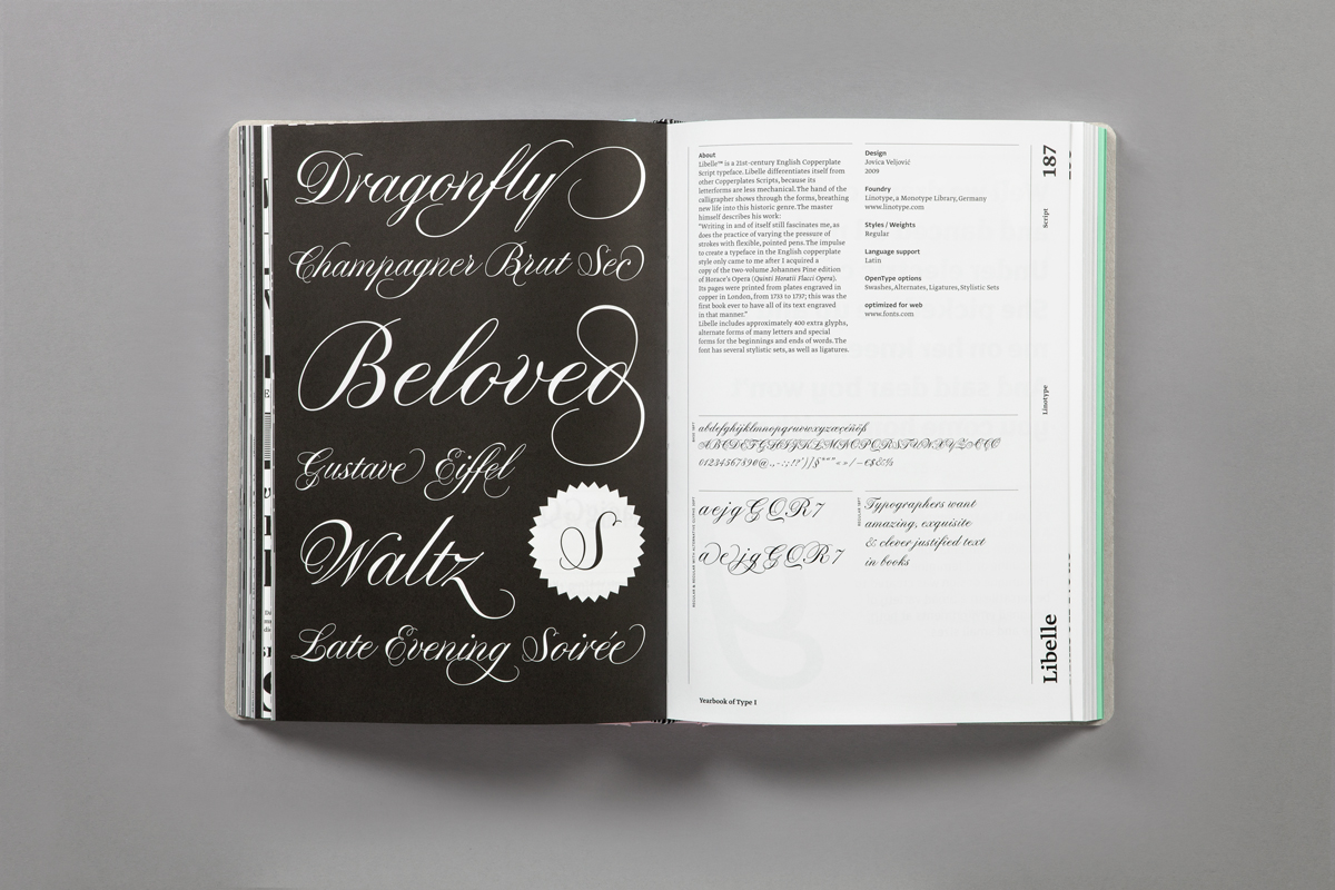
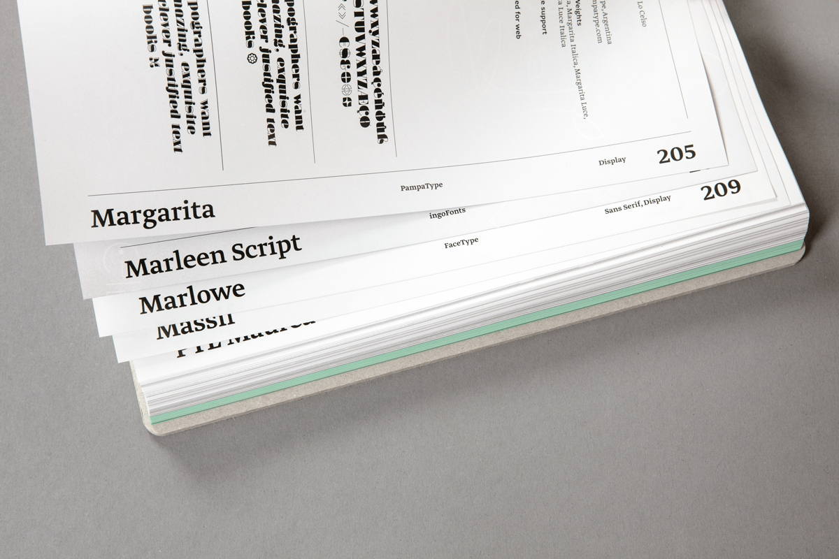
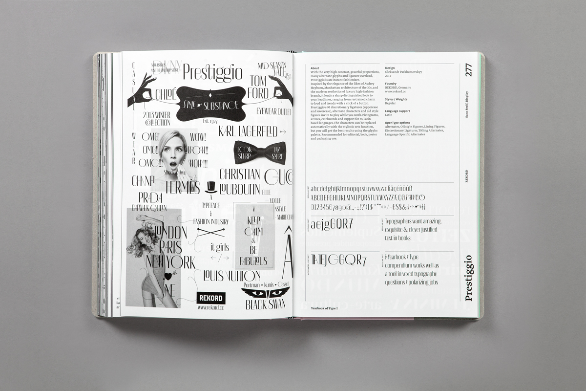
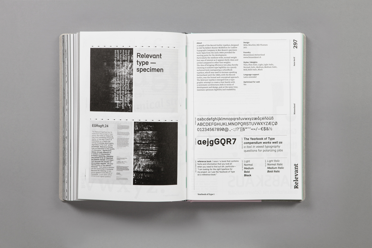
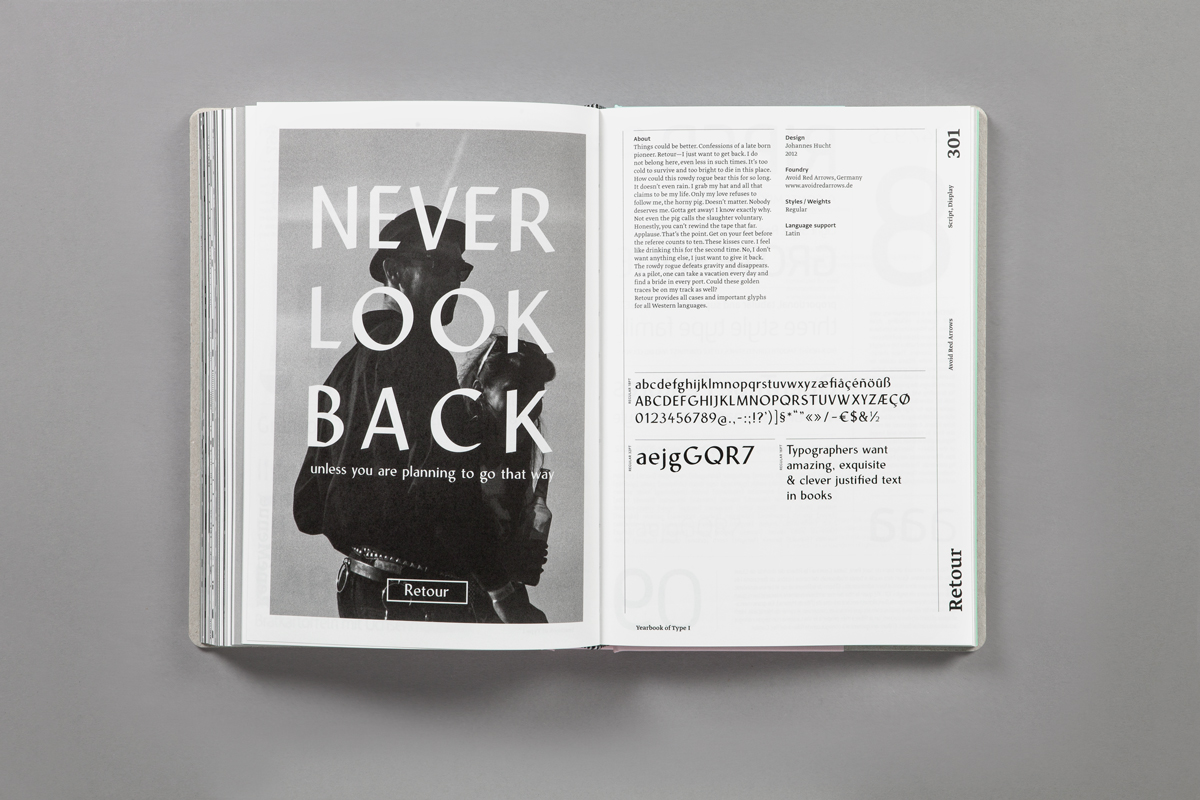
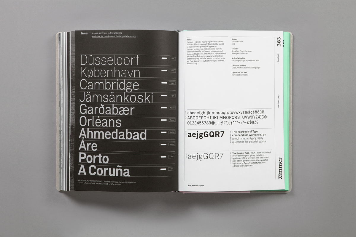
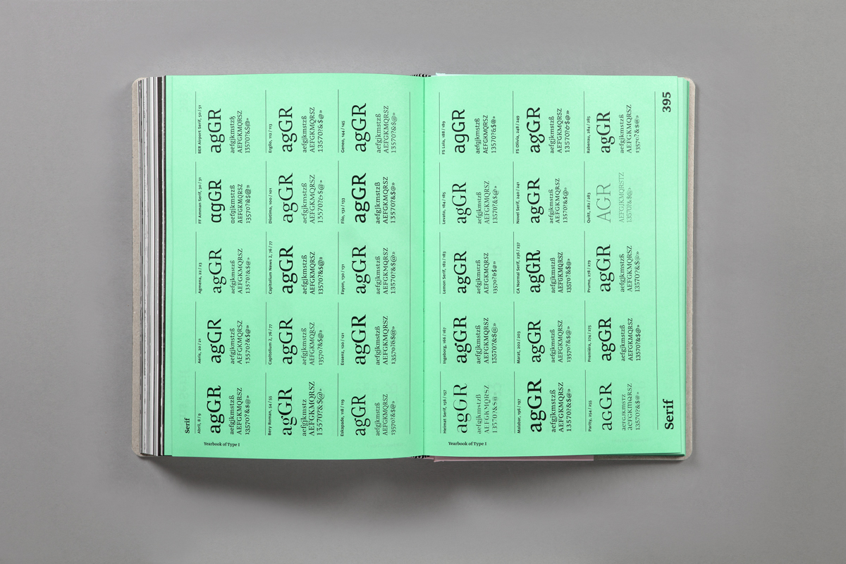
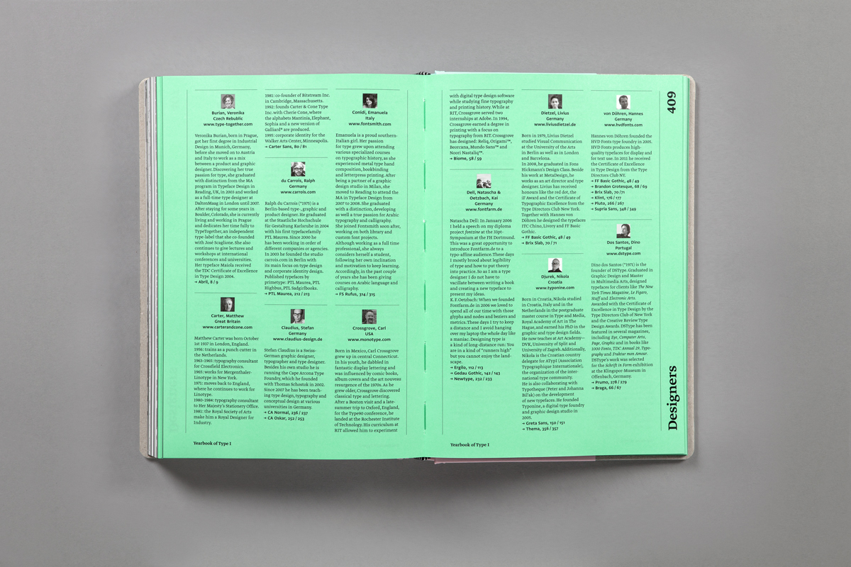
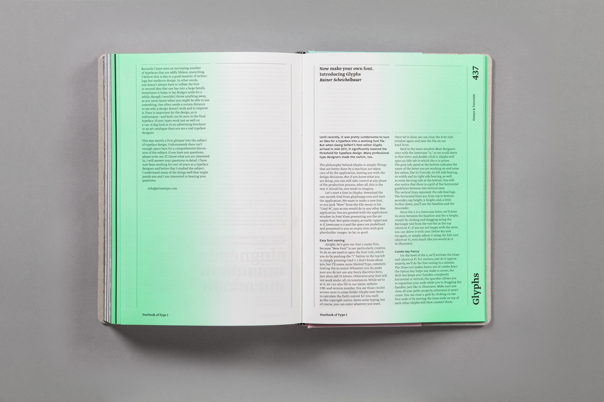
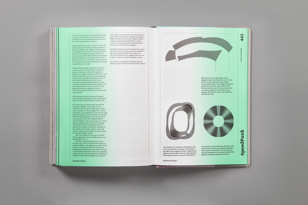
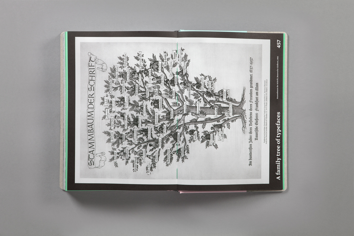
In the Yearbook of Type each individual typeface or typeface family is presented on a double-page spread. On the left side appears a visual created by the respective type designer or label with a detailed view of the type and an initial optical impression. On the right side more detailed background information is provided as well as an overview of the typeface’s different features. The catalogue is followed by an index of all the typefaces arranged by category. Short texts provide information on individual type designers and an essay section offers sketches, background knowledge, technical information, instructions and descriptions from the world of typography.
We are certain that the Yearbook of Type will be of great practical value. The emotional and informative presentation of the typefaces will serve designers and agencies as a source of inspiration and will help others select the right typeface. As a catalogue and reference work it will also be of interest to all those who are interested in the contemporary world of typesetting and the latest in typeface design.
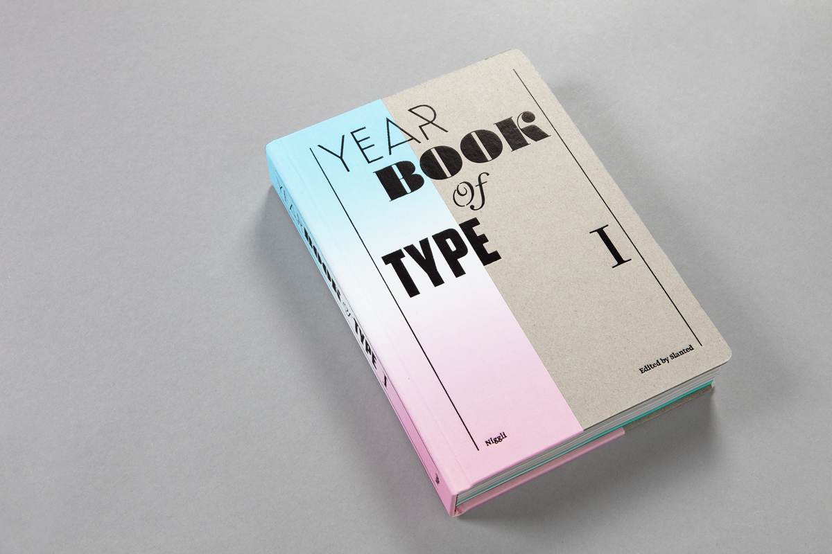
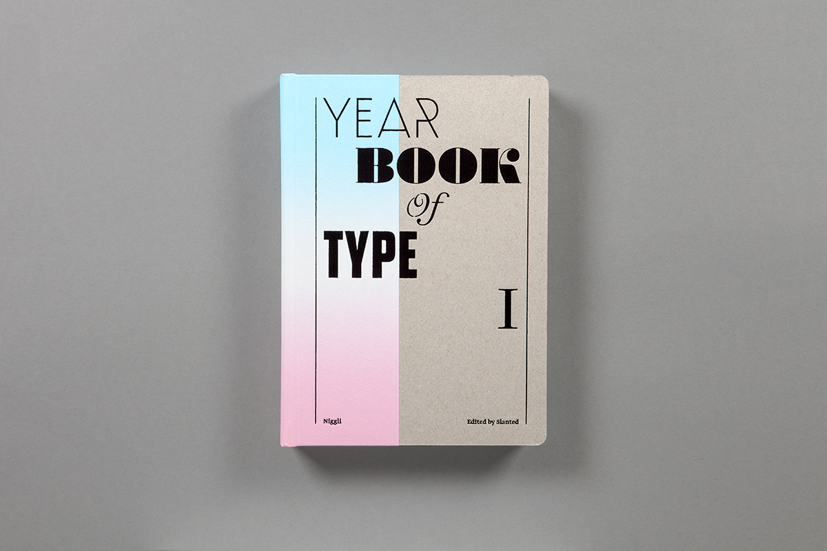
Herausgeber: Slanted
Verlag: Niggli
Gestaltung: Magma Brand Design
Veröffentlichung: Juni 2013
Umfang: 464 Seiten
Format: 165 × 240 mm
Sprache: Englisch
ISBN: 978-3-7212-0861-0
Preis: 49,80 Euro


Weblog
Die Qual der Wahl – Erfolg im Internet – die Auswahl der Webagentur
E-Mail-Outreach betreiben: Die besten Tipps, um effektiv Entscheider zu erreichen
Festplatte abgestürzt – das sind die 3 häufigsten Gründe!
Werbebotschaften – der Motor für den Verkauf
Webdesign – was müssen Unternehmen beachten?
Welche Werbe- und Designtrends sind für 2024 zu erwarten?
Limitierte Editionen: Das Phänomen von exklusiven Sneaker-Veröffentlichungen
Die Vorteile eines eigenen Website-Servers: Das sind sie
Veröffentlichung der eigenen Arbeit
Das richtige Produkt im Netz finden: Die Welt der SEO-Agenturen
Windows für Mac-Liebhaber: Die besten Tipps im Umgang
Deutsches Design beim Bauen – das sind die wichtigsten Merkmale
Ein praktischer Leitfaden für Marketer, die KI nutzen wollen
Vielfalt der Druckverfahren im Etikettendruck
Chaotisches Genie oder einfach schusselig? Fünf Tipps für den besseren Merker
Gestaltung des Glücks: Wie visuelles Design die Wahrnehmung von Gewinnchancen beeinflusst
Designmöglichkeiten in Windows: So personalisierst du deinen Desktop
Handwerk trifft auf High-Design: Die Exzellenz von Möbeln ‘Made in Germany’
Digitale Kunst: Fusion von Technologie und Kreativität
Der Mehrwert macht’s: Diese Inhalte gehören auf Unternehmenswebseiten