
Type Design
Adelbrook
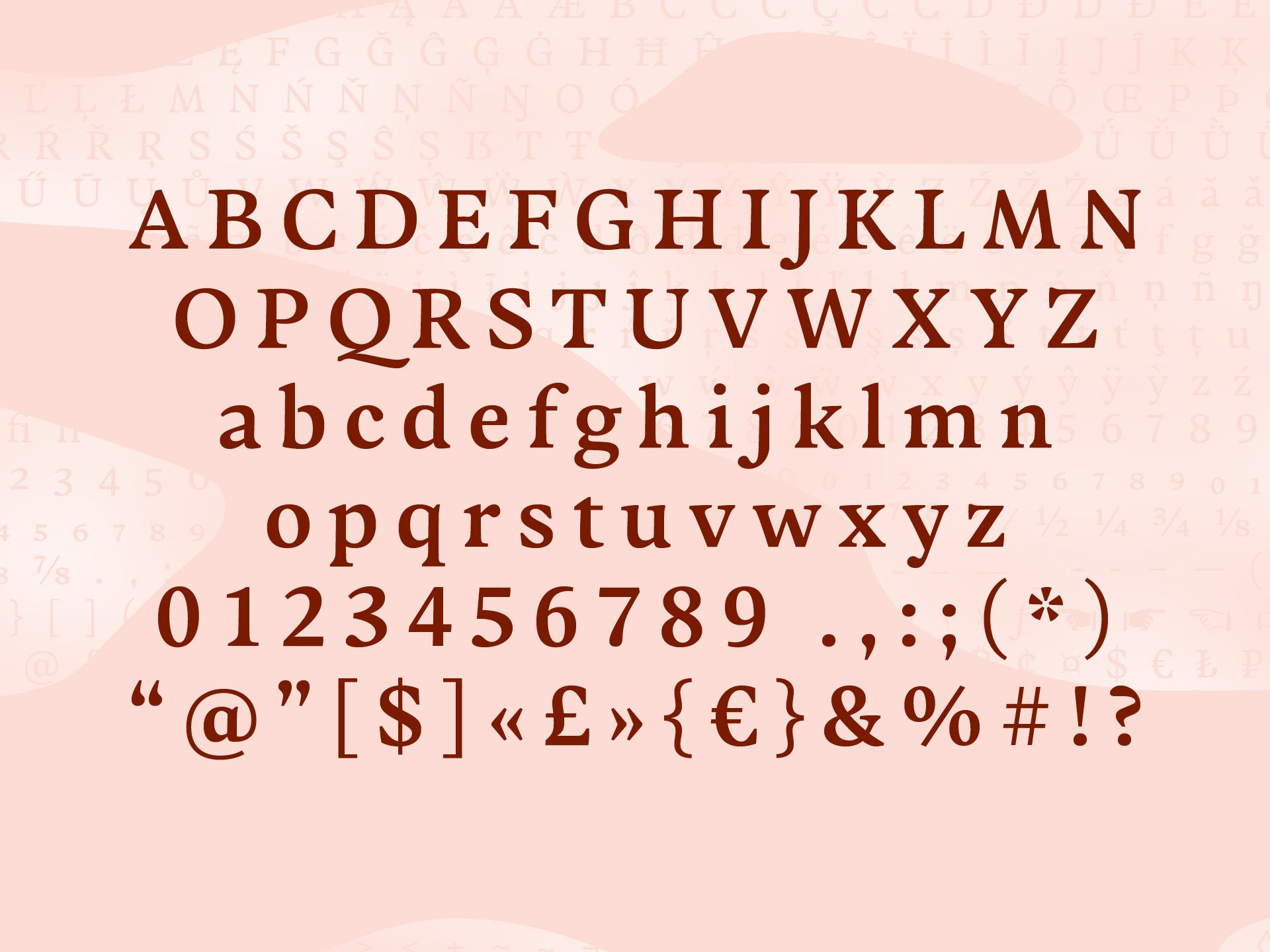
The dynamic serif typeface Adelbrook is a typeface family that keeps calm. It is designed by Philip Lammert and published under his foundry name Vibrant Types. Typographically it enriches text with an archaic structure, because of its harmonious rhythm, the dynamic stroke, asymmetrical serifs and leaning stems. This humanist typeface has gravity and stands firmly on the baseline. Emphasized foot serifs and upward tapering stems define a heaviness. In fact, all the details are heftier the lower they are located. This shows especially in a subtle vertical hairline variation and in light or unapplied head serifs.
The restraining italic underlines the modern appeal of the type family. Although traditionally humanist italics are overly expressive, this semi-serif design integrates with a brush-like nature in a subtle way.
Typeface designer Philip Lammert tried his hand at drawing a lively design, which nevertheless maintains a constructedness. He consistently applied the design principle with the stem becoming narrower towards the top to the entire design. The tension accompanying these clear rules captivated him so much that he completed the font family seven months later in 2021. Although all decisions were conceptually predetermined, he revised the character set several times on the way to a coherent alphabet.
All these details result in a sophisticated text typeface with a contemporary sharpness. Adelbrook is available as five fixed weights from Light to Bold with corresponding italics, and also as variable fonts. The fonts offer features such as arrows or additional numbers and case-sensitive forms. Free test fonts can be downloaded at the foundry website www.vibrant-types.com, where commercial fonts can also be purchased.
Designer
Philip Lammert


Weblog
Die Qual der Wahl – Erfolg im Internet – die Auswahl der Webagentur
Entdecke die neuesten Trends in Damenmode: Stilvoll und zeitlos
E-Mail-Outreach betreiben: Die besten Tipps, um effektiv Entscheider zu erreichen
Festplatte abgestürzt – das sind die 3 häufigsten Gründe!
Werbebotschaften – der Motor für den Verkauf
Webdesign – was müssen Unternehmen beachten?
Die Vorteile eines eigenen Website-Servers: Das sind sie
Veröffentlichung der eigenen Arbeit
Den Ort finden, an dem Kreativität am besten entsteht
Deutsches Design beim Bauen – das sind die wichtigsten Merkmale
Ein praktischer Leitfaden für Marketer, die KI nutzen wollen
Chaotisches Genie oder einfach schusselig? Fünf Tipps für den besseren Merker
Wie Design unser Leben beeinflusst
Design und Cybersicherheit: Die Symbiose von Form und Funktion
5 Tipps für die Vermarktung von Wein
Machen Sie Ihr Videografie-Portfolio zum Hingucker: Expertenrat und Strategien