Schriftvorstellung
Building out the Malabar family
Schriftvorstellung von Dan Reynolds
1. From Malabar Regular to Malabar Book
In March 2009, I published my Malabar typeface through Linotype. Malabar’s concept is that of a serif family supporting both the Latin and Devanagari scripts, although I have not brought my Devanagari fonts to market yet. In terms of style, Malabar’s letterforms combine elements from both French Renaissance and Baroque types. Malabar was developed primarily with newspapers in mind, especially with an eye to India’s still-growing sector.
I began working on Malabar while I was a student at the University of Reading in the UK. Instead of seeing my design as a definitive solution for a specific problem, I view it much more as a proof of concept. Type design bears much in common with industrial design; font products are only ever really finished once they are used in a real-life application. In order for the family to realize its full potential, it will require additional growth and development. For instance, in order to function in a real newspaper, Malabar would first need to be tested on the client’s own presses. Certain strokes may need to become heavier or lighter. Caption cuts—with wider spacing, less contrast, and broader forms—must be drawn, as well as sub headline versions, and a condensed series.
As to how this process might unfold, a test-run to create a book version of Malabar is currently underway. Since books were never my intended area of application for this design, Malabar’s adaptations for that field have only come about because a specific typographer—with a demanding project in mind—approached me with the idea. The new book fonts, which will be released for general licensing after the book for which they were designed is available in stores, have lighter vertical strokes than the Malabar family’s regular weight. This lowers the letters’ stroke contrast dramatically, since there is now less difference between the thick and thin strokes. One of Malabar’s features is a very high x-height, which is typical in the newspaper genre. An OpenType feature has been added, allowing the typesetter to switch between Malabar Book’s standard-length ascenders/descenders and new, longer alternates.
2. Malabar Devanagari
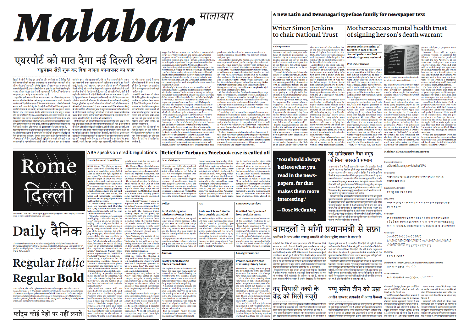
With both Latin and Devanagari character sets, Malabar supports two of the world’s most widely-used languages: English and Hindi. Of course, Malabar may set many other languages, too, including most European languages, and additional North Indian ones, such as Marathi, Nepali, and Sanskrit.
In recent years, more and more newspapers have taken advantage of typeface selection as a key element of their total brand image. Malabar could play an excellent roll in a rebranding campaign. The typeface is also of interest to publishers of multi-script texts, as one of its strengths is the harmony between the Latin and Devanagari elements. Both character sets are designed to allow them to work together, or on their own.
Why an oldstyle axis, and not a transitional or modern choice? Simply, an oldstyle direction was chosen as the best counterpart to the stroke direction most favored in Devanagari text faces. While oldstyle Latins and Devanagari do not have the same letter axis by any means, the Latin oldstyle axis is a virtual ‘flip’ of that used in Devanagari. In such ways may harmony be built. Neither the Latin nor the Devanagari characters are constructed out of pieces or elements of the other. Rather, both scripts share certain stylistics keys, such as the occasional sheared terminal. More importantly, the relative proportions of the two scripts to one another are well chosen, and the stroke thicknesses are compatible. This produces a similar color between texts set in each script, what could be called the real hallmark of multi-script design.
The most-visible element in Malabar Devanagari is the so-called »headline« that runs across the top of each word, binding it together as a unit. This black stroke is more or less the top of most Devanagari characters. In Malabar’s design, this feature is placed slightly lower than the height of the Latin capitals, allowing English words—or other terms in the Latin script—to sit comfortably amidst Devanagari text. This sort of integration is even possible for words written in all-caps. It is not uncommon to find »English« abbreviations, URLs, or e-mail addresses in lines of Hindi text.
Devanagari characters do not have ascenders and descenders in the same manner as the Latin script, although vowel marks that take their position above or below the base consonant are used. These vowels present a similar effect to Latin extenders. Malabar’s Devanagari vowels are rather large in comparison with its Latin ascenders and descenders. In other words, Malabar requires more leading for Devanagari texts than it does for Latin. However, it is not necessary to adjust the point sizes of the two scripts to work with one another. Visually, 12pt Devanagari text is as large as 12pt in the Latin script.
3. Reception
Despite Malabar’s work-in-progress status, the typeface has received critical acclaim. At the beginning of 2009, Malabar received a Certificate of Excellence in Type Design from the Type Director Club of New York’s TDC2 2009 competition. In May of that same year, Malabar was awarded a silver prize in the Original Typeface category of the European Design Awards. In February 2010, Malabar was recognized with one of ten Design Prizes of the Federal Republic of Germany in gold. Over 1,200 design works were nominated for consideration in this competition. Malabar is only the second typeface to receive a German Design Prize; in 2007, Erik Spiekermann and Christian Schwartz received the gold trophy for their DB Types as well.
According to Gestalten’s Robert Klanten, member of the 2010 Design Prize jury, »the robust impression given by the Malabar font is particularly impressive, while remaining extremely legible. ‘Shrinking’ the upper-case letters and the ascenders on the lower-case letters is a trick that is as simple as it is sophisticated. This means that the Malabar letters do not just look bigger, they are very easy to distinguish from each other through small, scarcely noticeable adjustments to curves and serifs. Some letters, for example the lower-case ‘k’, look almost playful, but this in no way impedes legibility. On the contrary, these features make it possible for newspaper readers to read even long passages set in small point sizes without getting tired. The Devanagari variant of the font works with the same design concepts and is a fine example of how masterly typography can support the written word in all written languages. In Malabar, Linotype has successfully created a font that is as timely as it is timeless, appealing through the outstanding typographical quality of the letters and individual font styles, and through the perfect harmony of the font styles in combination.«