Pfitzer Redesign
Reduce to the max! Redesign of the visual identity of the print company Pfitzer including logo and stationery.
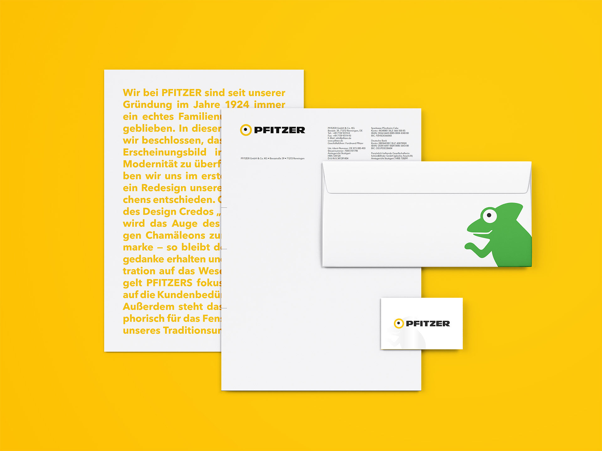
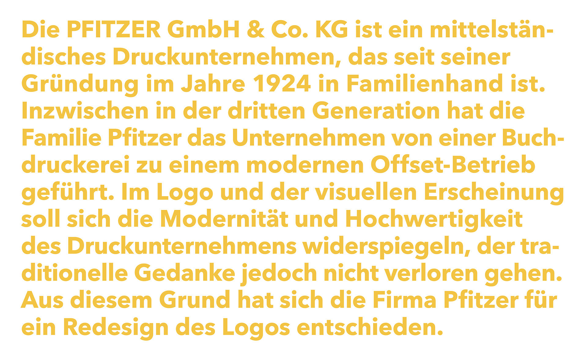
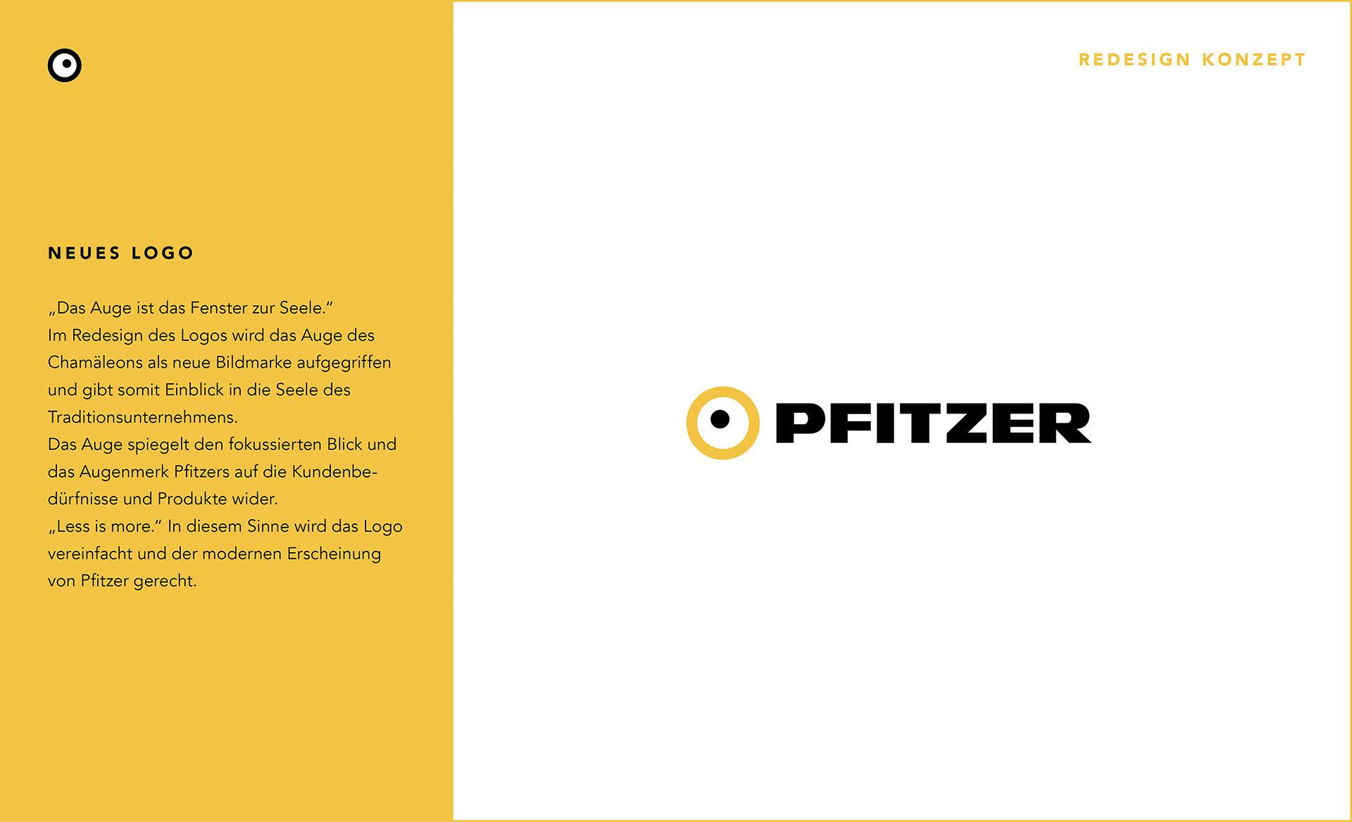
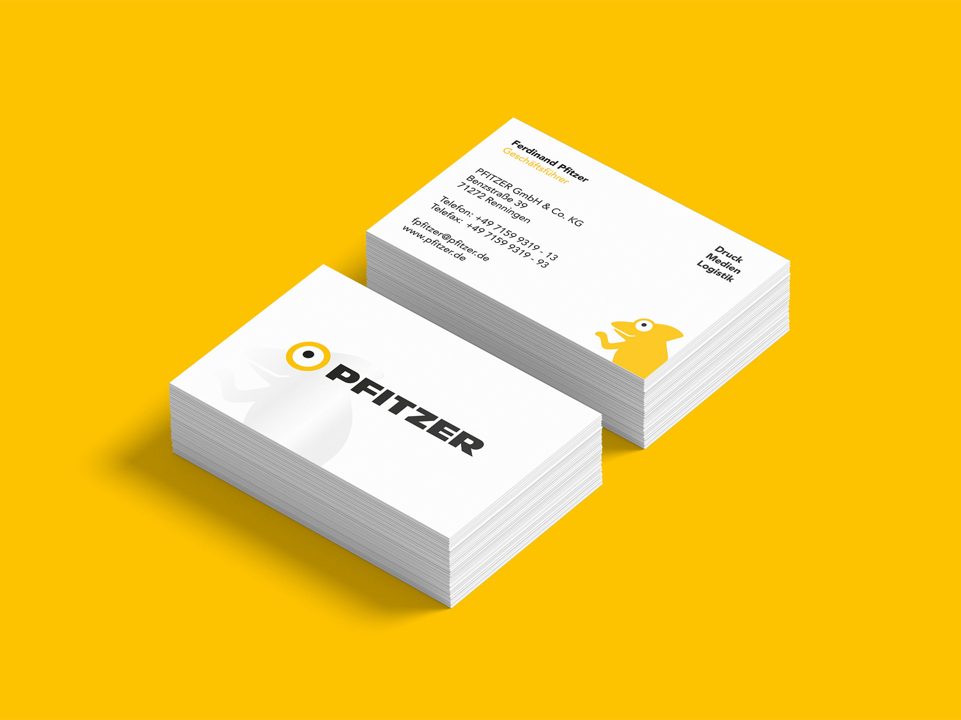
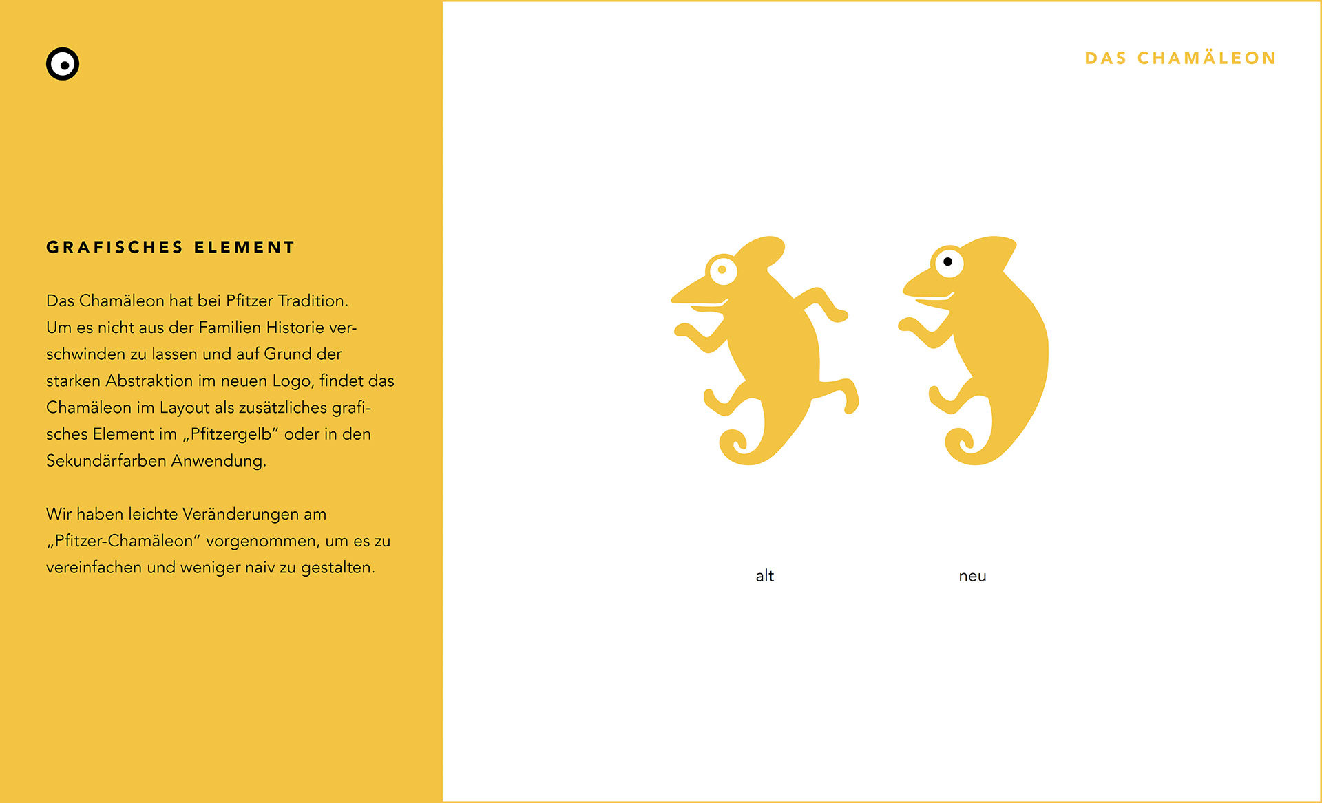
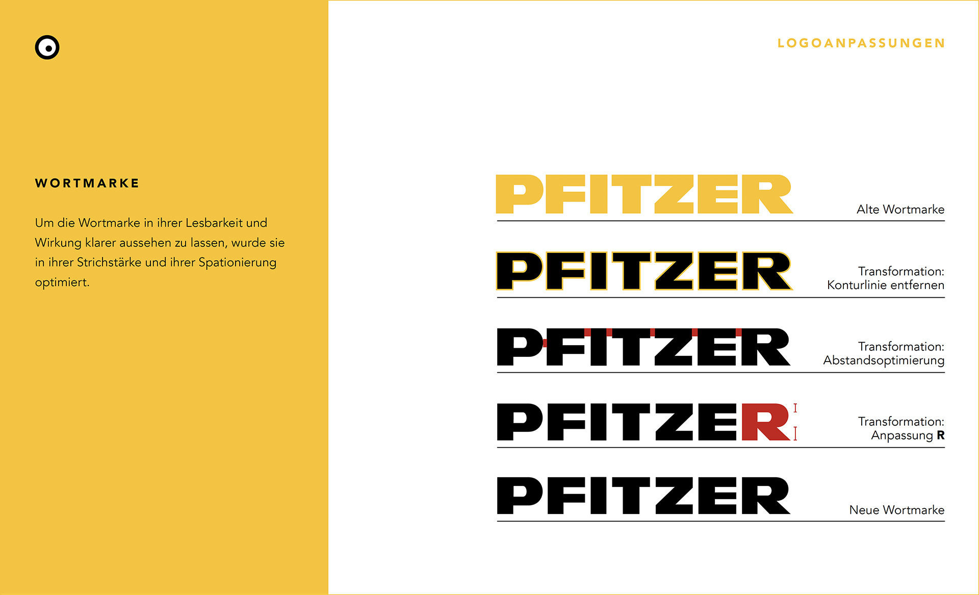
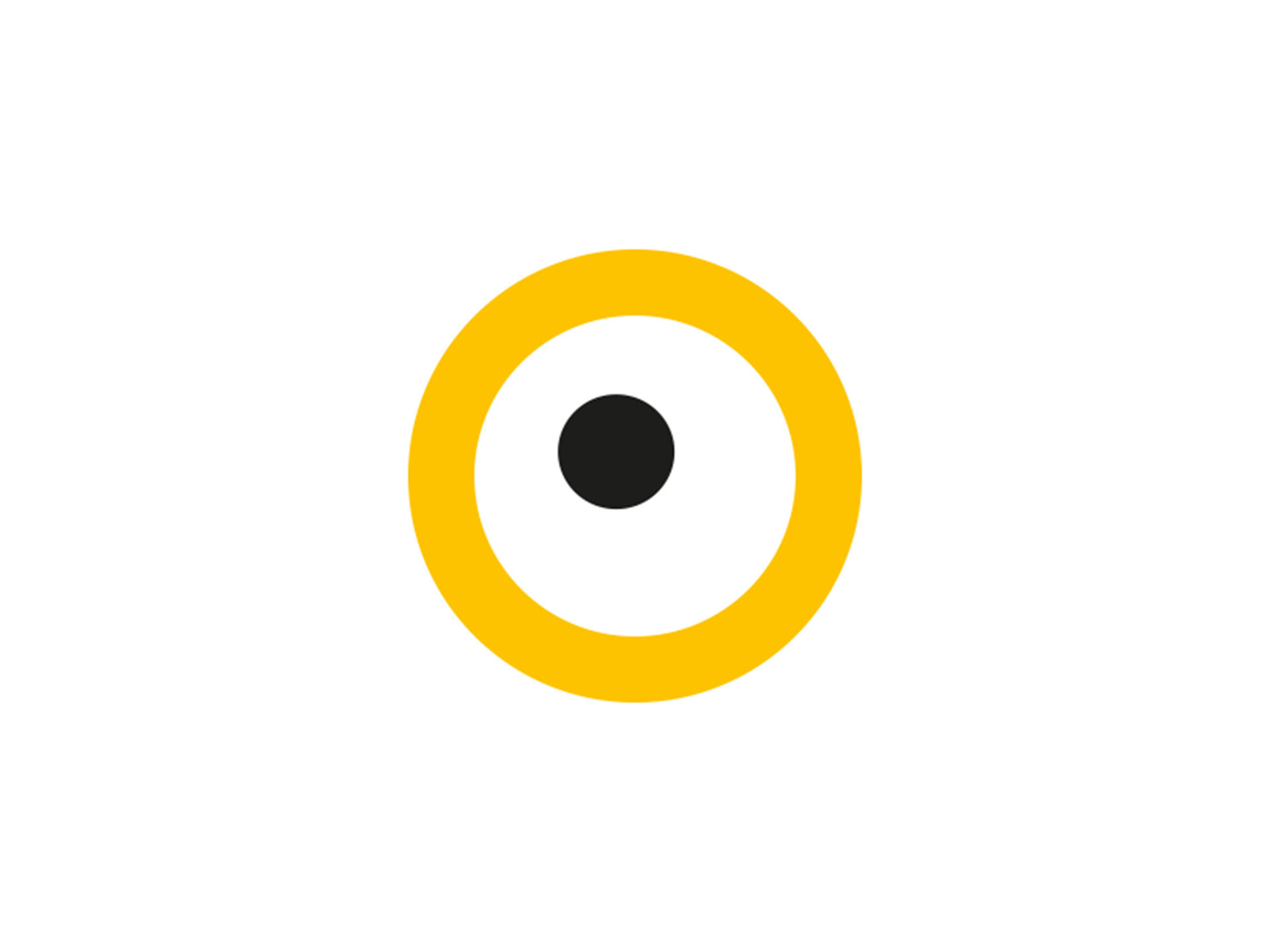
Pfitzer Gis a print company with a very long family tradition. The chameleon with its color changes was an essential part of the logo and the identity of Pfitzer. We reduced it to the maximum and used the eye of the chameleon to recreate the logo. The eye represents the eye to the soul of the company and their focus on their clients wishes. We also reduced from 5 main colors to one primary color and 4 secondary colors and gave a little typographic touch up to the word mark.
Agentur
Thekitchen


Weblog
Darum sollte eine Firma Giveaways nutzen:
Was tut sich im Online-Marketing 2024?
Einbruchschutz für Eigenheime: Die Grundlagen im Überblick
Moderne Heizsysteme: Welche Heizungsanlagen versprechen die größte Energieersparnis?
Entdecke die neuesten Trends in Damenmode: Stilvoll und zeitlos
E-Mail-Outreach betreiben: Die besten Tipps, um effektiv Entscheider zu erreichen
Welche Werbe- und Designtrends sind für 2024 zu erwarten?
To-go-Verpackungen mit Persönlichkeit
Das richtige Produkt im Netz finden: Die Welt der SEO-Agenturen
Windows für Mac-Liebhaber: Die besten Tipps im Umgang
Den Ort finden, an dem Kreativität am besten entsteht
Designmöglichkeiten in Windows: So personalisierst du deinen Desktop
Die besten Online-Tools zum Gestalten von Kalendern
Handwerk trifft auf High-Design: Die Exzellenz von Möbeln ‘Made in Germany’
Job als Konferenzdolmetscher – welche Voraussetzungen müssen erfüllt werden?