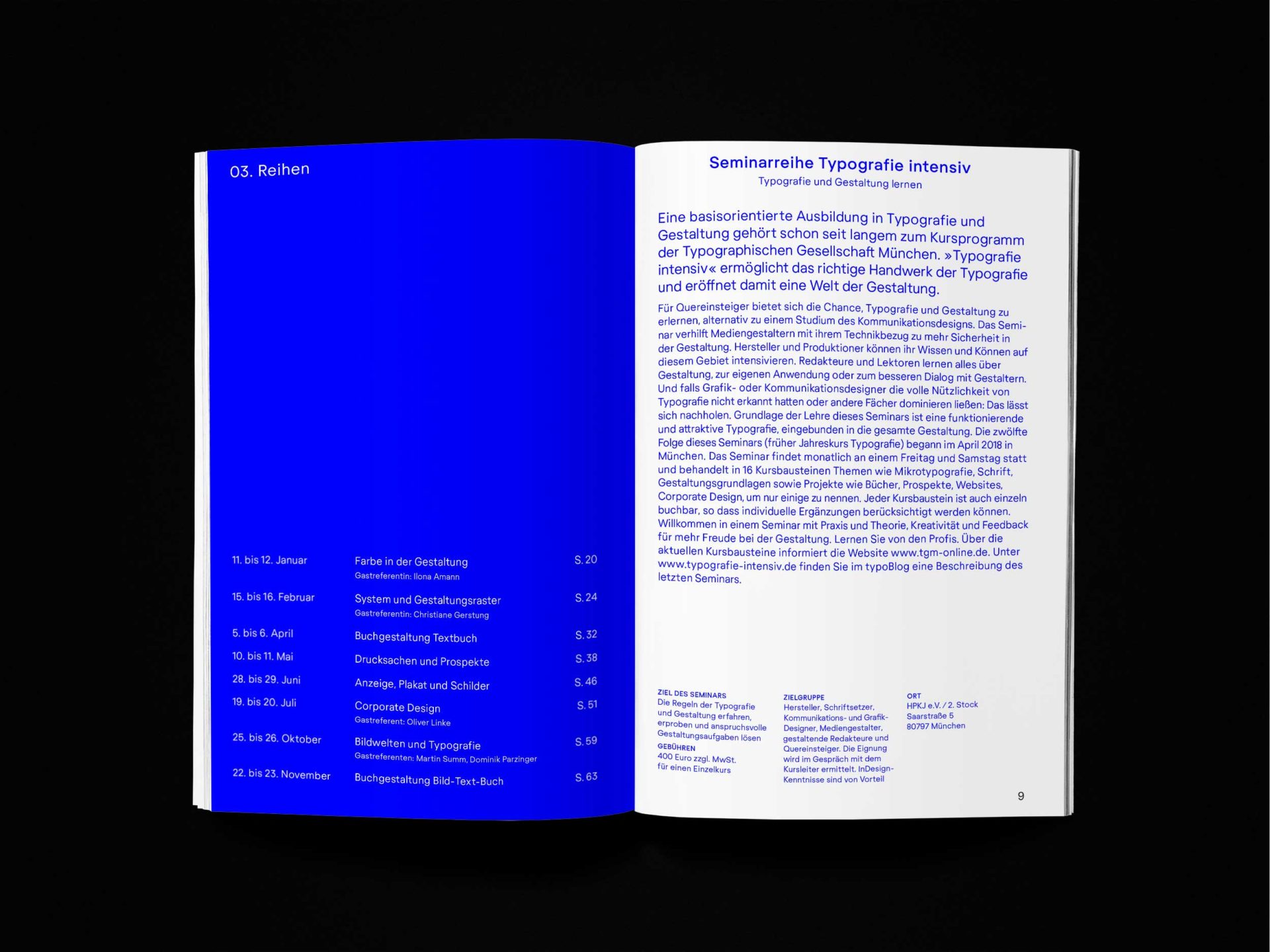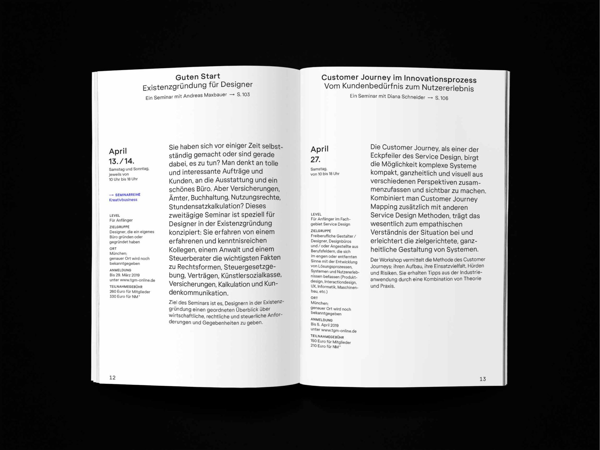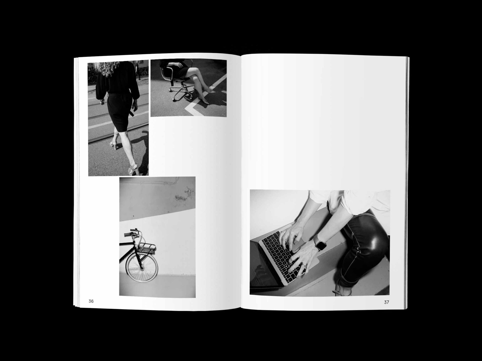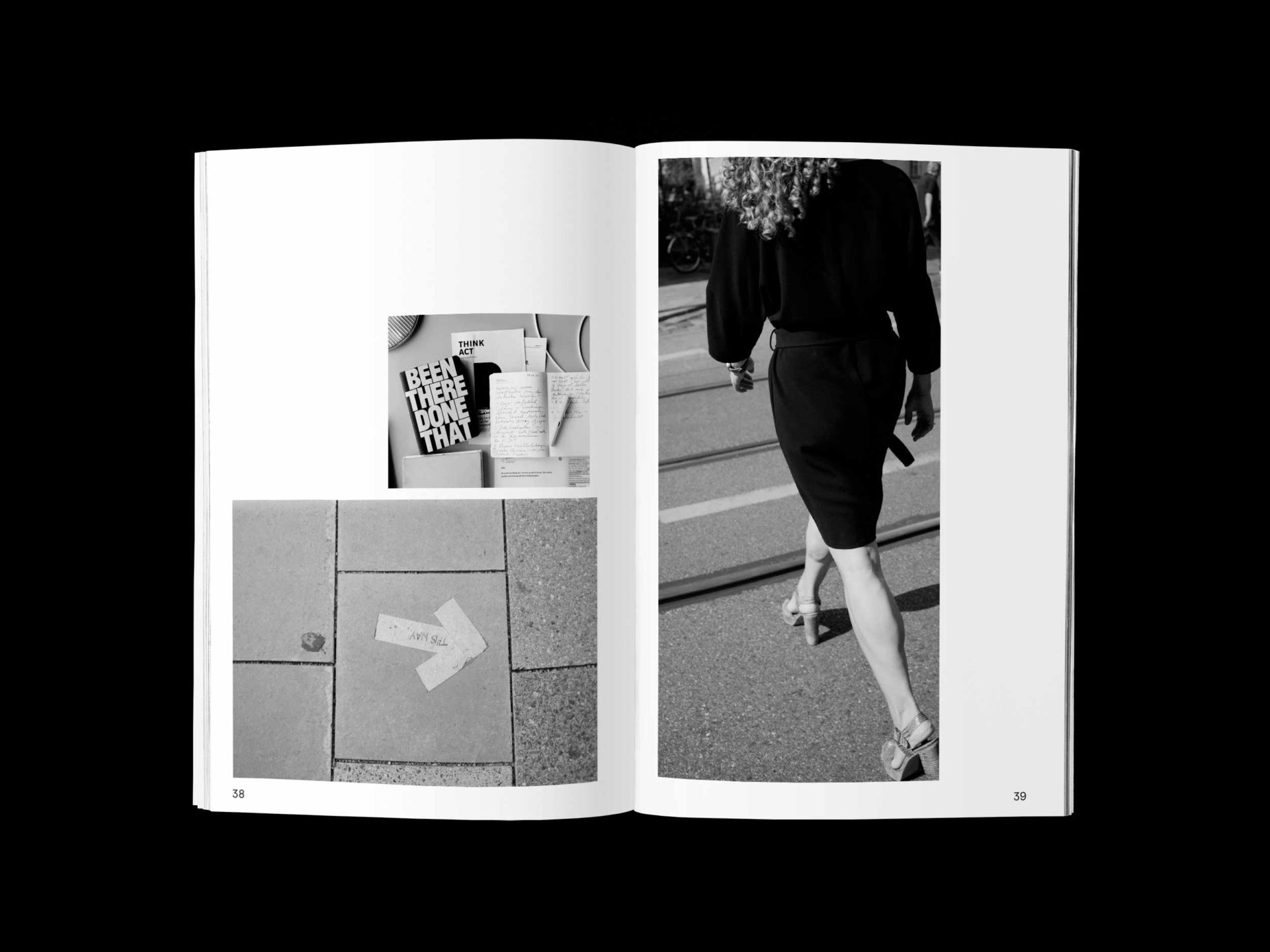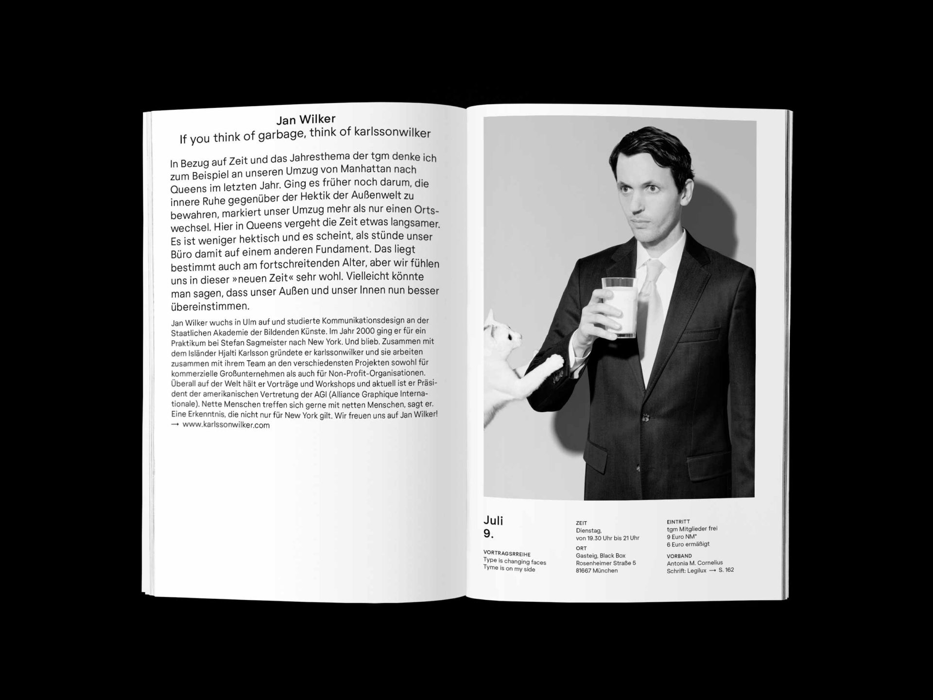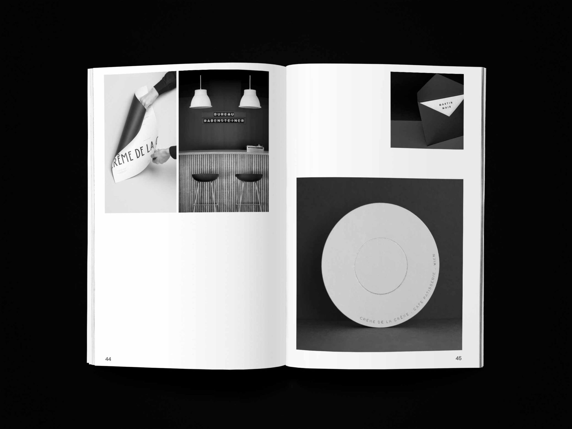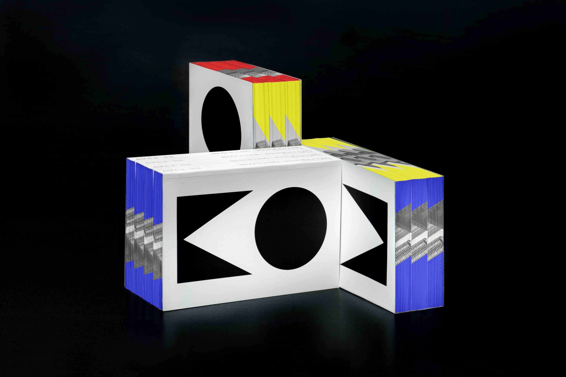
TGM Programmbuch 2019
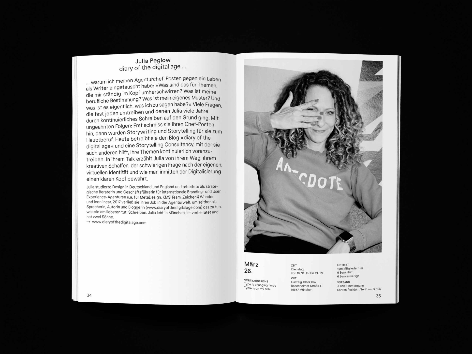
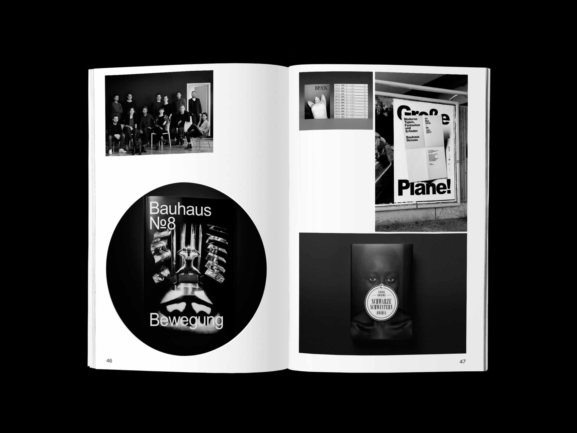
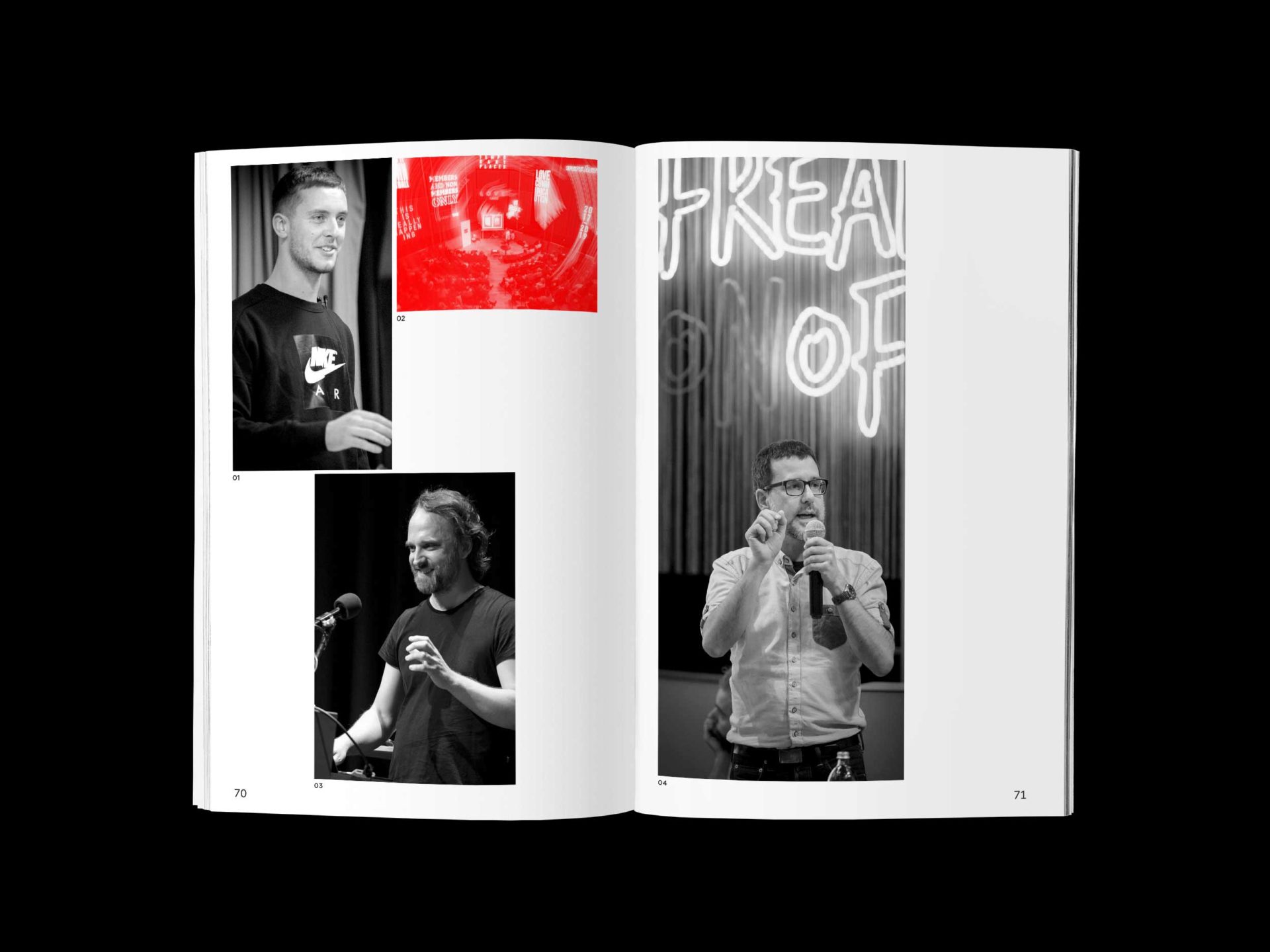
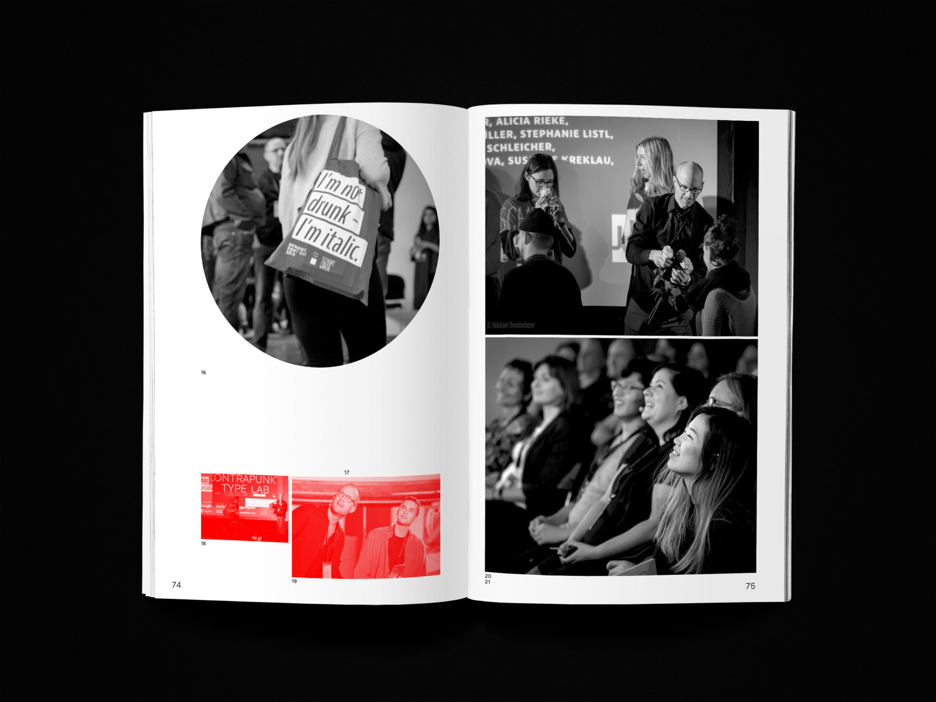
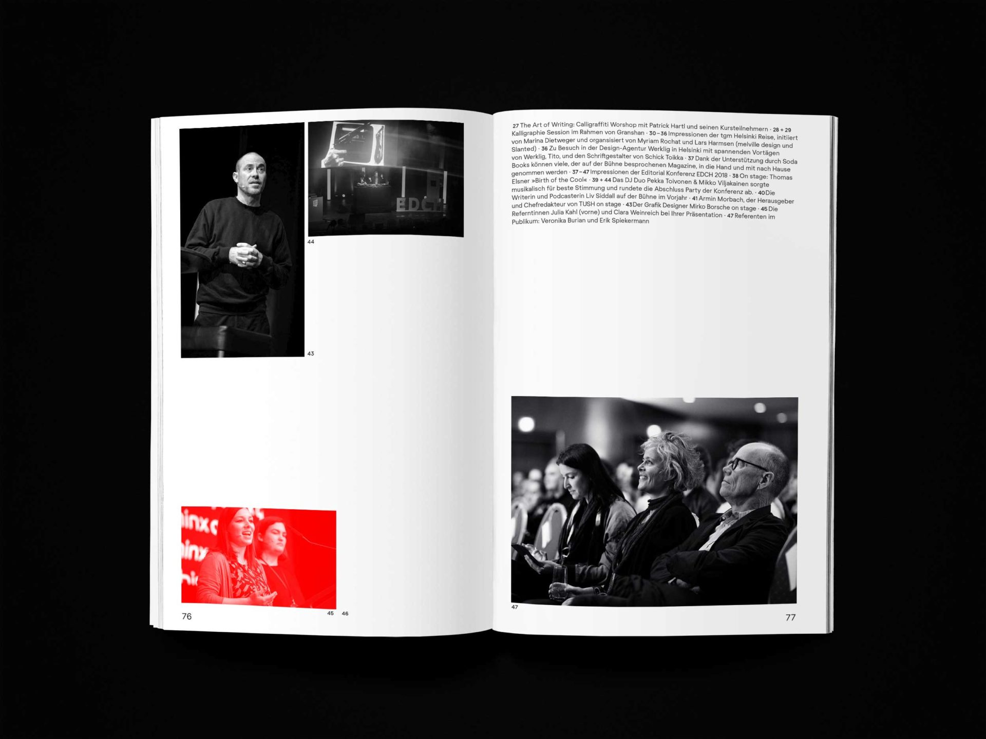
The tgm was founded in 1890 by printers and type setters and it was born into a time of upheaval in many areas of life. Life styles, ways of thinking and working methods changed faster than ever before and new professions, working conditions and thought patterns arose from these changes. During the last few years, it evolved into a design orientated association with an interdisciplinary way of thinking, and a growing range of courses to match it. This resulted in an extensive and diverse network of designers, typographers, photographers, advertisers and many more; with the goal to further the education of its members and to not only use typography, but above all to discuss it! And thus, the tgm for example uses typewalks to tell the story of type and lettering on buildings and signs. We talk about how to (typographically) debate in the future at conferences such as EDCH and the Dynamic Font Day; and for the lecture series we invite people that have something to say. As Chairwoman of the association Christina John curated several lecture series in the past years, inviting design and typography celebrities. Throughout the years designers auch as Stefan Sagmeister, Mirko Borsche, Eike König, Mario Lombardo, Sascha Lobe, Fons Hickmann, Paula Scher, Amir Kassaei or Kurt Weidemann – to name a few – followed these invitations and appreciated the warm welcome of our community. In the future, the tgm wants to have a say when discussing the cultural enrichment of Munich’s subculture and we want a relevant voice in urban development by establishing an unbureaucratic and direct exchange between different people in the creative field. Thereby we do justice to our social responsibility of furthering creativity.
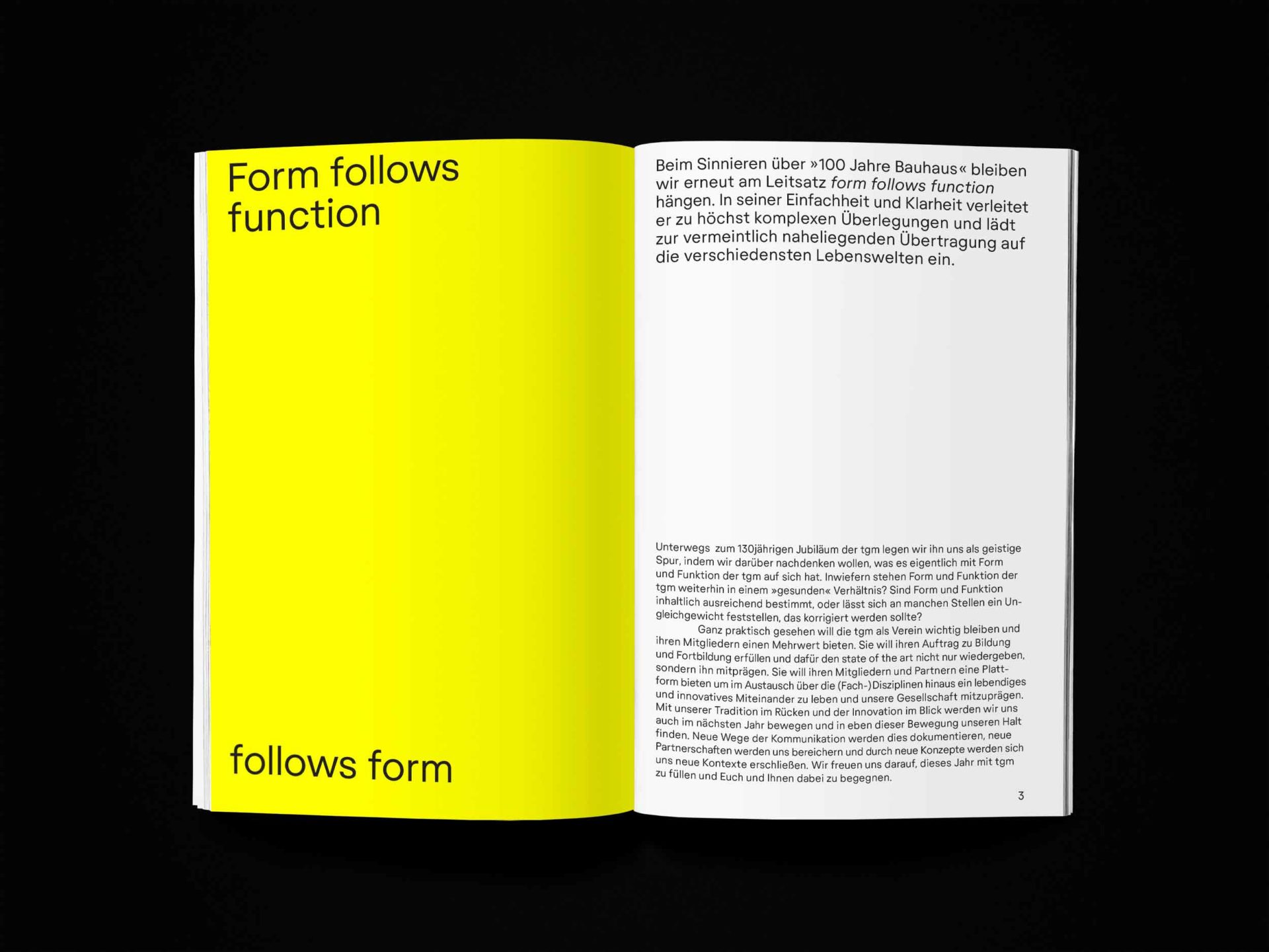
In accordance with the traditional willingness to innovate and our innovative view of tradition the tgm is picking up the central elements and essential ideas of the Bauhaus in this anniversary year. And we apply them to the “architecture” of the tgm, for example by asking: Are form and function of the tgm in a “healthy” balance? Are from and function in content sufficiently defined, or is there an imbalance that needs evening out?
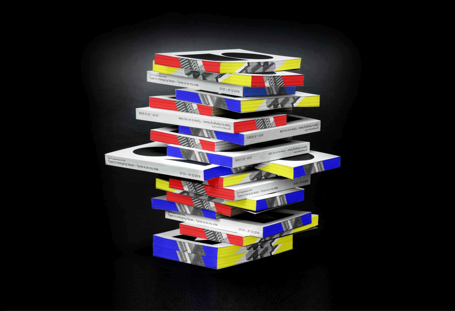
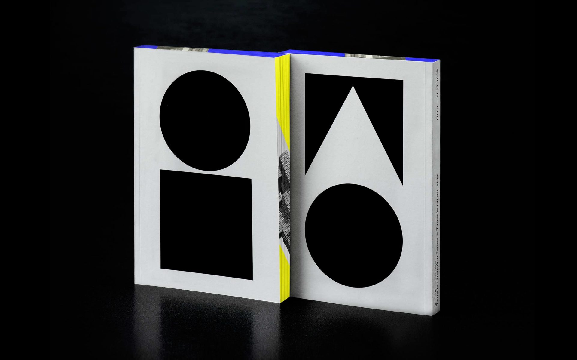
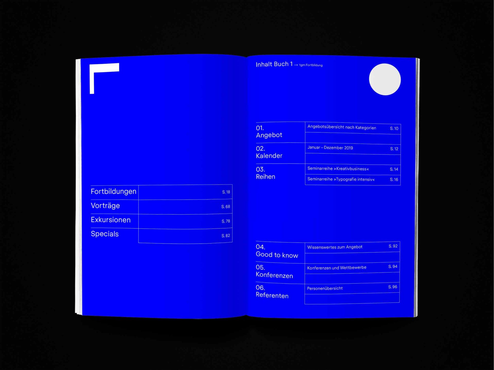
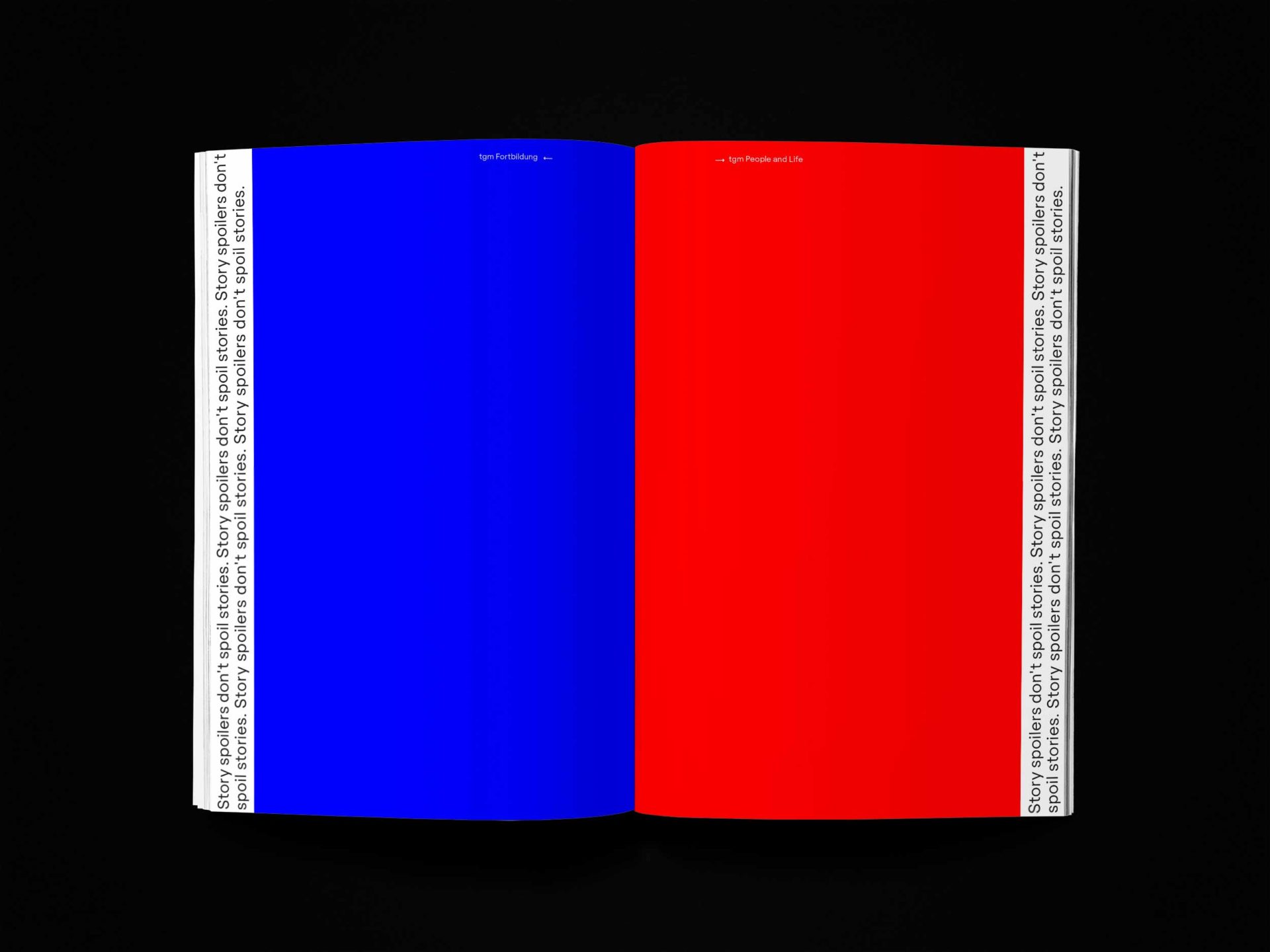
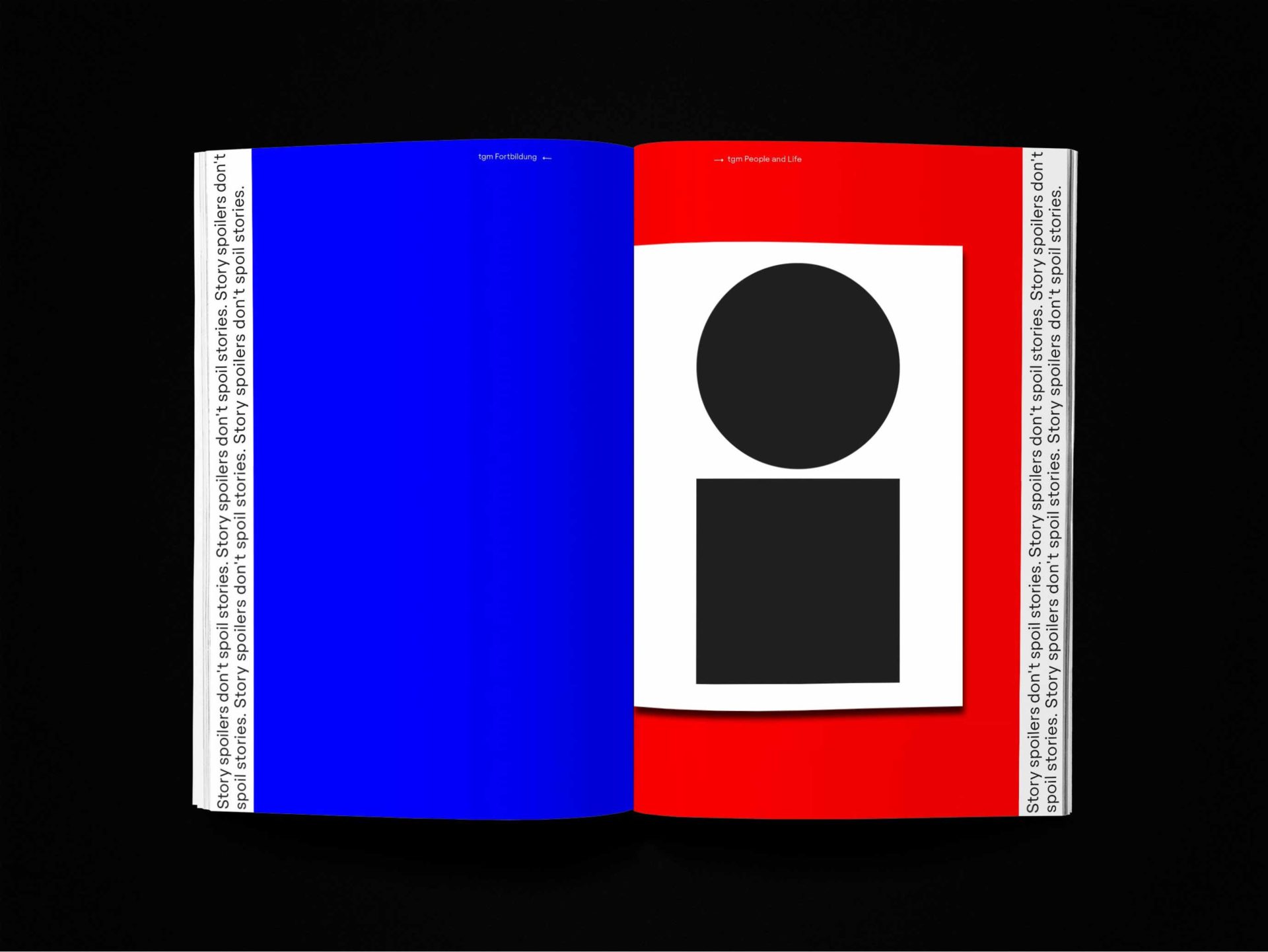
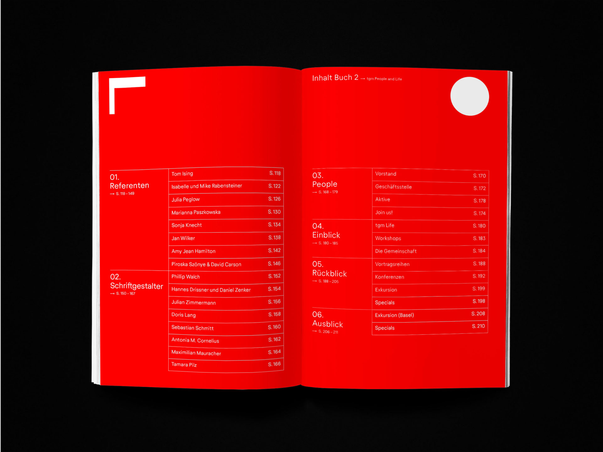
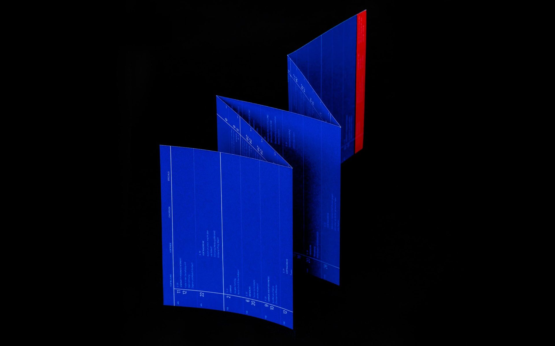
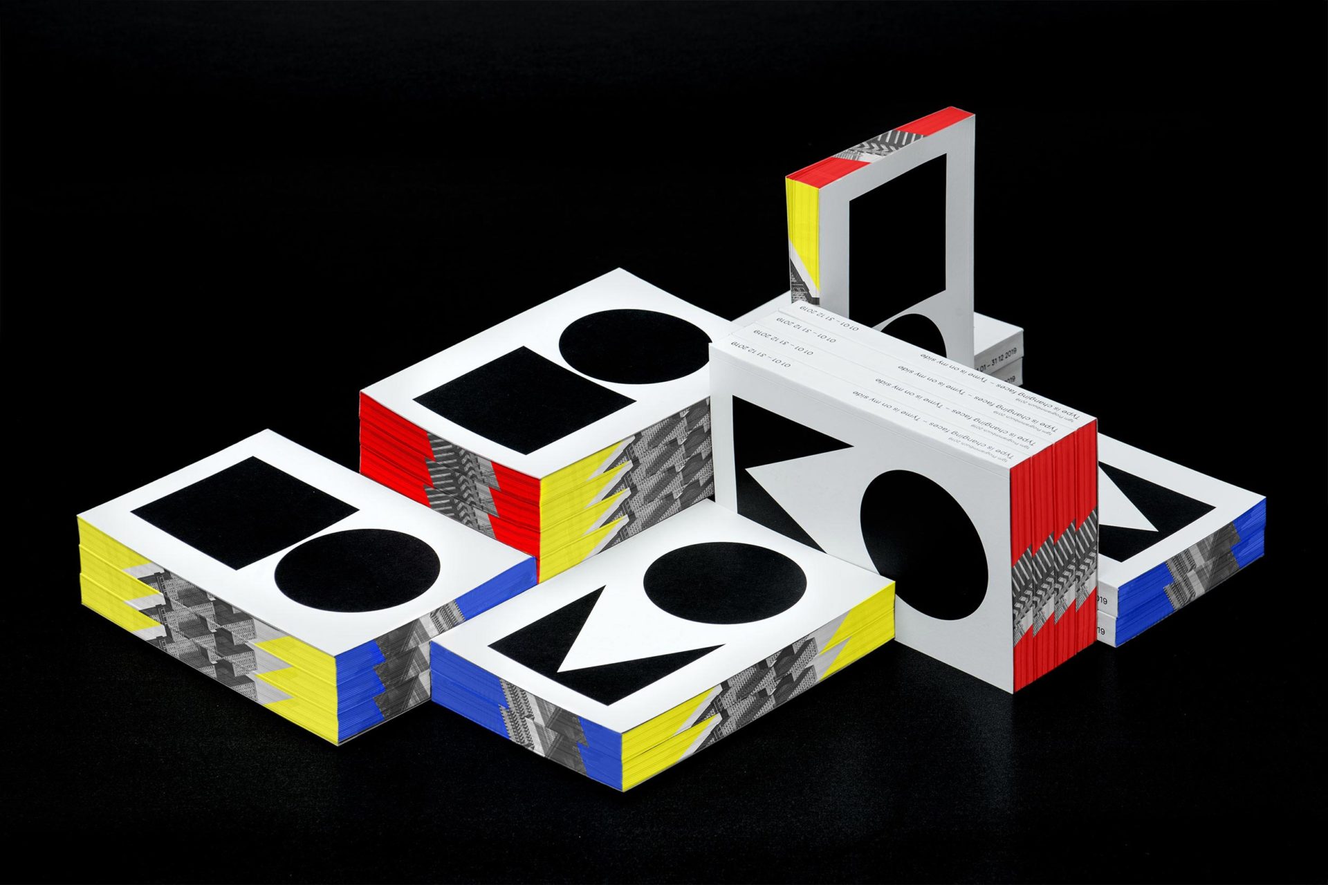
In the tgm annual yearbook the different aspects of out self-perception are assigned primary colours. The educational programme is presented in blue. The events (conferences, trips, presentation etc.) and the people on and behind the stage are shown in red, and the yellow notebook in the the middle separating the two topics is an invitation to participate. This strict and simplistic composition is not accidental, but an expression of the impression Milch+Honig want to make; furthermore it indicates the (colour) system of the tgm’s soon to be launched new website. These changes in and through our time are taken into account and prepared for the future in the tgm annual theme:
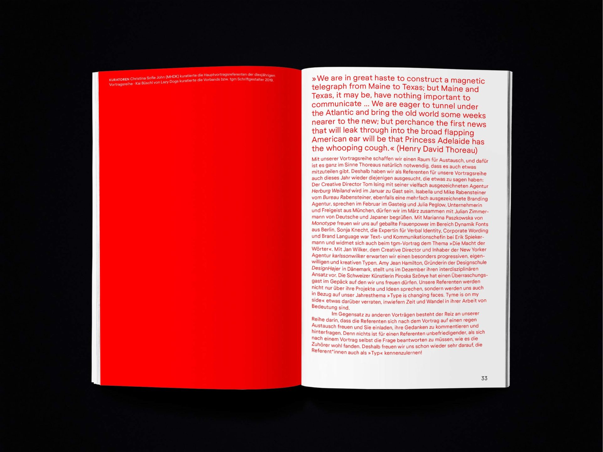
Type is changing faces.
Tyme is on my side.
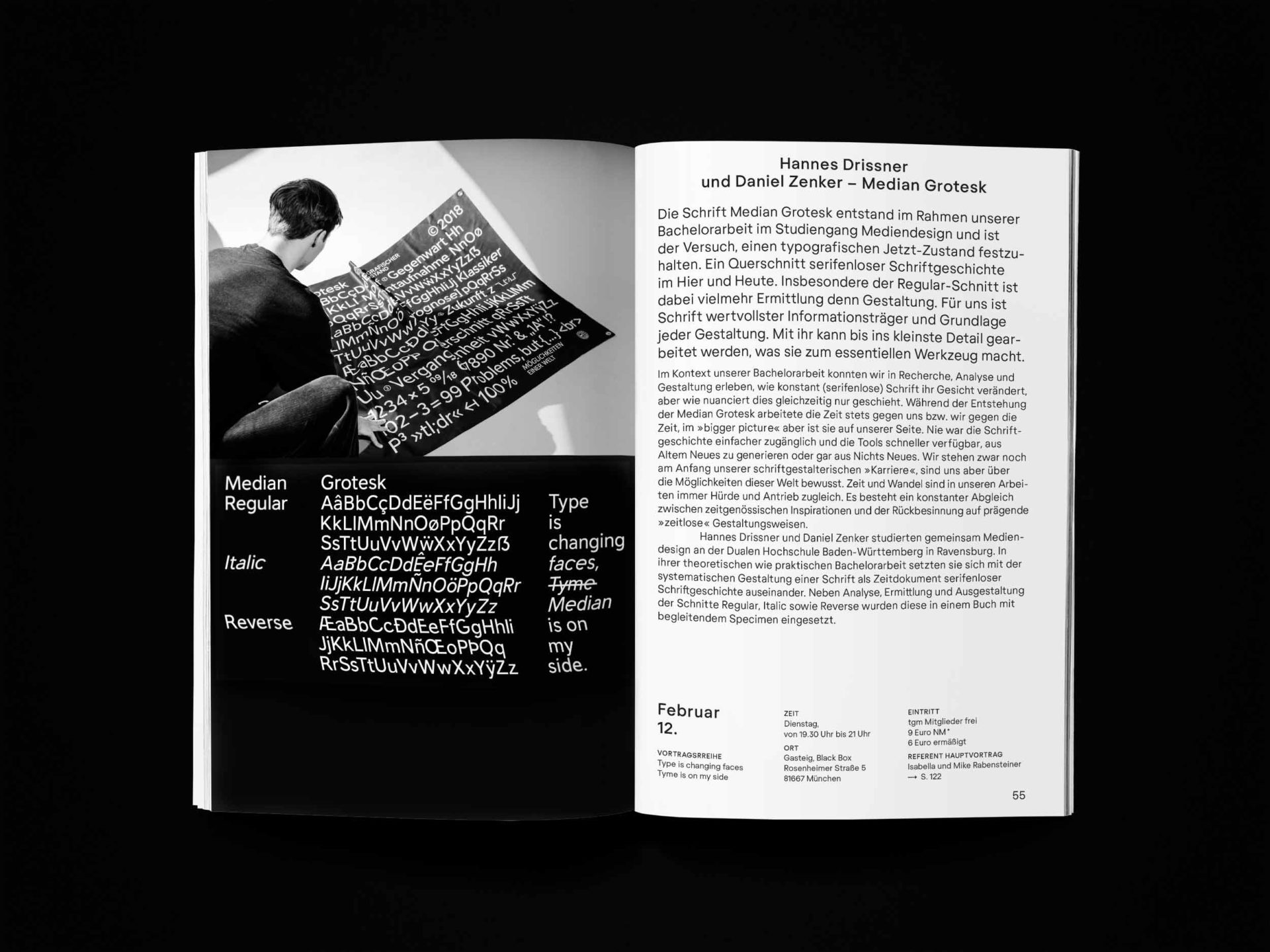
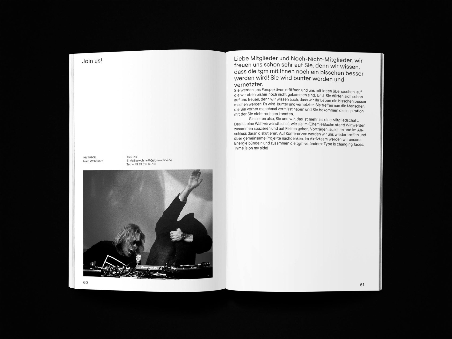
This combines two aspects that will occupy the tgm in the coming years: Not only typography keeps evolving and changing, but so do the “types” of people that make up, change and shape our association. We do not only want to acknowledge these changes, but actively shape them, by encouraging communication within and outside of the tgm. The new website is part of this strategy. The second part of our annual theme is simultaneously unambiguous and paradox – for how can it be true when we say time is on our side, when time seems to be sorely lacking everywhere? “That is why” is the answer! How else can we picture time than as something we can shape? The board of the tgm is planning on contemplating the future, knowing that time is on their side. Specifically, this means not moving frantically and randomly without clarity or focus only to give off the appearance of movement. No, it means, to have the courage to do what we are constantly told: to stop and to try and get a sense of the bigger picture in order to draw the right conclusions. Resting assured that this is not a standstill. In accordance with Mondrian and typography, the tgm is searching for a properly designed world.
Every offer under the roof of tgm is a result of solidarity. It is a result of people and companies who are united by the common interest in typographic quality. This project has only been possible with the support of Gotteswinter und Aumaier, Papier Union, Conzella Verlagsbuchbinderei, Richard Mayer Buchbindermeister, Buchbinderei Nagl, Clemens Gritl, Antalis, many supporters besides the sponsoring.
Agency
Milch+Honig
Designer
Christina John
Photographer
Dominik Parzinger
Weblog
Corporate Design: Deshalb ist es für das eigene Business wichtig
Warum ist Körperpflege so wichtig
Seife gegen Pickel
Warum Designer soziale Medien nutzen sollten
Warum jedes Unternehmen ein Erklärvideo braucht!?
Corporate Design auch im Handwerk? So erreichen Handwerksbetriebe einen Wiedererkennungswert
Verbessern Sie Ihr Home-Office mit dieser Ausstattung
Modedesign im Wandel der Zeit
Was tut sich im Online-Marketing 2024?
Mit einer cleveren SEO die Sichtbarkeit im Netz erhöhen
Einbruchschutz für Eigenheime: Die Grundlagen im Überblick
Moderne Heizsysteme: Welche Heizungsanlagen versprechen die größte Energieersparnis?
Webdesign – was müssen Unternehmen beachten?
Vielfalt der Druckverfahren im Etikettendruck
Chaotisches Genie oder einfach schusselig? Fünf Tipps für den besseren Merker
