Neue Radial Soft A–D
Neue Radial Soft is not what it seems at first sight. Most certainly it is not another geometric grotesque, but an impeccable visual system that unites four of the most popular sans serif genres of recent decades, integrated in this superfamily under the suffixes A, B, C and D.
Neue Radial Soft A follows the idea of New Functionalism that cultivates the model of the original London underground typeface in some details, while Neue Radial Soft B exemplifies the roots of a rational grotesque of the late twentieth century, a continuous success-story. Neue Radial Soft C is a contemporary representative of the geometric sans, mechanically constructed to optically appeal to the appearance of a true ‘compass and ruler’ typeface. Avant-Garde-esque elements ensure a smooth transition into Neue Radial Soft D that reflects the tradition of neo-grotesques.
The capital letters in all four families, almost square in appearance, follow an ancient model first demonstrated in the Roman capitalis. With only little metamorphosis from one family to the next, the capitals constitute the backbone of Neue Radial Soft, although a common denominator also lies in the overall structure of several prominent lowercase characters such as a, b, d, h, i, n, u. At the same time, details in stroke endings, strokes that enclose counter forms and transitions from bows into stems are carefully adjusted in detail to match the respective genre. The system successfully merges the three traditional stroke endings, i.e. vertical, diagonal, horizontal, and joins organic with mechanical stem structures. As a result, each family member speaks its own dialect, while all four stylistically share the same language. In other words, the range of weights, number of glyphs and font metrics are identical in all four families that each offer their own style and expression.
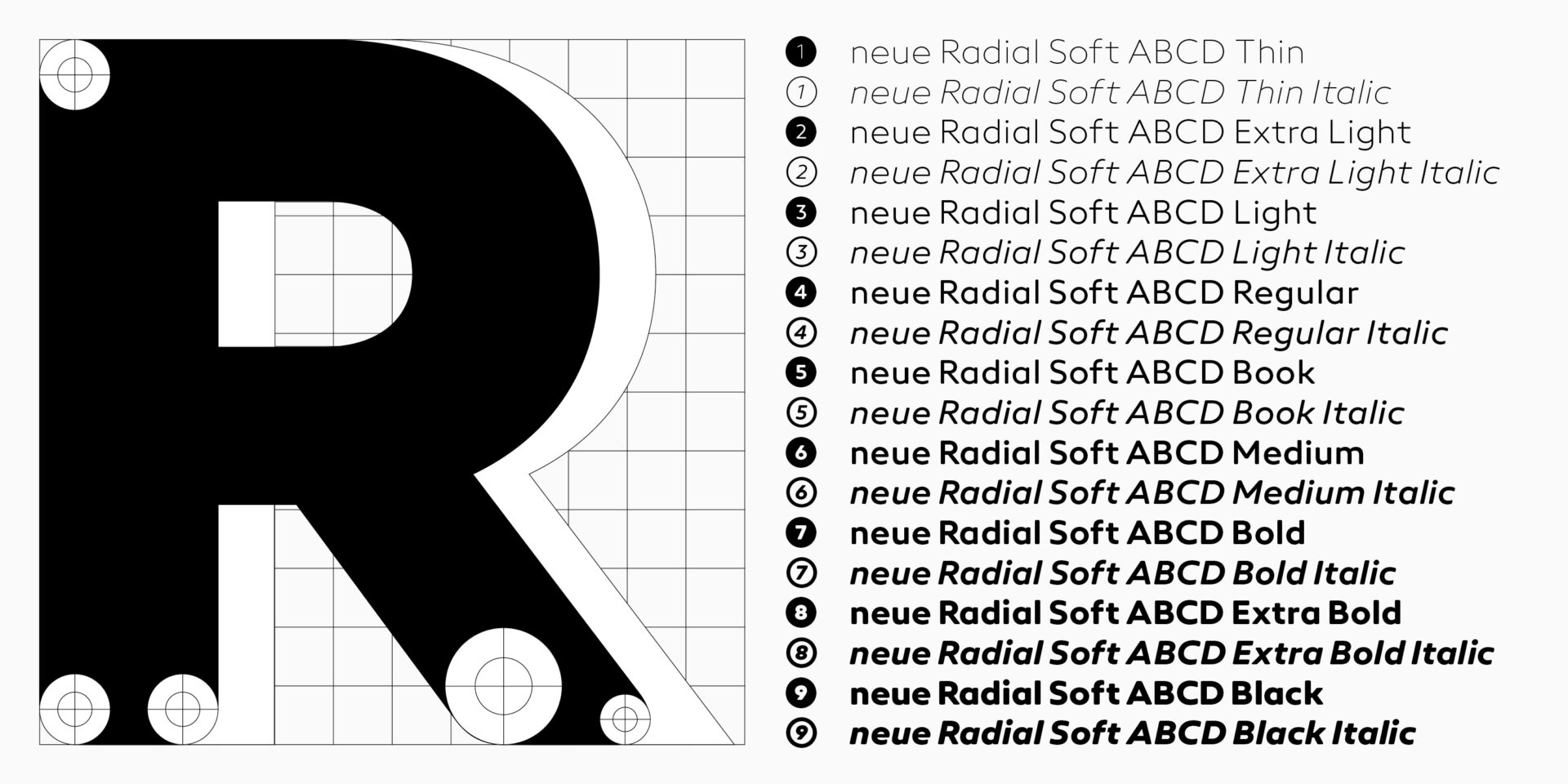
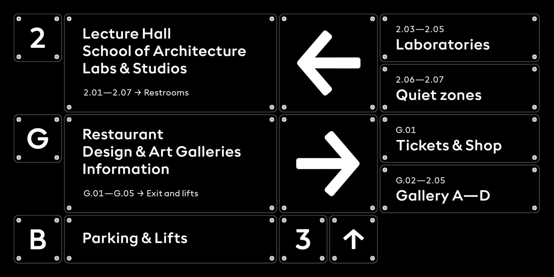
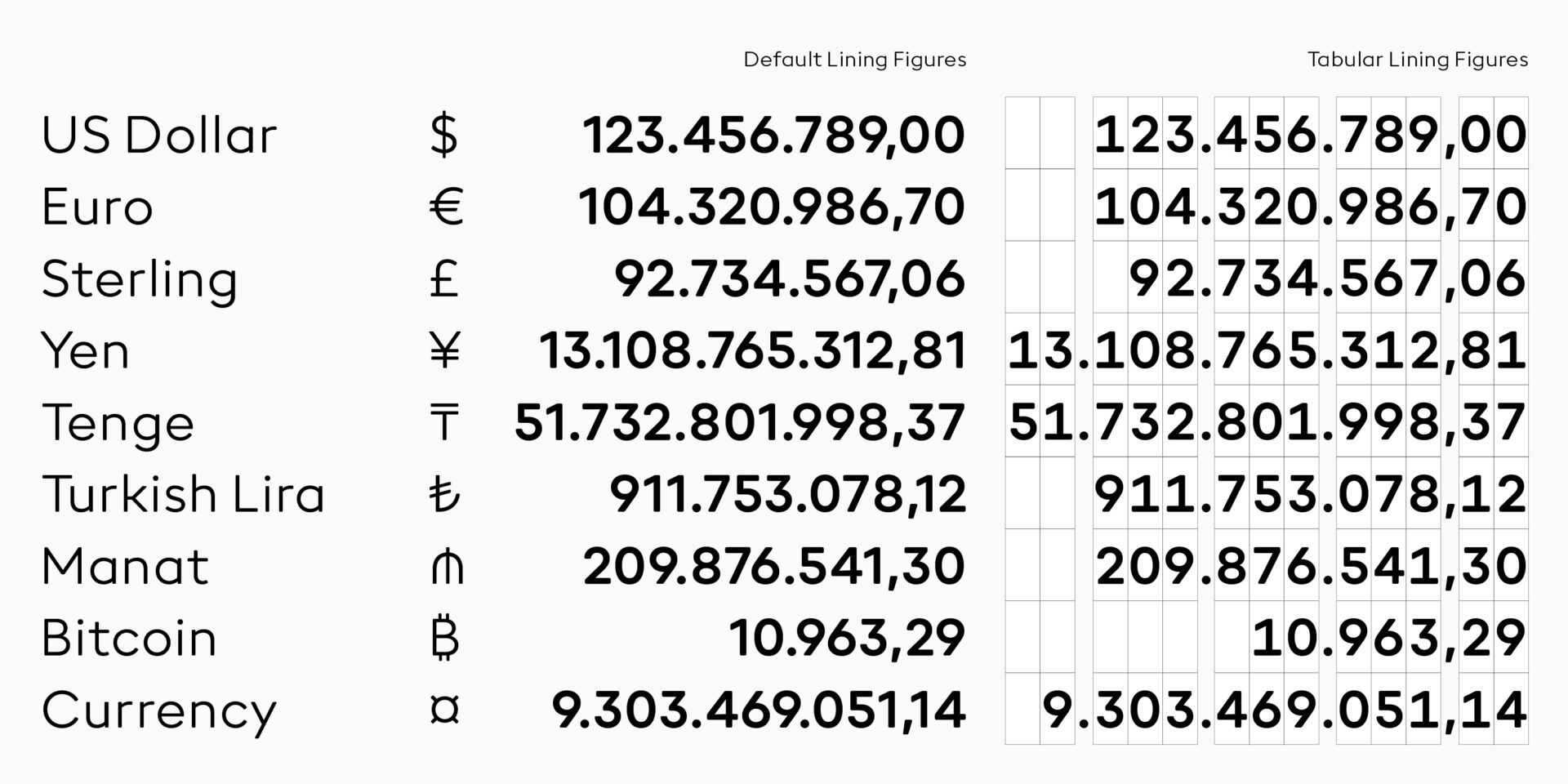
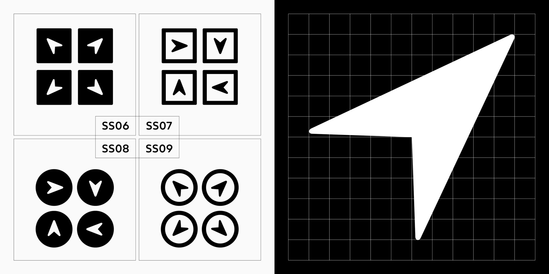
Let’s be clear, Neue Radial Soft is a highly consistent design machine. Each family comes in no less than 18 weights ranging from thin to black, decorated with regular and book weights, if necessary. No need to mention different sets of figures, but essential to point out squared and circled digits as well as several styles of arrows allowing for extensive use in identities, information design and orientation systems.
Designer
Alexander Roth
Alexandra Schwarzwald
Publisher
Neue
Weblog
Darum sollte eine Firma Giveaways nutzen:
Rolex Uhren: Darum sind sie nach wie vor angesagt
Was tut sich im Online-Marketing 2024?
Mit einer cleveren SEO die Sichtbarkeit im Netz erhöhen
Einbruchschutz für Eigenheime: Die Grundlagen im Überblick
Die Qual der Wahl – Erfolg im Internet – die Auswahl der Webagentur
Entdecke die neuesten Trends in Damenmode: Stilvoll und zeitlos
E-Mail-Outreach betreiben: Die besten Tipps, um effektiv Entscheider zu erreichen
Festplatte abgestürzt – das sind die 3 häufigsten Gründe!
Werbebotschaften – der Motor für den Verkauf
Webdesign – was müssen Unternehmen beachten?
Limitierte Editionen: Das Phänomen von exklusiven Sneaker-Veröffentlichungen
Veröffentlichung der eigenen Arbeit
Windows für Mac-Liebhaber: Die besten Tipps im Umgang
Ein praktischer Leitfaden für Marketer, die KI nutzen wollen

