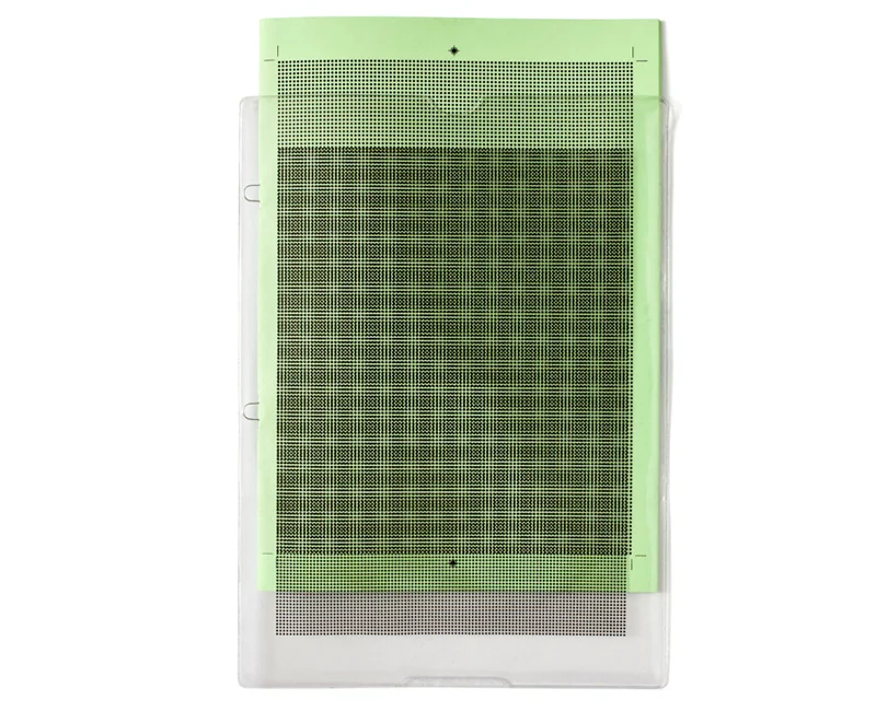
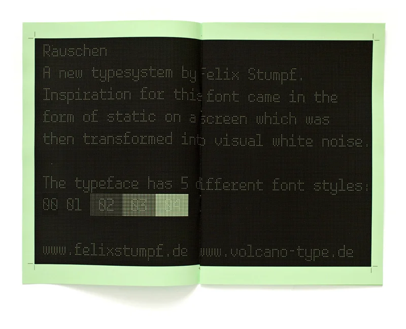
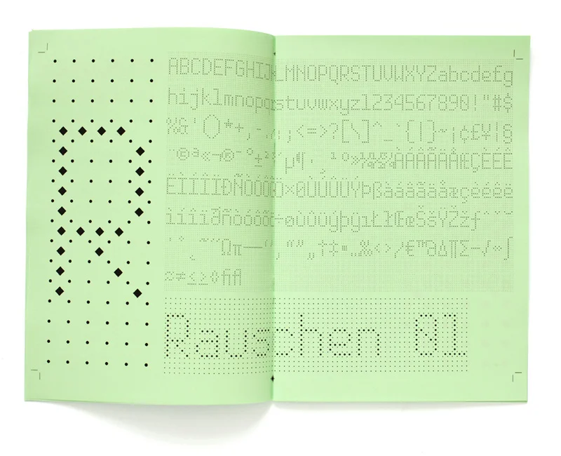
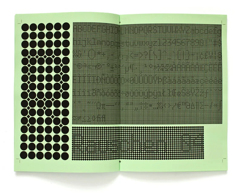
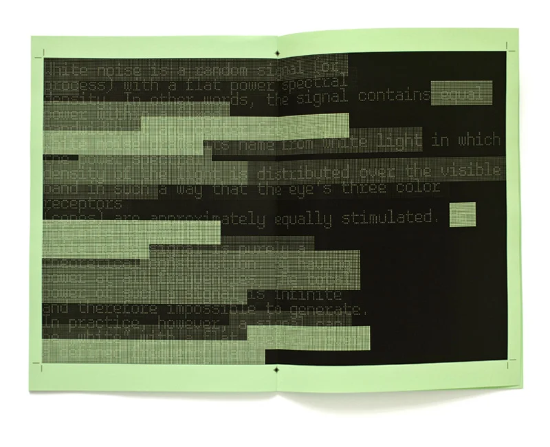
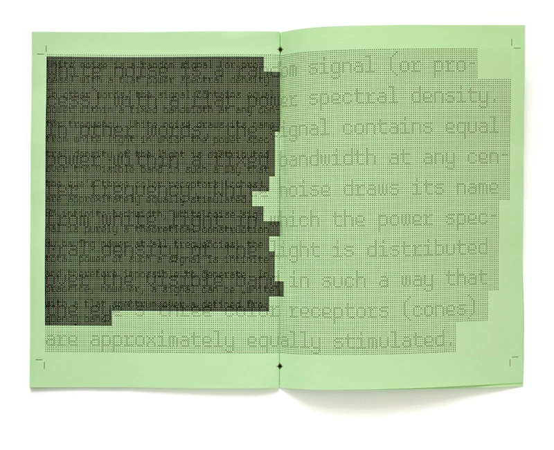
inspiration for this typeface came from the static on television screens. it has been created through the use of a modular grid system with circular dots. the individual letters, which consist of small rectangles, form part of the grid. the font style is determined by the size of the dots in the grid. the typeface attains a different form of visual white noise, depending on which font style is chosen. this in turn changes when the typeface is observed either from close range, from afar, or from the side. one of
the font styles functions without the dots in the grid. this shows how successfully the individual characters of this high quality font have been optimised. the “rauschen-booklet” received the certificate of typographic excellence from the type directors club new york in 2010. the typeface has 5 different font styles and is distributed by volcano type.