
Type Design
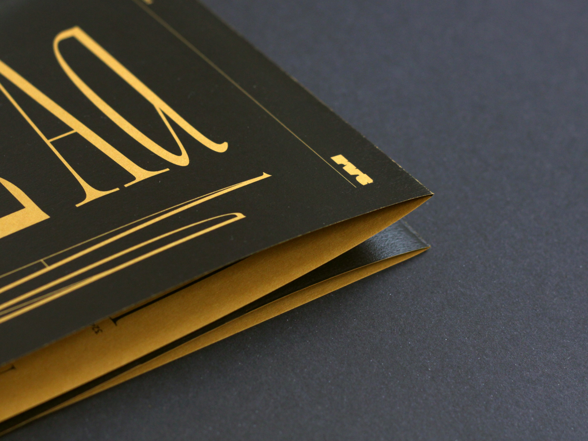
No. 3 Series
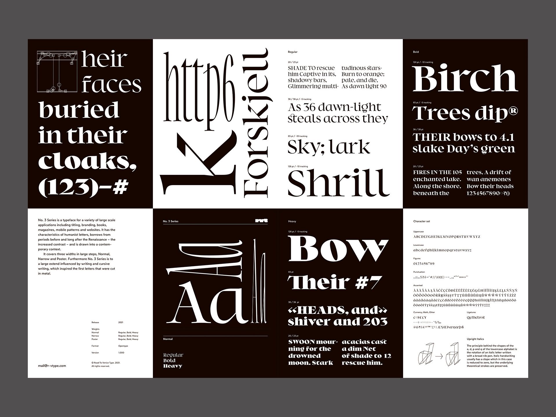
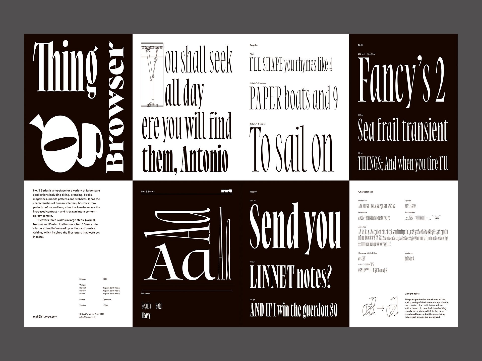
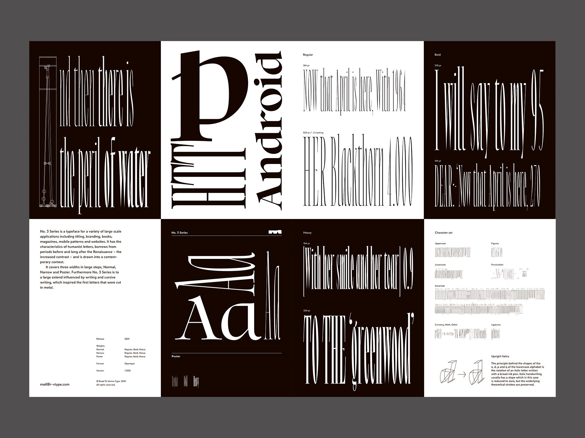
No. 3 Series is a humanist face for large sizes. Its applications range from titling, branding, books, magazines to mobile patterns and websites. No. 3 Series borrows from periods before and long after the Renaissance – the increased contrast – and is drawn into a contemporary context.
It covers three widths in large steps, Normal, Narrow and Poster. Furthermore No. 3 Series is to a large extend influenced by writing and cursive writing, which inspired the first letters that were cut in metal. For example the principle behind the shapes of the a, d, p and q of the lowercase alphabet is the rotation of an italic letter written with a broad nib pen. Italic handwriting usually has a slope which in this case is reduced to zero, but the underlying theoretical strokes are preserved. No. 3 Series is now available on Road to Venice Type.
Road to Venice Type was established with the premise to design fonts in constructive conversation with type history, reflected in or seen through a contemporary and forward oriented perspective. The intended output is a typeface that conveys meaning, but stands back enough to communicate the written message and functions the way it should.

Weblog
Darum sollte eine Firma Giveaways nutzen:
Rolex Uhren: Darum sind sie nach wie vor angesagt
Was tut sich im Online-Marketing 2024?
Mit einer cleveren SEO die Sichtbarkeit im Netz erhöhen
Einbruchschutz für Eigenheime: Die Grundlagen im Überblick
Moderne Heizsysteme: Welche Heizungsanlagen versprechen die größte Energieersparnis?
Die Qual der Wahl – Erfolg im Internet – die Auswahl der Webagentur
Entdecke die neuesten Trends in Damenmode: Stilvoll und zeitlos
E-Mail-Outreach betreiben: Die besten Tipps, um effektiv Entscheider zu erreichen
Webdesign – was müssen Unternehmen beachten?
To-go-Verpackungen mit Persönlichkeit
Die Vorteile eines eigenen Website-Servers: Das sind sie
Das richtige Produkt im Netz finden: Die Welt der SEO-Agenturen
Den Ort finden, an dem Kreativität am besten entsteht
Deutsches Design beim Bauen – das sind die wichtigsten Merkmale
Vielfalt der Druckverfahren im Etikettendruck
Warum mehrsprachiger Content unerlässlich für globale Marken ist
Job als Konferenzdolmetscher – welche Voraussetzungen müssen erfüllt werden?