Easy Grotesk
Easy Grotesk? It’s confident and optimistic. It’s fresh, friendly and combines the conventional with the surprising; trust and familiarity with a visual twist.
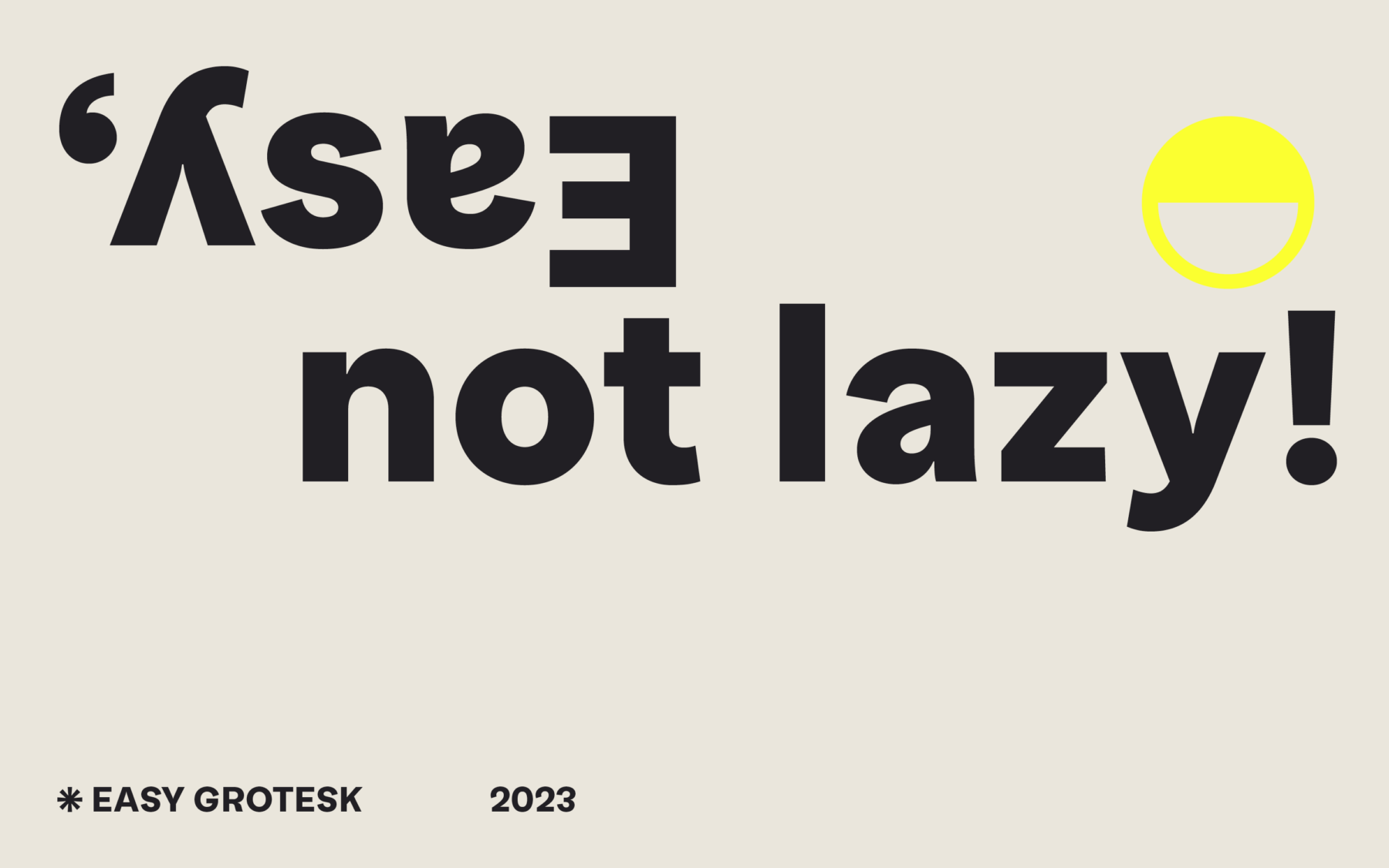
Easy Grotesk brings together two opposing aesthetics. There’s the easy-going typographic texture on the one hand, and quirky character on the other. Useful and functional, this cheerful helper is carefree but not careless. It’s Easy, not lazy!
Expressive gestures are key to Easy Grotesk’s personality. It may follow a standard neo-grotesque model, but it plays with the principles. Where, ordinarily, the lower parts of a letter are a little larger to make it feel more stable, Easy is dynamic: the top heavy, almost upside down s and signature a are only a few of the details that bring playful character to typography.
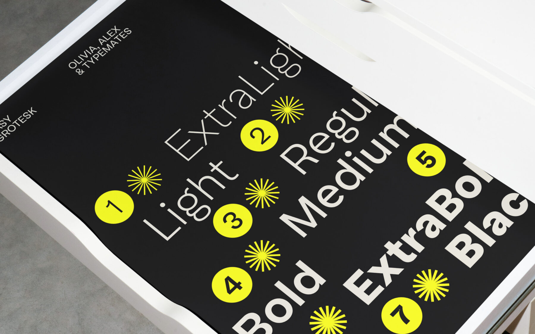
Easy Grotesk’s unmistakable appearance pulls the reader closer. While its proportions give the typeface distinction and impact at display sizes, they’re subtle at smaller ones. Level-headed proportions, ample body, and spontaneous detailing delivers content with joie de vivre. Originally designed for a tech startup, its seven styles, matching italics and relaxed attitude can organise complex information and make it approachable. Easy.
Like most TypeMates fonts, Easy Grotesk covers almost all the languages that use the Latin alphabet and is packed with plenty of typographic features. Along with Tabular Lining and Oldstyle Figures, its OpenType features include a wide range of alternates (a simplified a and g, a distinctive G and k, and a tailed l for extra legibility) and plenty of typographic extras: arrows, case-sensitive forms, and symbols. On top of that, the Variable Font implementation of Easy Grotesk opens up additional ways to create motion graphics.
Weblog
Die neuesten Fortschritte in der Hörtechnologie
Jenseits der großen Namen: Die Kunstszene der Zukunft entdecken
Günstige Zimmer in Dresden – für Monteure und Handwerker
Blockieren EMAs den Kursanstieg von Dogecoin?
Webdesign und Entwicklung neu gedacht: Strategien für digitale Erfolge
Grafikdesign für internationale Kampagnen: Wie man Layouts für verschiedene Sprachen optimiert
Interaktive Erlebnisse schaffen: Die Zukunft des UX-Designs
Designs zum Leben erwecken: Die Kunst der Lasergravur Einleitung
PayPal Alternativen: Eine Übersicht
Moderne Designprinzipien: Die Grundlagen für eine gelungene Gestaltung
Design-Trends 2025: Was erwartet kreative Köpfe in Deutschland?
Nachhaltiges Design: Was steckt hinter der umweltbewussten Produktgestaltung?
Black Friday auch für Webdesigner attraktiv?


