Verano Archivo
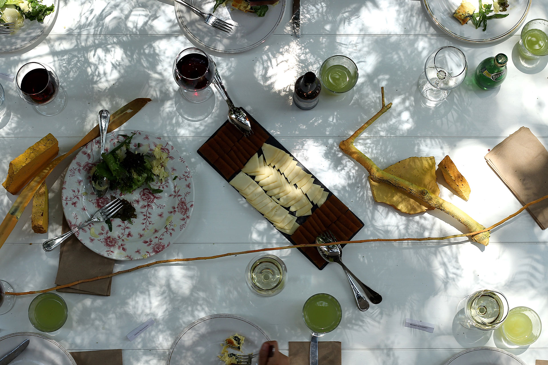
Archivo is probably the most the beautiful space for architecture and design in Mexico City. It is dedicated to collecting, exhibiting and rethinking design in a broader sense in Mexico. TwoPoints.Net had the pleasure to design the Visual Identity of “Verano Archivo”, an experimental exhibition with activities for kids and adults.
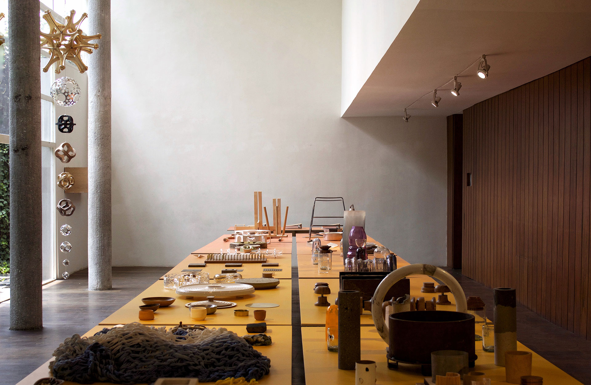
About the exhibition “Design in process”: The exhibition explores the experimental and development stages that precede a finished object, product or project. Covering proposals that range from product or textile design to architecture and urban design, the premise of the exhibition is that the most important, interesting discoveries and learnings occur in the early stages of a project, and that these are usually difficult to distinguish and read in finished, polished objects. Isauro Huizar and Mario Ballesteros did a wonderful job curating the objects and making them look effortless beautiful.
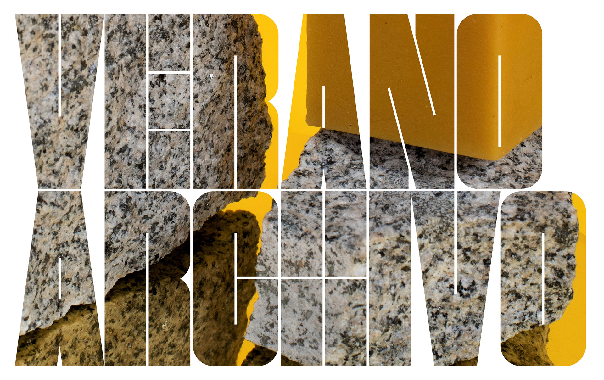
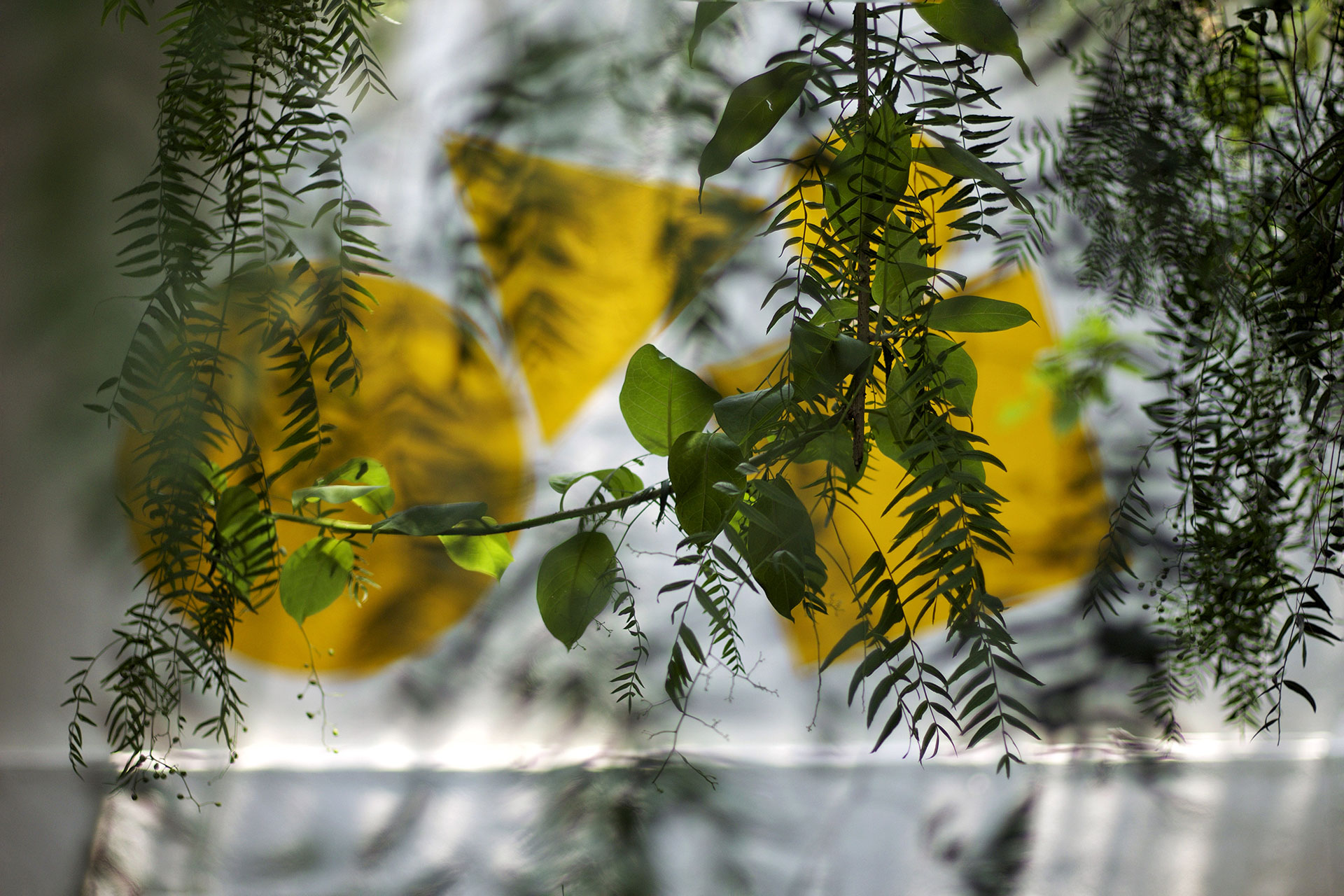
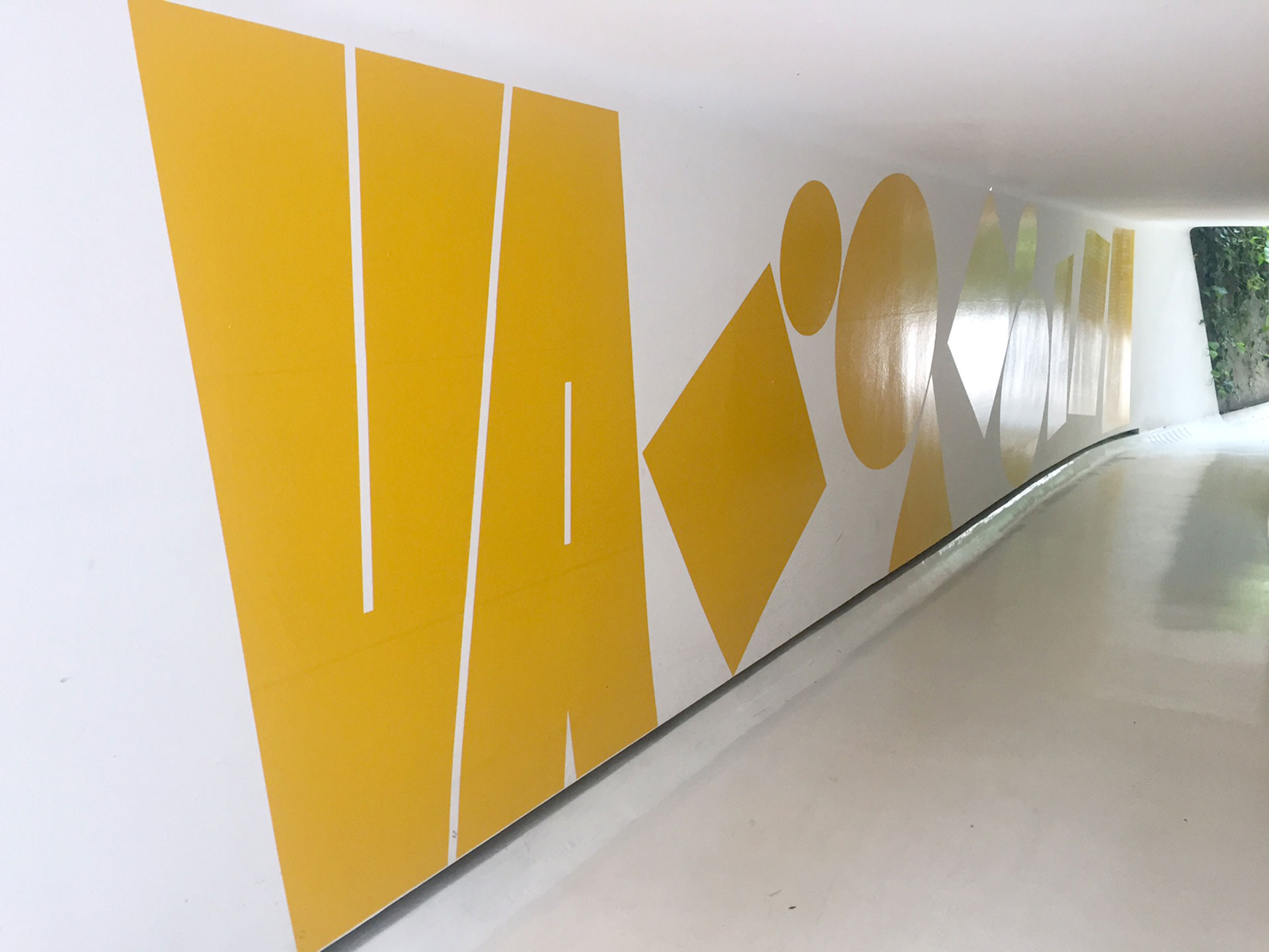
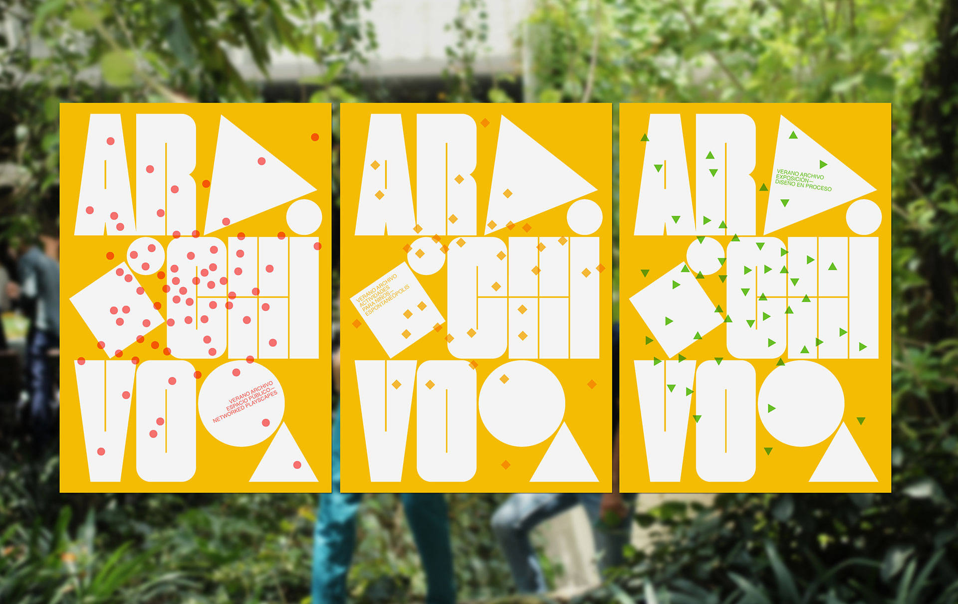
About the Visual Identity: TwoPoints designed a typeface which became the heart of the Flexible Visual Identity (FVI) for “Verano Archivo”. A typeface in itself is already a FVI. It allows us to combine letters to create new forms, able to adjust adequately to context and space. The letters “VA” or the full title of the event “Verano Archivo” may be set horizontally or vertically. The letters are either yellow or can be filled with images from the exhibition. The color yellow, which represents summer, is the common thread of the FVI. It connects all the pieces of the exhibition, the inauguration lunch, the posters and the space itself, even if the typeface or the additional geometric elements aren’t used. Apart from connecting all the pieces of “Verano Archivo”, the FVI also visualized the three different elements of the event: the exhibition, the activity for kids and the activities in the open space. Each of the activities became a color and form code and were silkscreened separately on top of the letters, creating one poster for each of the activities and when printed all together, a general poster for the entire event. On the “selfie-wall”, a huge mirror in the exhibition space, the system turned into an interactive game. The visitors of the exhibition could glue the geometric forms themselves on top of the letters “Verano Archivo” and take a picture of themselves.
Agentur
TwoPoints.Net
Photography
Diego Padilla
Agustín Paredes


Weblog
Die Qual der Wahl – Erfolg im Internet – die Auswahl der Webagentur
Entdecke die neuesten Trends in Damenmode: Stilvoll und zeitlos
E-Mail-Outreach betreiben: Die besten Tipps, um effektiv Entscheider zu erreichen
Festplatte abgestürzt – das sind die 3 häufigsten Gründe!
Webdesign – was müssen Unternehmen beachten?
Limitierte Editionen: Das Phänomen von exklusiven Sneaker-Veröffentlichungen
To-go-Verpackungen mit Persönlichkeit
Die Vorteile eines eigenen Website-Servers: Das sind sie
Windows für Mac-Liebhaber: Die besten Tipps im Umgang
Den Ort finden, an dem Kreativität am besten entsteht
Deutsches Design beim Bauen – das sind die wichtigsten Merkmale
Ein praktischer Leitfaden für Marketer, die KI nutzen wollen
Chaotisches Genie oder einfach schusselig? Fünf Tipps für den besseren Merker
Wie Design unser Leben beeinflusst
Warum mehrsprachiger Content unerlässlich für globale Marken ist
Designmöglichkeiten in Windows: So personalisierst du deinen Desktop
Die Macht der Farben: Farbpsychologie im Webdesign
Instrumentenbau: Design trifft Handwerkskunst