Jessica Hische – Images of words
When I first found Jessica Hische’s website showing her work on the internet, I spent an entire hour there because it was so much pleasure to see how much she enjoys letters, shapes and colors. Letters become objects, figures and images when she’s using them, which is simply fascinating. It was a big pleasure for us to interview her for our magazine.
Do you see yourself more as a typographer, illustrator or designer?
More of a letterer than anything—which is really close to an illustrator. Lettering and illustration are essentially the same industry, one just deals with images and one with images of words.
You seem to have a very good feeling for colors and color schemes. What role does color play in your work? How do you use color?
I love color, particularly warm colors that are a tiny bit muted. Most of the work that I do is quite colorful, especially my very illustrative lettering work. I try to keep the palettes consistent and sophisticated without repeating myself too much between projects.
When seeing your letter-works on your project dailydropcap.com, I didn’t see only letters but personalities. Is that what you feel as well when you design letters?
Definitely! When I look at the lettering work that I do, I can immediately tell what mood I was in the day that I drew it and also sometimes what music that I was listening to. It’s hard to hide your personality in your work unless you’re working very modularly.
Do you have a favorite letter?
I think R or K are my favorite letters—there is just so many ways to draw them! I also love the letter Q
Can you describe how you work? Do you start with sketching by hand before you go to illustrator?
I do sketches before most projects, mostly because I need to be able to show something to the client to approve before we go to final. I used to do very rough sketches, but sketches for lettering have to be a bit more detailed so that the client can clearly see what my thoughts are for the style. I don’t trace my sketches in illustrator, I just look at them as I’m working. I tend to correct all of my drawing errors this way and end up with something a bit more consistent. It’s drawing a person from memory instead of from a photograph. You tend to idealize and exaggerate in good ways.
Do you have a project that you liked most or is there a project you want to work on but didn’t have the chance yet?
I think my favorite project up to this point has definitely been the Barnes and Noble classic book covers I worked on. It’s rare that I get to work on something with such a high production quality and seeing the final books in print was one of the most exciting moments in my career. They were incredibly fun to work on too! I’m not sure if there is a specific project that I wish I could work on at the moment, I have fun working on a huge variety of pieces whether I’m working on a tiny illustration in a local magazine or on a big illustration in an ad campaign.
Your new website has an interesting addition to it: the teen-girl mode, where the website changes to sort of a rainbow-colored land, full of colors and pling-pling. Why did you add that?
I love being able to show my sense of humor, especially in something like a portfolio site. Most people’s websites are very dry and business-like. Most people know that my »business« is just me, so it felt right to let the website feel more like »me«.
You are well-known for your internet-projects momthishowtwitterworks.com and shouldiworkforfree.com. What was your inspiration for these projects?
I like to make resources for myself and other designers. Both of those projects began when I wanted to share information with other people but didn’t really have the proper forum to do so. By making small websites to communicate ideas and knowledge, it becomes a resource for a lot of people and it makes me feel good to »give back to the internet« since people on line have done so much for me.
You teach at design school and you give advices to young designers on your blog. What are the most important things young designers should learn?
To be nice to people! A lot of young designers see everything they do as a favor exchange instead of just doing things to be nice. Being a bit altruistic with your kindness will always come back to you in good ways.
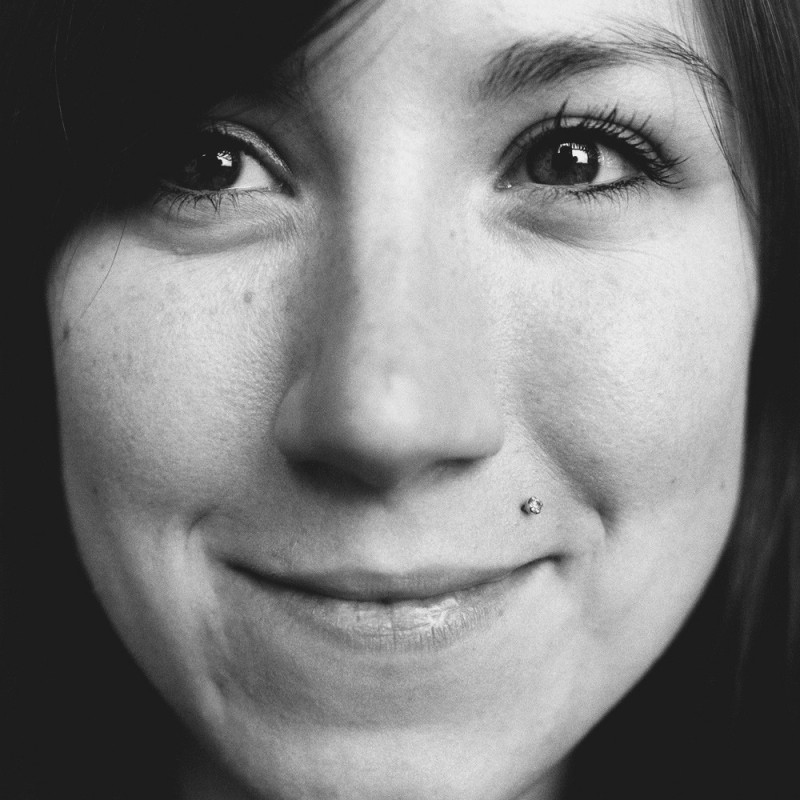
The interview was made by Nadine Roßa. Photo by Pascal Béjean